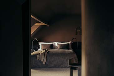
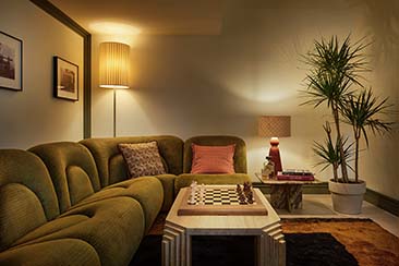
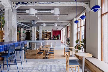
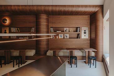
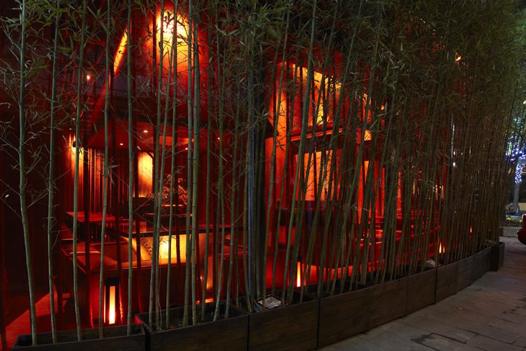
It’s a brave company that sets out to make its restaurant look like something out of Kill Bill, but that was the design brief Prism Design were given for the Shanghai branch of Japanese eatery Kemuri. Thankfully the result was not utter carnage – not a drop of blood to be seen, in fact – but instead a nicely rendered, traditionally “Asian” place with some added steel.
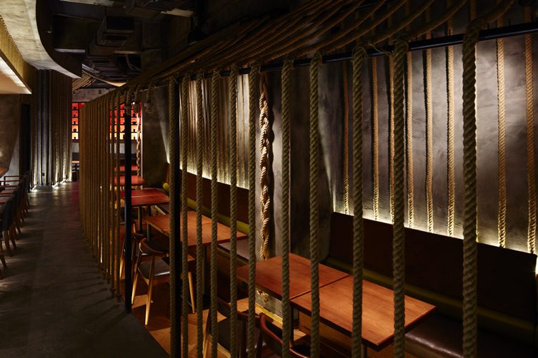
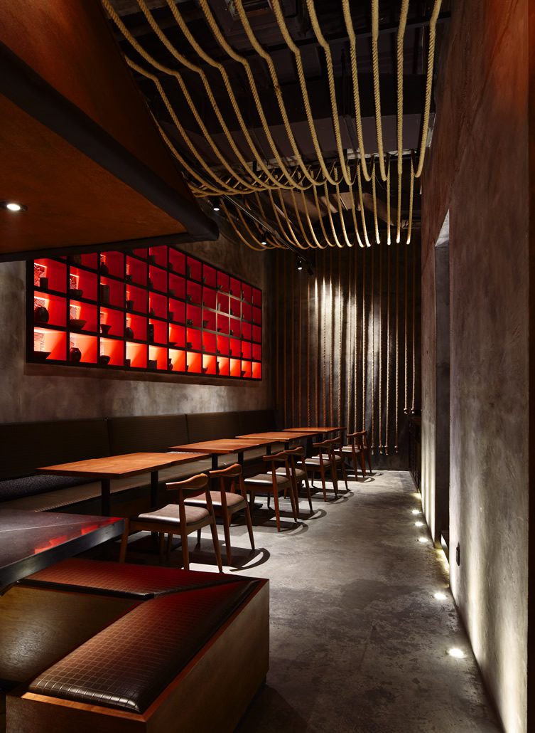
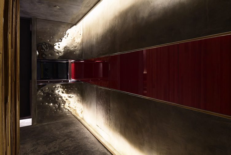
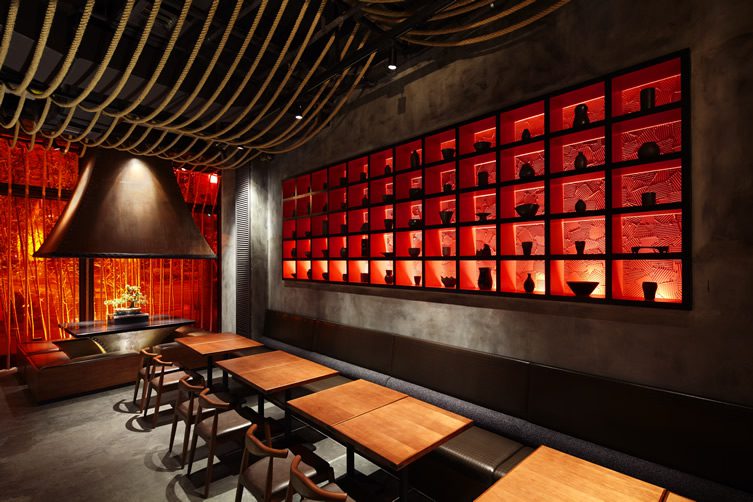
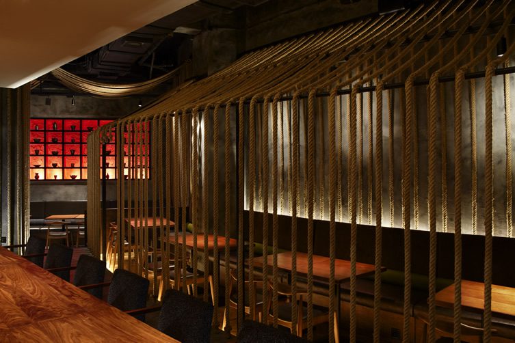
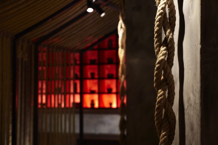
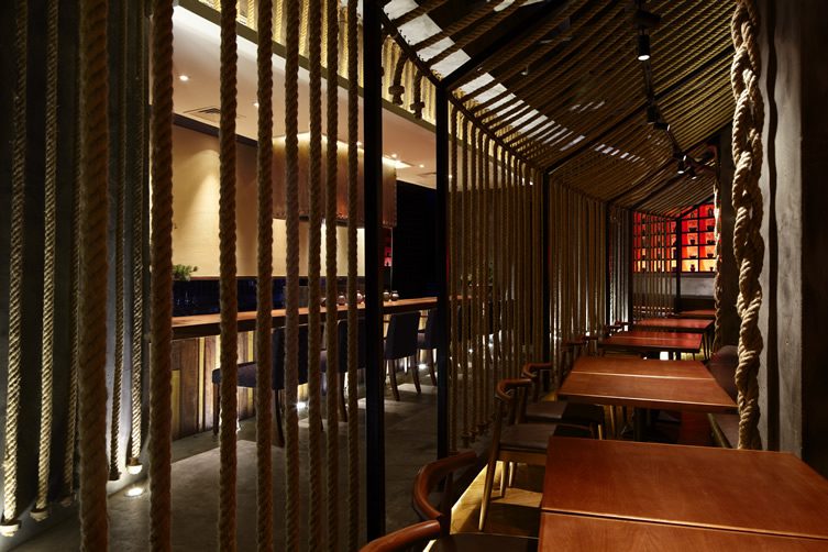
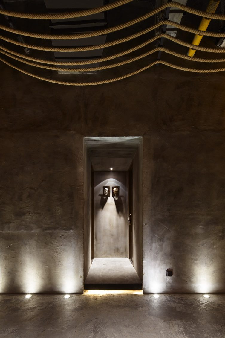
Kemuri Shanghai does have some deep red flowing through it, but only from the moody light installation that barely raises the room above the ambient level. Heavy rope curtains hanging over the wall tables help create an intimate atmosphere – swap the tables for beds and this could be a 19th Century opium den. Kemuri, meaning smoke in Japanese, is actually a style of cooking which was also the second of Prism’s motifs. Providing a slash of modernity to cut through the period feel, the designers used bare concrete walls, one bisected by a rich red vein culminating in a steel end panel that has been beaten to look like it has seen a fight or two. Just make sure you tip well…
Photography © Nacasa & Partners Inc.
(Photographer, Eiichi Kano)


