Having just been nominated in this year’s Restaurant and Bar Design Awards, having already garnered accolades and awards for their previous incarnations, the refit of Royal Leamington Spa’s infamous Smack nightclub has already caused as much of a stir as the name change, and fabulously confrontational domain name, did a few years back.
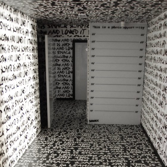
With its uncompromising, monochrome scheme and knowing nods to the likes of Stephen Sprouse and Banksy, the stark interiors certainly take no prisoners, and with the likes of Chase & Status, Pendulum and Bombay Bicycle Club finding their way to the relatively sleep Warwickshire spa town, it’s no surprise that Smack is big news to the more open-minded members of the local – student heavy – population. We caught up with Smack’s founder, Steve Smith, for a quick chat…
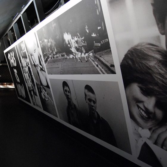
Tell us a little bit about the history of the club?
I opened the club in 1999 as Sugar. The club was the first “boutique club” of its kind in the UK and design was always paramount, and at the forefront of everything we did. Alongside a very forward thinking music policy, we soon had people visiting from all over the UK. On the design front, we had numerous articles in the media, including two features in The Face, and a double page spread in ID, as well as Heat, The Times, Guardian, Dazed and all club publications. The fact the London media were so excited about the club, told us we were onto something good. A Leamington Spa club featured in the style bible, The Face, was certainly an achievement.
Leamington’s not necessarily the first place you’d expect something so bold, why here?
The reason we are based in Leamington, is that it’s where I grew up. It’s an affluent area, with a good student population, and the crowd appreciate our work.
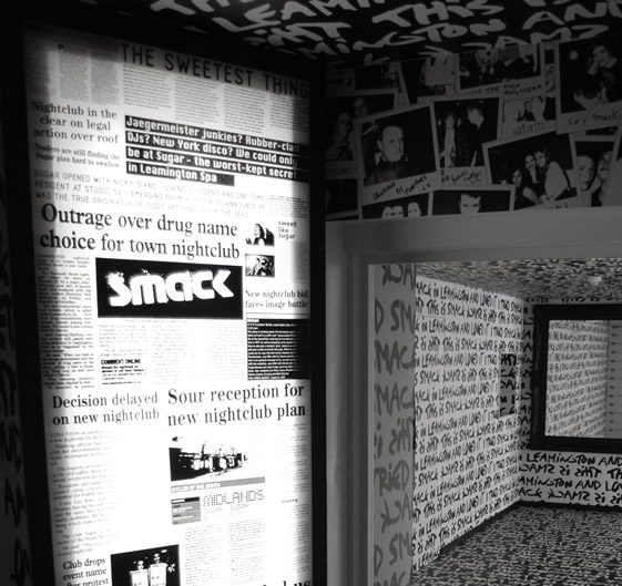
Ok, we can’t really continue without briefly mentioning the name…
Since 1999, the club had 3 major refurbs as Sugar, and in 2007 had its fourth refurb and a brand change to Smack. The thought process was simple. Firstly, I was more than happy to wind up the local media, and secondly, I was sick and tired of design by numbers bars/clubs, which opened with names and promo material, which in my mind were a complete contrast to the bland, boring, uninspired, seen it a hundred times interiors they actually offered. With Smack, I chose the dirtiest street name I could think of, which was in complete contrast to the beautiful interior we had created, so in some ways, it was a piss take of how I felt the industry was.
We won best interior 2007 at the Beda awards, and the local media put a line about this, even though the name change had been front page news for three weeks. That scheme was ripped out in 2010, for what you see now.
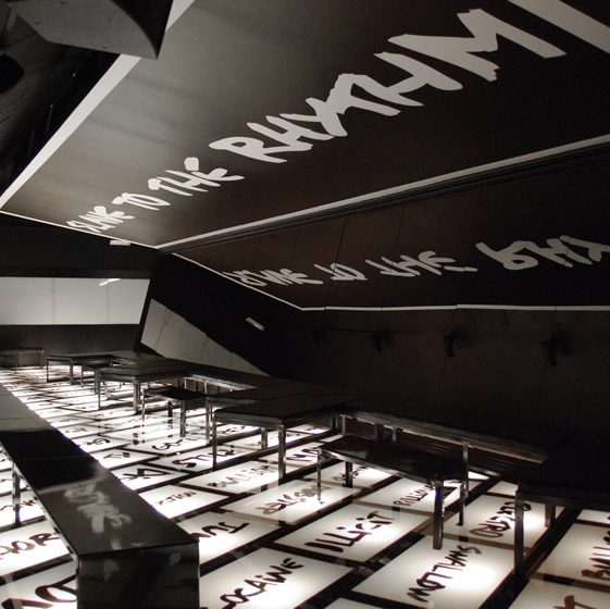
Who was involved in the design and build of the space?
I operate and trade all my venues, and although my design brief has always been key to me, I have become more confident in my own ideas and become more involved in the process. The current scheme at Smack is pretty much all my own work. I’m not skilled enough to provide drawings, so involved Adrian [Baynes] who did my initial Sugar scheme in 1999. His input was the design of the DJ booth, and the canopy section in the main club. All artwork, graphics and the rest of the design were down to me.
Where does your personal design inspiration come from?
My interest in bar/club design kicked off with the Schrager hotels. I used to go on a 3 day visit to his latest creation, rather than a 2 week lad’s holiday. I was also living in London when The Atlantic was king and was fortunate enough to start collecting Banksy in the early ‘00s, so, as time grew, I became more and more interested in design/art /music/popular culture and how they all related to interiors and architecture.
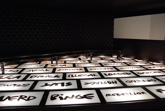
There are certainly a lot of heavy references to contemporary artists and popular culture throughout the club, did you have any key influences for the overall concept of Smack?
Smack had no specific influence. I have not followed any current trend of the day. I just followed my instincts and the results speak for themselves (please take this in the spirit it’s meant)
How important do you think interiors are to a night out? Thinking of the Hacienda, the design and space is still discussed today, almost as much as any of their nights…
I think interiors are key to a night out. Obviously, the crowd, the attitude and the music is important. But I think the design is the starting point, and the rest follows and falls into place.
So, your LED system in the second room is pretty special. What was the inspiration and what’s the reception been like?
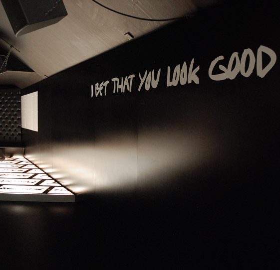
The LED room was an idea I’d had for years. The fact the rest of the club was black and white, made it a perfect time to do it and to make a complete contrast to everywhere else. There is a product on the market, but it was hideously expensive. We spent months online tracking someone down who could make what we wanted for a price we were willing to pay. We eventually achieved this, and had boards from China and LEDs from Japan, shipped to California, where they were assembled and sent to us. We then had to create a system to mount onto walls and ceilings, which was a major task in itself. We found a company in Holland, who had software which could make them dance, and it all came together perfectly. To date, we have had over 600,000 views on Vimeo and YouTube on the back of our first Facebook post. The room has been a major success – the first 150 into the club head straight into this room, with the next 100 queueing to get in there.
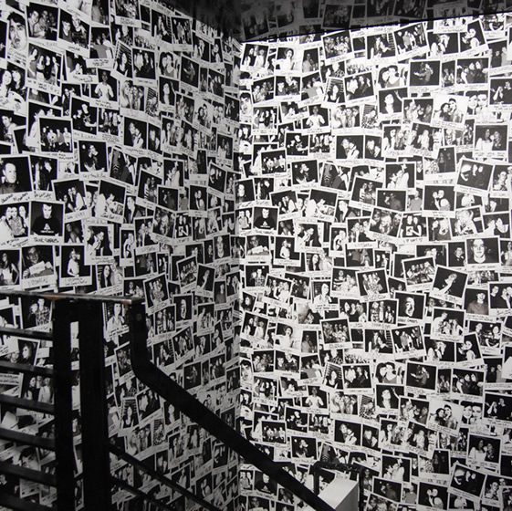
We love the polaroid wallpaper, who are the photographs of?
The polaroids are of club customers. We took the photos, not telling people what they were for, and gave them a comment slip, which we then added to the photo in the artwork process. The comments are not censored, which in the case of the guy who wrote “I’m fucking her tonight”, as he was photographed with a very pretty girl, did not go down too well with her boyfriend when he saw the wallpaper two weeks later…
You certainly seem to attract some big names for the area, how do you pull this off?
As we are owners/operators as well as promoters, we are able to get top end names to the club and keep door charge relatively low. A promoter would not be able to put Pendulum, or Chase & Status on at a 600 capacity venue for £6, but we’re willing and able to do that. We have a varied music programme, keeping it current and relevant to our crowd and it seems to be working, as we hit capacity pretty much every time we open the doors.
You mentioned you had some other projects alongside Smack, tell us a bit about those…
We currently run Moo, which is a leftfield/indie bar, which has a refurb planned starting next week (this one will blow you away). We have The Duke, a 21st Century boozer, which opened last year. I also opened our first pop up bar in 2006, when I demolished a warehouse and opened a 4,000 purely outdoor bar, The Garden, which we traded as long as the sun was up. We also opened in the space of an old health club, Mink, with a pool, graffiti flock wallpaper bar, and I removed a section of the roof to allow indoor smoking. Let’s just say, the council were not too happy with that one either. On top of all that we also run a health club called Pure, which again is very design led.
…and what does the future hold for Smack?
Well, the problem is going to be how we top this one with the next refit..


