Keen-eyed readers will have seen us drooling over London duo Uniform Wares‘ minimalist, future icons previously and they’ve clearly garnered fans from further afield too, as Joseph Becker – San Francisco Museum of Modern Art’s assistant curator of architecture and design – has chosen the young British designers as one of several brands to highlight the legacy of Dieter Rams in contemporary design, for the forthcoming Rams retrospective: Less and More: The Design Ethos of Dieter Rams.
Clearly, for any young designer to be uttered in the same breath as the German great is an honour, but to be showcased at an international exhibition dedicated to the designer, this early in their careers, must be a humbling experience; we caught up with the pair for a quick chat about their inspirations, the exhibition, and of course the don of design himself…
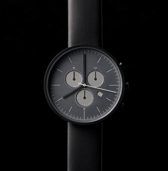
Uniform Wares’ 300 Series Chronograph
Regular readers will be familiar with the elegant simplicity of your watches. For those who are new to Uniform Wares, can you summarise in just one sentence who you are and what you do?
We are Patrick Bek and Oliver Fowles, co-founders of Uniform Wares. We design and manufacture contemporary timepieces that are intentionally pared down and characterised by their distinct form, durable materials, classic and seasonal colours and engineered surface finishes.
What were the pair of you working on before?
Prior to Uniform Wares, we were working on various design projects for furniture and lighting manufacturers. However, we were both keen to produce our own range of small, personal products that were part of an everyday ‘uniform’ and thus Uniform Wares was born. Our first product was a watch and it all went from there…
Pretty impressive being featured in SFMOMA’s new Dieter Rams exhibition, when did you find out, and how did it feel?
We were contacted earlier this summer by a curator at SFMOMA and we were overjoyed. It’s an incredible honour to be associated in any way with the work of Dieter Rams. He’s great source of inspiration for us and so many others in the design industry.
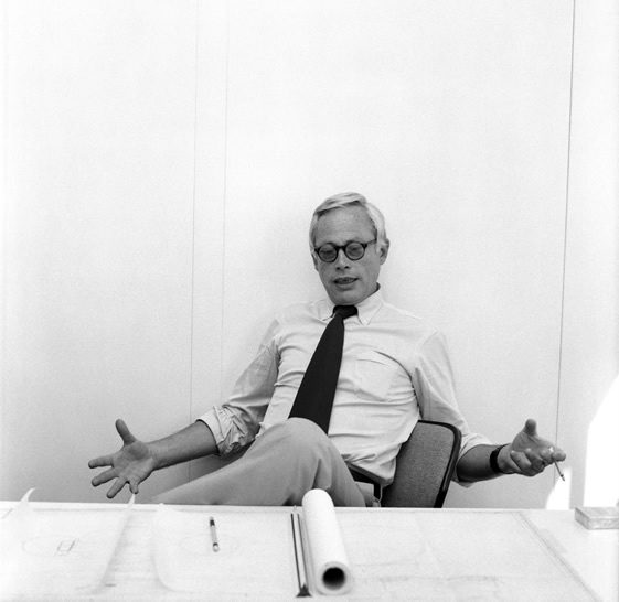
Dieter Rams
I remember being blown away by some of Rams’ early pieces for Braun whilst visiting the Atomium in Brussels when I was much younger, do you remember the first time you saw his works, and how did it influence you as product designers?
I’m sure we would have come across his work in daily life way before we knew it to be the signature of Dieter Rams. His influence in the electronics industry has been well documented and as a child of the eighties my first piece of Rams-inspired electronics would have been the Sony walkman, without Rams’ 1959 Portable Transistor Radio and Phonograph the Sony Walkman may have taken a totally different form. That said, our proper introduction to his work would have been at university. No product design course could be without an introduction to his 10 Principles for Good Design.
You can almost use his “10 Principles for Good Design” as an approval checklist when browsing your collections. How much of an influence has Dieter Rams been on Uniform Wares?
Honestly, we never directly referenced Dieter Rams but after studying his work at college and the reasoning behind his products, these principles have been engrained into our approach to a product. There are many designers that have influenced our way of thinking, whether they are product or fashion designers, but it is important to carve your own path and approach designs with some principles of your own.
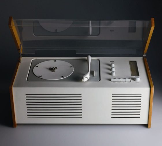
Dieter Rams’ Braun SK4
Have you seen the rest of the exhibition yet? There are an awful lot of iconic pieces in Rams’ portfolio; if you had to choose your favourite of his works, what would you go for and why?
We haven’t seen the exhibition yet, but we saw a similar show at The Design Museum in London last year. For me (Patrick) it’s the Braun SK4, I see it as a tool for sound; it has an obvious simplicity that is softened by wooden panelling and the shadow gap at its base lightens the piece. To think this was designed in 1957 is quite astonishing. (Oliver) I am a fan of the ET66 Calculator (1987). I think the considered layout of the central digits, outlined by the grouped primary and secondary function buttons make it so intuitive to use. The subtle use of colour to denote the groups of buttons is also clever and something we utilised in our black chronograph with 6 different grey pantone references used to form the dial and balance the indexing. The orange Equals button on the ET66 is also an iconic detail.
There’s times when I look at products and am astounded by their unnecessary over-complication. Are there any products out there that leave you wishing their designers had just followed Rams’ ten commandments?
(Patrick) Nearly all television remotes and the user interface for that matter. (Oliver) This seems to have been neglected, they all seem about 10 years behind what most of us would call a rich, intuitive UI experience which as an example is something we all use everyday with our smart phones. I think this needs addressing.
This will surely raise your international design profile. What’s next for Patrick Bek and Oliver Fowles?
We have a new watch, the 250 Series, that will be released in October this year and projects in various stages of development for 2012 and 2013, which we’re very excited about launching.


