The Farmiloe Building was my last port of call during this year’s London Design Festival. I was there to see Designersblock; my third design show of the day, fifth show of the weekend, on the last day of an exhausting, exhilarating nine-day festival. I was tired, and if I’m completely honest, heretical as it sounds, a little designed-out.
Within seconds of setting foot in the grounds of this amazing building, I felt restored, ready to explore again, inspired and uplifted. I can’t tell you how much of that was Designersblock and how much was the Farmiloe building itself; the two were so beautifully intertwined. But I’ve written about Designersblock elsewhere, so now I want to tell you about this amazing space…
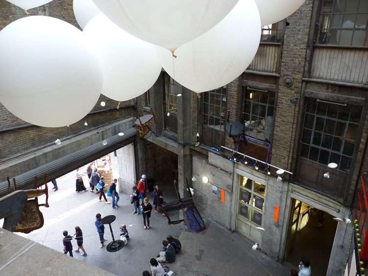
Designersblock at The Farmiloe Building, photography © Katie Treggiden
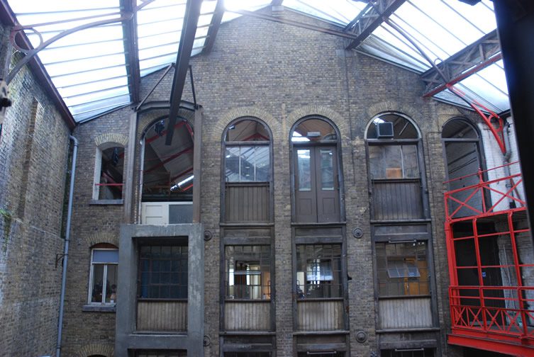
Built in 1868 by Browne & Robinson and located at the Smithfield Market end of John Street, this Clerkenwell landmark was once home to lead and glass merchants, George Farmiloe & Sons.
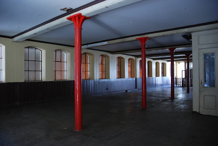
The 40,000 square foot space has a Portland stone and Aberdeen granite Italianate palazzo-style exterior. Inside, a vast full-height atrium connects the strongest Victorian warehouse floors in London. Further exploration leads you through a maze of paneled offices, although I was staggered to discover from Designerblock’s Bud Moore that they’re not real… “they are almost entirely fake – if you look at the walls they are actually cardboard painted chocolate brown, under the radiator covers there is no place where a radiator has ever been, if you look at the skylight you can see it’s below someone’s living room floor; basically it’s a film set.”
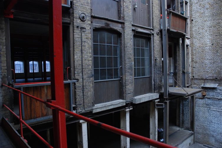
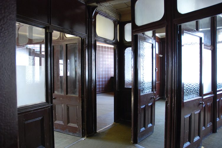
And films aplenty have used the Farmiloe Building as a set, from Batman Begins and The Dark Knight to David Cronenberg’s gangster film Eastern Promises and from Sherlock Holmes (the 2009 remake) to Poirot, Marple and Spooks. But just what is about this building that inspires design show curators, film-makers and tired design writers alike? I think it’s to do with the contrasts and contradictions. The swooping open atrium set against the labyrinth of narrow corridors and tiny rooms. The opportunity to set something brand new and shiny against a backdrop of faded glory. The surprising change of pace that lurks around every corner.
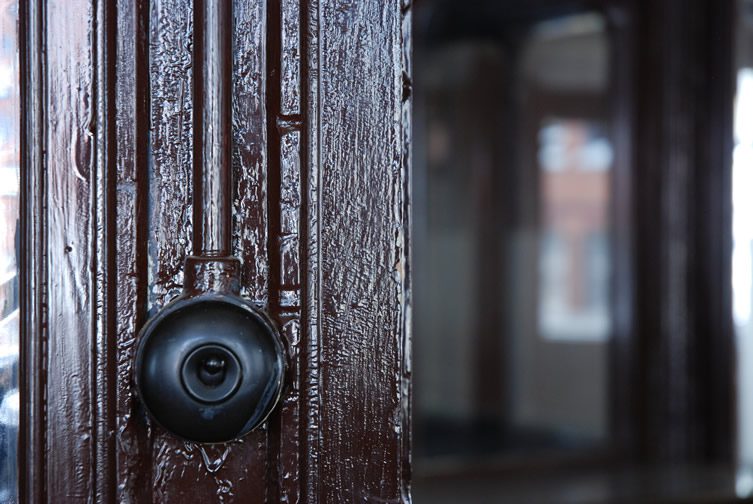
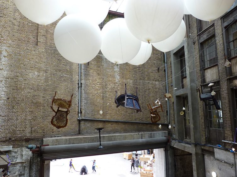
Designersblock at The Farmiloe Building, photography © Katie Treggiden
Bud Moore touched on a similar theme when I asked him why it appealed to Designersblock “Personally I think it’s to do with context. People know the building has had a life before but they’re not really sure what it was. Visiting the building without the knowledge of the previous life it had as a warehouse for brass fittings and tiles gives you a blank space to project onto. You may or may not be intrigued about the previous use of the building but that previous use sits in your unconscious either way.
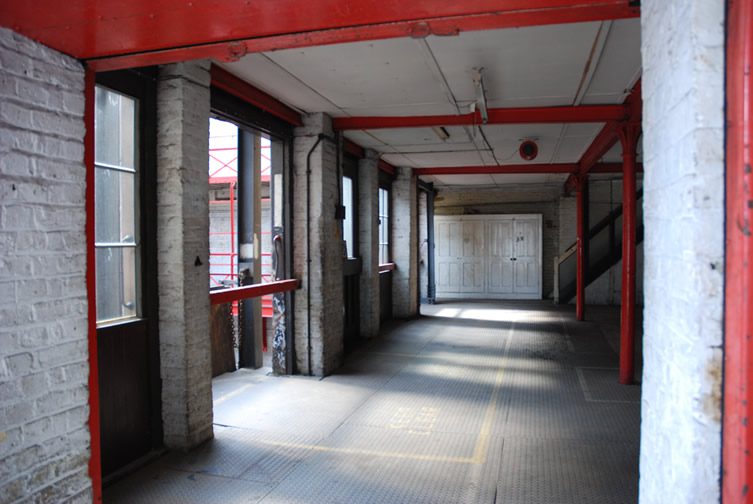
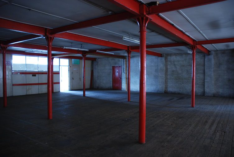
It has outdoor space, the atrium, the tunnel, all sorts of different ceiling heights, different backdrops (painted, fully finished and unfinished etc) so we can accommodate a wide variety of work in a setting that works best to show it off.”
Bud also described the building as “monumental” – and I think he’s right; it’s rare you get to stand in such a large, solid building – something that is so very… ‘there’.
Photography © Bud Moore unless otherwise stated


