The most important thing for me about design is its capacity to make people’s lives better. This can be something really little, like well-designed hangers that your clothes don’t fall off. And that’s important – it’s all the little things that add up to make your day. But when I get really excited about design, is when it’s making a big difference to the lives people who really need that difference.
I was recently very privileged to spend a few hours visiting and photographing the Maggie’s Cancer Caring Centre in London. It is at once homely and uplifting, down-to-earth and incredibly moving.
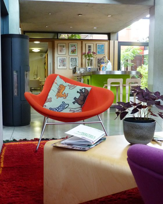
Richard Rogers and his team at Rogers Stirk Harbour and Partners have created an oasis of calm in a pretty chaotic spot between Fulham Palace Road and Charring Cross Hospital. Definitely a worthy winner of the 2009 Stirling Prize.
The first thing you notice is that it doesn’t smell like a hospital – and this has been carefully considered, they intentionally use different cleaning products to make sure that it doesn’t. It’s amazing what a difference that little insight makes to the feeling of the whole place.
The ethos of the centres is all about empowering people, so on your first visit, someone will make you a cup of tea, but after that you help yourself.
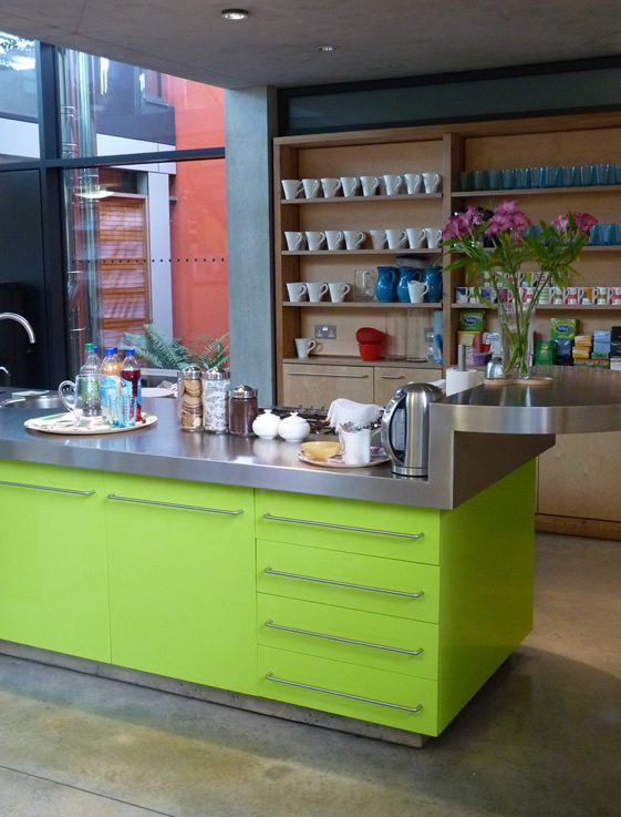
The big kitchen table contributes to the homely atmosphere, as do the wobbly mugs, and it provides space for patients to talk in a safe environment. Equally, newspapers give those who don’t feel like talking something to hide behind.
Maggie Keswick Jenks wrote A View from the Front Line in 1994 while suffering with cancer for the second time. It talked about cancer from the patient’s point of view and showed what patients needed – beyond medical treatment. By May 1995, and now suffering from cancer for the third and final time, she had written a blueprint for a space where patients could come to receive support in whatever form they needed – from a cup of tea to benefits advice, from art therapy to counselling. Sadly, Maggie passed away before the first Cancer Caring Centre was completed in 1996, but she had done the necessary groundwork, and her husband Charles made sure it was finished.
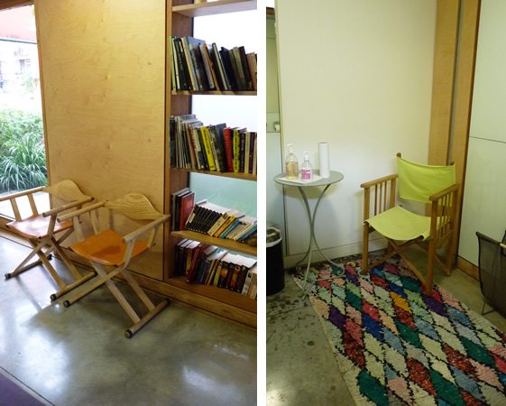
Given Maggie’s experience that information can be very empowering as long as there’s someone you can discuss it with, each centre features a library of literature like this one. Often, ‘popping in for a leaflet’ can serve as a door opener for those nervous about coming in. Benefits advice is the number one reason given by people on their first visit, and is a crucial service to help with the loss of income that often accompanies long-term illness. Other practical support such as nutritional advice to deal with suppressed appetites and damaged taste buds is also on hand.
But it’s the softer benefits that keep people coming back, the aromatic gardens, the fact that some form of outside space is visible from every room and the quiet spaces to read or reflect. And more than the design, it’s what happens inside. The staff tread a gentle line between supporting and empowering, and the range of services on offer from support groups to relaxation techniques and tai chi to Nordic walking are all designed to help people find the hope and determination they need to take control of their situation.
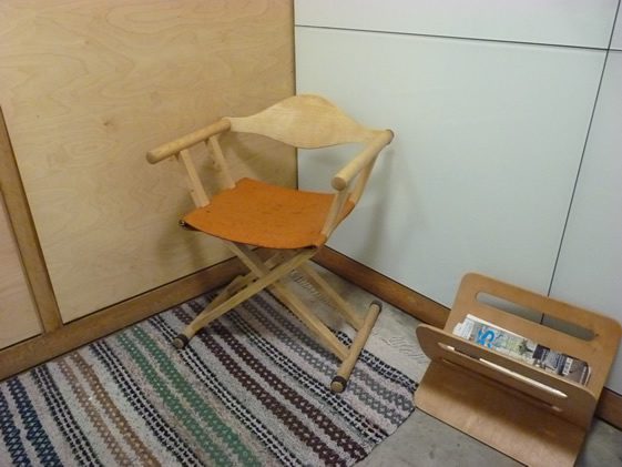
But little touches, like a chair, magazine rack and mirror in every toilet, giving people time and space to compose themselves after a private cry, show the level of insight and empathy that’s gone into the design and architecture of these centres.
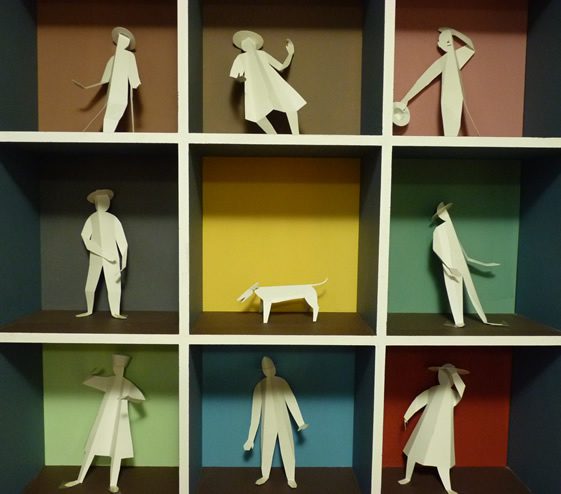
The architect’s brief is surprisingly open, and as a result each centre delivers that perfect combination of comfort and inspiration differently. In the London centre, the warm orange colour is as welcoming as the ‘open arms’ of the building that surround the entrance and draw you in. The double height open space at the centre provides a sense of optimism and empowerment, while little cosy nooks cocoon you away from the world when that’s what you need. While natural materials like wood, and even the polished concrete, are nurturing, the acid colours are energising.
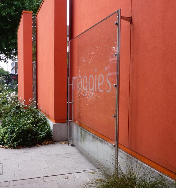
I found my visit inspiring and humbling, and most of all it was an important reminder of what design is for. It’s for making people’s lives better, and I can’t think of a better example of that than Maggie’s.
Photography © Katie Treggiden


