Right. Sit up. Everything down. Eyes on me. If you haven’t heard of the mighty Insect, then you will most certainly possess some of his work – if, that is, you buy music. Master illustrator, oddball image maker, surrealist and auteur, Luke Insect is the man behind the darkness, the light and the shade that graces many of your record sleeves, the magazines you had to read, the ads you grew up loving. He is. Just nod.
Known in the nineties as simply INSECT (underground-overground early Old Truman Brewery interloper, ‘just the Vibe Bar and us, when you couldn’t get a coffee on Brick Lane’), Luke – together with erstwhile partner Paul – took pop art illustration by the neck, introduced it to the night and worked with everybody from über-independent Blue Dog Records to the Blue Note to a whole clutch of global brands, before the forces of horror and 1960s psychedelia caused him to strike out alone. The result? Stanley Kubrick on acid.
Until the mid 1990s, you concentrated almost exclusively on sleeve art. Was that as a result of working for Leisure Process?
Yeah I was pretty lucky with my first job. I graduated from Newcastle Poly and started as chief tea-maker at The Leisure Process a couple of months later. I didn’t really know much about the company except that they’d worked on some big record sleeve campaigns.
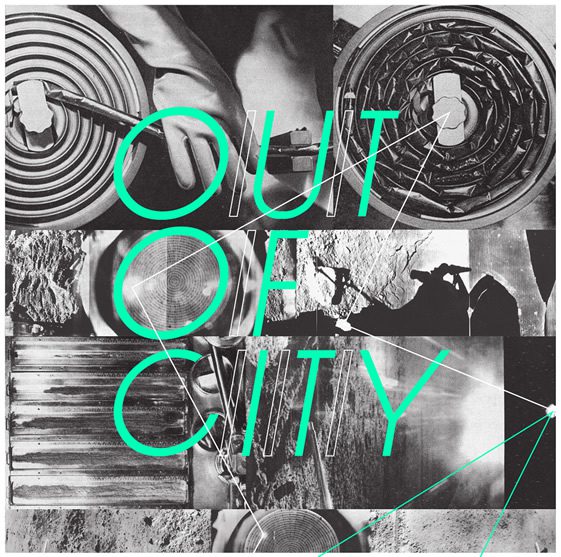
Within my first month or two there I was art working sleeves for Motorhead and Ozzy Osbourne and got the chance to illustrate a gatefold album sleeve for Funkadelic. They worked with a couple of re-issue labels like Charly Records and the turnaround for the sleeves was fast and frequent so we were often working on 4 or 5 sleeves a week – it was pretty good training!
Tell us a little bit about how you set up Insect and who you worked with at the time.
Paul (Insect) and myself were pretty much running the studio at The Leisure Process – designing, liaising with clients, managing print – and after 4 years we realised that we could be doing this for ourselves. We were out watching new bands most nights, and a couple of my mates had been signed to big labels like Virgin and Sony so I knew I’d be working on sleeves for them. And a couple of the clients we’d been working with at TLP wanted to carry on working with us… So we took the plunge, left Soho and headed out east – to where we were both living at the time.
Along with the existing clients, we hooked up with The Old Truman Brewery – where our first studio was in 1998 – and started designing their flyers, which lead to working with The Blue Note club round the corner. And through working with mates’ bands we were introduced to the art departments at a lot of the record labels who called us in about other upcoming projects…
You were known at the time for an intense and dark pop art orientated style. Was this something that evolved naturally, out of the milieu of 1990s east end London, or was it already clearly defined when you and Paul got together?
It evolved pretty naturally. I was always obsessed with horror films, so was always inspired by the darker side of things – and when we had our studio at various locations on Brick Lane, I got really into the history of the whole area, the Jack The Ripper thing, the swirling fogs around the cobbled streets, the opium dens and Freemasons.
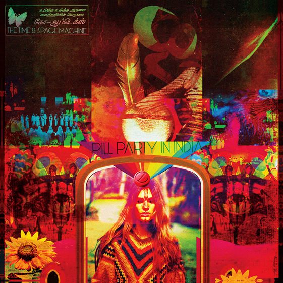
I was fascinated by all that – so much so that I set up a record label called House Of Wax and we put out a double album in 2002 inspired by all things darkly Victorian, with similar-minded artists like I Monster and Morlock. So yeah, I was fusing that maximalist Victorian Gothic style with 60’s Pop Art and psychedelia, which I’d gathered from my dad’s old OZ magazines and copies of International Times.
As well as music, you’ve worked on a number of big company ad campaigns. How does working with the likes of Honda or Adidas fit with your niche reputation in the world of sleeve design?
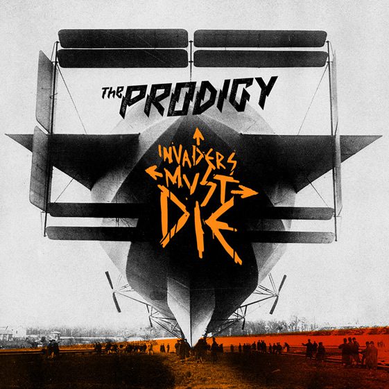
I don’t look at them that differently and I enjoy them equally – whether it’s a 7″ record sleeve for an unknown band or an ad campaign for a major brand, I’m getting commissioned for a ‘Luke Insect’ illustration or graphic – there are obviously more restrictions and things to take into consideration when you’re working with the latter, but most art buyers are going to know the sort of thing they’re going to get when they work with me.
And I actually like working within boundaries sometimes – it can often be more difficult being given a completely open brief than one with art direction already in place. Besides, there are so many great, forward-thinking agencies out there now that are ready to take risks…
You and Paul went your different ways in 2007. What direction did you take once you decided to go it alone?
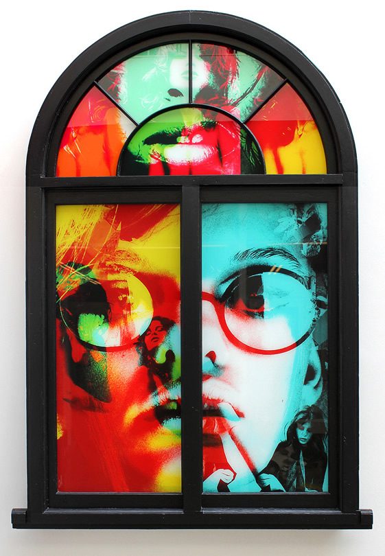
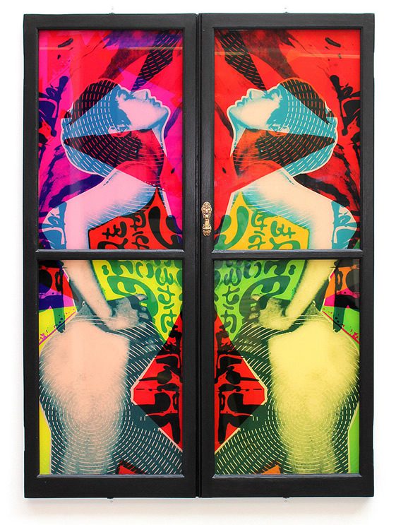
There wasn’t really a considered difference in direction, but working on my own rather than running a company meant I could explore different themes and ideas that were more personal to me. During the last few years at Insect my own work was definitely heading in a more ‘psychedelic’ direction, with collage and photomontage taking over from the darker, vector-based illustrations that Insect had become known for, and I was certainly heading away from anything that could be described as ‘street art’ – which Insect was often associated with.
My own passion for obscure film and music was definitely becoming a bigger influence.
What inspires you?
All things counter-cultural: obscure and experimental film and music, retro-futurism, retro-hedonism, vintage print, euro-horror, eastern-euro poster art, B-Movies & B-Music, rebellion, escapism, vintage electronics, DIY creativity, freaks and outsiders, cults and communes, folklore and witchcraft, any artists who are forward-thinking yet backward-referencing!
What are you working on now?
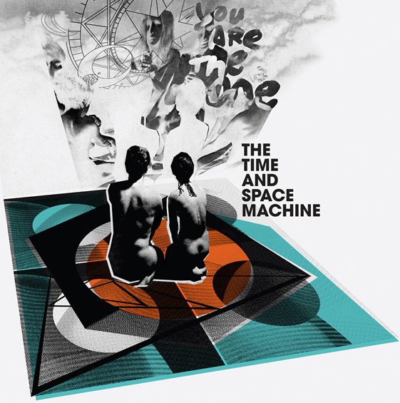
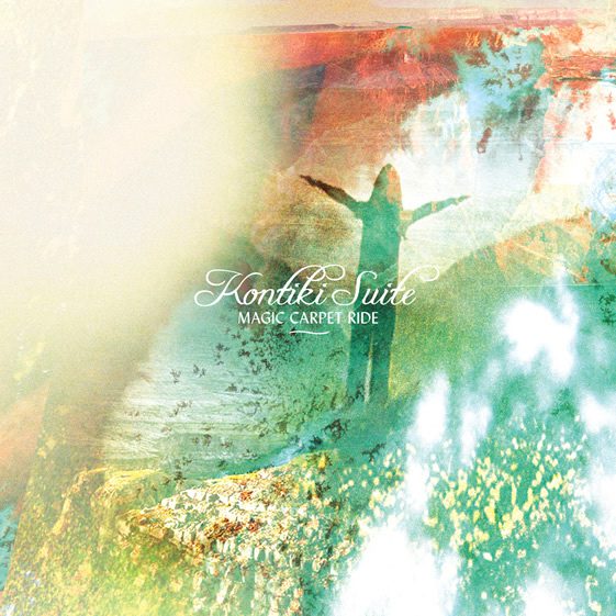
So far 2012 has been all about the music. I’m currently working on sleeves/campaigns for De La Soul, Toy, Psychemagik, The Time & Space Machine, Reverend & The Makers, Stealing Sheep, Kontiki Suite, TYTHE and a few others yet to be announced… Plus another great project that I’ve been working on for the last 10 years is The Old Truman Brewery’s FREE RANGE – essentially where all the Art & Design colleges across the country exhibit their degree shows in one place over 10 weeks.
I’m also working on a side project with illustrator and fellow horror fan Kenn Goodall called Twins Of Evil – a series of limited screen prints inspired by our fave horror films.
