Less is more; the notion that simplicity and clarity lead to good design – it’s a concept that us with a keen interest in design will probably never hear the end of, no matter how sick we get of hearing it. It’s true, that’s for sure – but more can be more too; don’t let the minimalism disciples tell you otherwise. But then, sometimes you see something so… damn… simple – that you kinda give yourself a big kick in the head and go scurrying back to Dieter Rams’ ten principles for good design; especially the bit where he says “back to purity, back to simplicity”.
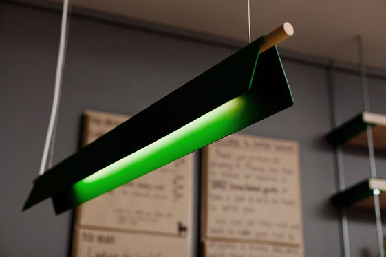
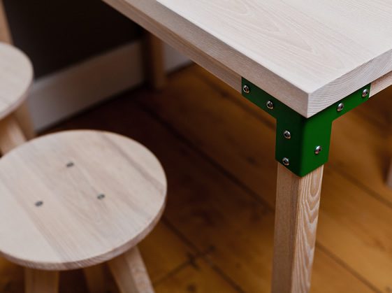
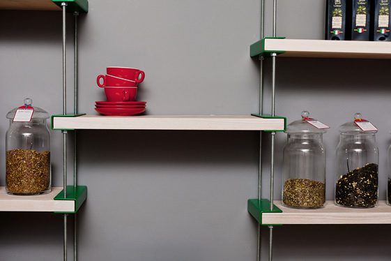
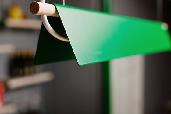
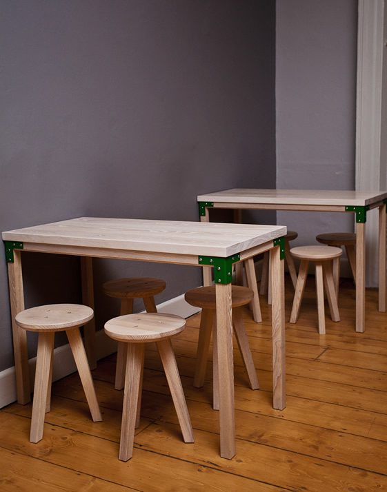
Brother Hubbard is just that thing – a bravely minimal Dublin coffee shop, designed by local boys Designgoat. Using just simple green brackets, and matching lighting, to accentuate the whitened ash wood shelves, tables and stools – the interior is a masterclass in having courage in your convictions. Surely not many would be so brave as to have this vision of sheer simplicity, and to stick to it so stringently. It pays off – the fine line between stylish minimalism and unbothered necessity wavers on their side. Let that be a lesson for those of us who question the fundamental maxims of design.
