Hugely original, strangely beautiful – and massive fun (especially for those who love to test their music knowledge), David Marsh‘s Pantone Album Covers have been causing somewhat of a stir since they first started appearing on the internet. The graphic designer, who has specialised in the music industry since moving to ‘Madchester’ in the late ’80s, lives with his young family in Manchester. We caught up with him to find out more about how his Pantone artwork obsession began, the inside line on Manchester’s heady days, and what’s next for the artist…
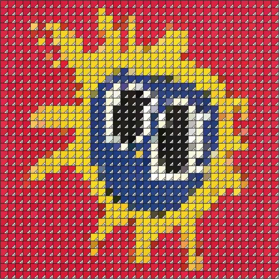
You’ve mentioned being hooked on Lichtenstein’s work from an early age – has the breaking down of images into simple colour elements always been at the heart of your work?
In a way it has, I remember copying the illustration styles and typography of comic books when I was a boy. I used to draw the characters and hatch the backgrounds and try and colour the characters with screen style dots as they did in the Beano and Whizzer and Chips.
I love op art and pop art, and surrealism. I think they all influenced me in a way, especially when I started my first design company in Manchester back in the early ’90s. Our first projects were flyers for Manchester clubs and raves, and some of our research material was Escher, Riley, Lichtenstein and Dali art books, Batman comics and Baseline magazine. We were using computers to create images and type and, being completely self-taught, experimentation was common. I think that period has massively influenced how I have worked since.
When did you start creating Pantone swatch versions of classic album covers – was it a eureka moment?
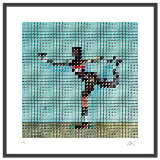
It was around 2005, I created ‘Pantona Lisa’ – a reworking of the famous painting in the Adobe Illustrator Pantone swatches. That was the beginning of this series. I created several more fine art images in the same style and built a series, the plan was to sell the prints or hire them to the numerous inner city residential developments that were taking over the mills.
Then, as you explain it, I had a eureka moment, I was developing ideas for a customer – Scroobius Pip – he commissioned me to create his debut solo album cover and the Pantone idea just fit; as when working on music imagery now you have to bear in mind they have to work at very small sizes for iTunes and iPod screens etc. Eventually the cover image was produced using circles rather that squares, but the idea had hatched.
I assume your works to be the result of a fairly laborious process – how long do they tend to take, and what’s involved?
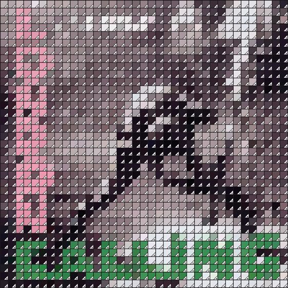
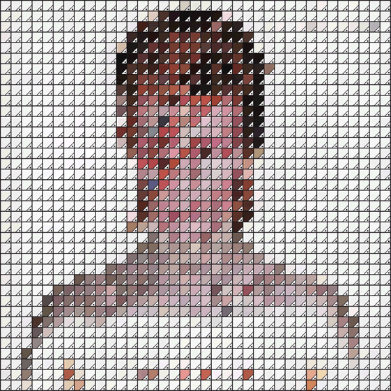
It took a few attempts and trials to refine the production process and the best number of squares to use to create the images (1,369 on a 12″ square format worked best). The production process is time consuming; I need to be in the correct frame of mind to produce an image.
It’s a case of using the 1,369 squares format, colour picking and dropping colour into the squares in Adobe Illustrator using a prepared resource Photoshop file. They tend to take about four to five hours from beginning to creating an artwork file ready to print, along with all the support JPGs and PDFs for websites and press.
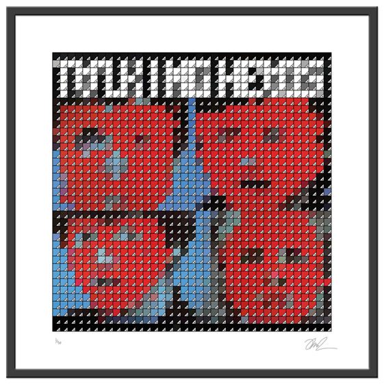
The covers you’ve reworked all carry pretty special albums within them – have you, or would you, rework a shoddy album just because it has a great cover; and what would that be?
Yes, I have produced a couple of pieces to order, and have made it quite clear that if the cover works getting the swatch treatment, then I will create an artwork if asked. The images I have in the series though are all records that I own, that was the initial criteria, my own record collection.
Some covers are far superior to the content and can be even described as iconic, but music and art are subjective – so I won’t comment on records I think are rubbish.
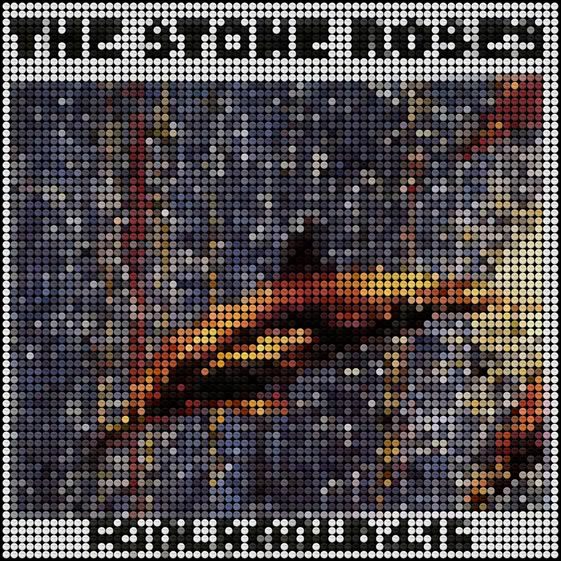
You moved to Manchester in ’89 – just as the Madchester scene was hitting its peak. They must have been pretty heady days – your ‘white doves’ version of the Fools Gold 12″ cover being a knowing nod to the party scene – how was it being a part of all that?
Yes it was a very exciting time, we were all around 20 years old, and all the promoters, DJs, designers, clubbers, record shop owners and recording artists were all around the same age – and all could be found in the clubs that were at the driving edge of the movement, a lot of good friends were made in the music and related businesses.
Also rival city’s football supporters ‘mellowed’ at that time and lads could go out in Liverpool, Manchester, Warrington, Blackburn and Leeds without the fear of trouble that had been before – and may be present now. Ideas between people who probably wouldn’t have mixed were shared, and the whole country’s young people seemed to be united in harmony – why would a government legislate to destroy that?
It should be a laugh seeing 45 year-old blokes trying to relive their youth in Heaton Park this summer!
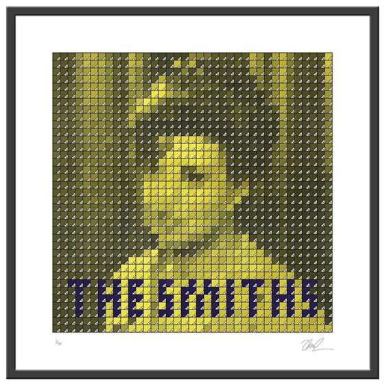
You can create album artwork for any currently active music act – who is it?
Django Django. A bunch of art school lads who produce a lot of their own visual material and ideas for promos, I think that would be exciting. Plus I love their current album. 808 State also, I love their attitude to design and music. And Björk, in fact Björk foremost – as she is creatively brilliant, and open to ideas… and a good laugh by all accounts.
Abstract up close, clear from afar – surely these works are crying out to be painted on buildings at some almighty scale – any plans to take these, or other similar works to this sort of scale?
I want to produce them in different media, maybe as larger paintings or collage as individual one-off pieces. To create a Screamadelica on the side or roof of a building would be a dream come true! I have a few ideas on locations!
Talking of future plans – what are you working on at the moment?
I have been asked to produce a series of illustrations based on David Bowie covers as one-offs for a customer in Liverpool; which is great, as I am using a Wacom tablet to create the images – another learning curve. I’m sending 35 Pantone prints to France for three shows that are running over the summer too, so getting the prints ready – and all the support material – is taking all my time when I’m not working my 9-5. I’m also looking at new ideas to begin a new project over the summer, I’ll let you know when that happens.
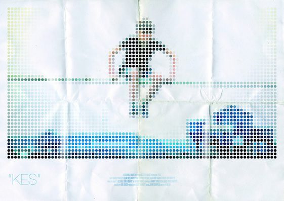
I love KES, your poster for it is brilliant – was this a commission or a personal homage?
Another personal homage. My Mother’s from a large family, and was born and brought up in the coal mining community of Barnsley – KES reminds me of my childhood up there, visiting relatives and getting up to all sorts. The film is very accurate to life in that area around the late ’70s, early ’80s, and is one of my favourite films. One day I plan on getting all these ideas printed and maybe showing them as a complete work.
And finally, you’re a Liverpool fan – how is that, living in Manchester?
I moved to Manchester around the time of our last league title, so living in Manchester whilst they were winning league after league hasn’t been a barrel of laughs. I’ve been ripped for years and still get loads, but the lads I know from ’89-’94 who support ‘them’ and City, and the United fans I have met since, are mainly all good blokes – very similar to the lads I go the match with now in a way. We’re still the most successful English club side and don’t let them tell you otherwise!


