Shop windows, when done right (usually with equal components of self-assurance, flair, humour and wonder), are a thing to behold. They can offer that youthful Charlie and the Chocolate Factory amazement, that “I want it, and I want it NOW” lust, but most of all – they’re an opportunity for the most creative of brands to showcase their artistry and innovativeness, a way to invite you into the brilliant mind of their creative team. On the unfortunate flip-side, the majority are dull. Really dull. And you’d expect the likes of perennially-dull starched suit pedlars Moss Bros to fall into the latter. Wrong. Well – for a few more days at least.
Now in its third year, The Royal Institute of British Architects‘ Regent Street Windows Project has, over the last few weeks, seen some of the country’s most visible show windows transformed by a series of architects. Creating installations that are cohesive with both the brand’s creative guidelines and the architect’s house style, the likes of 00:/‘s tube carriage – that extends the window display to a functional interior unit – and Delvendahl Martin Architects’ elegant floating voids, for the aforementioned Moss Bross, offer typically unadventurous retailers a gentle slap around the chops.
Regent Street Windows Project 2012 runs ’til 6th May – here’s hoping the creativity’s contagious…
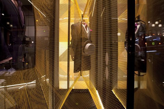
Moss Bros
Delvendahl Martin Architects
Photo © Agnese Sanvito
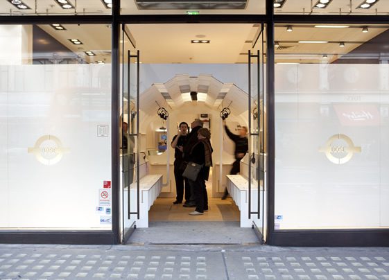
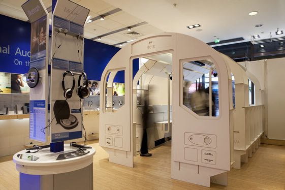
Bose
00:/
Photo © Agnese Sanvito
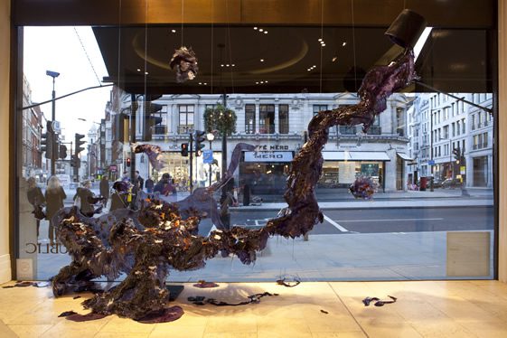
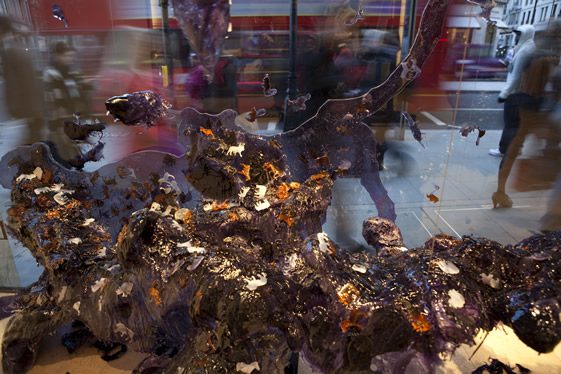
Banana Republic
Ushida Findlay Architects and Visitor Studio
Photo © Agnese Sanvito
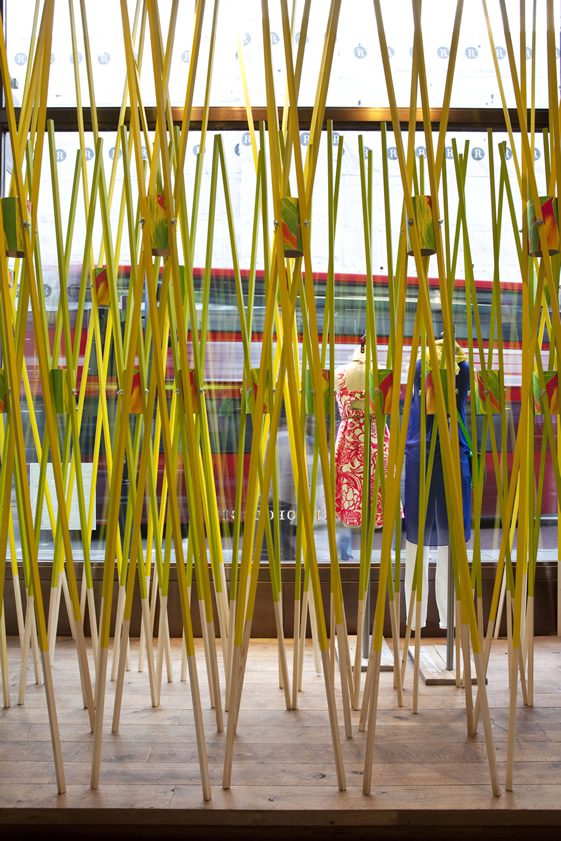
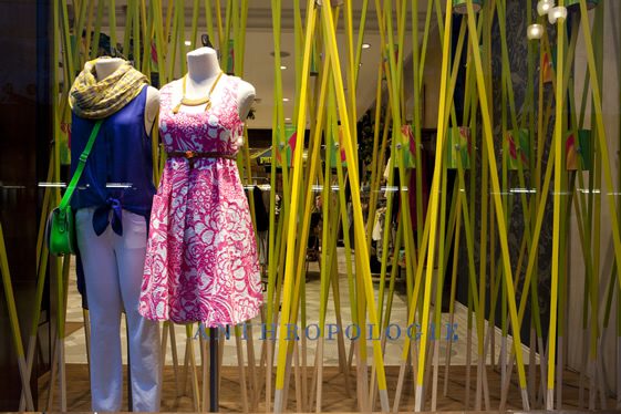
Anthropologie
Gort Scott
Photo © Agnese Sanvito
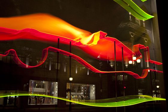
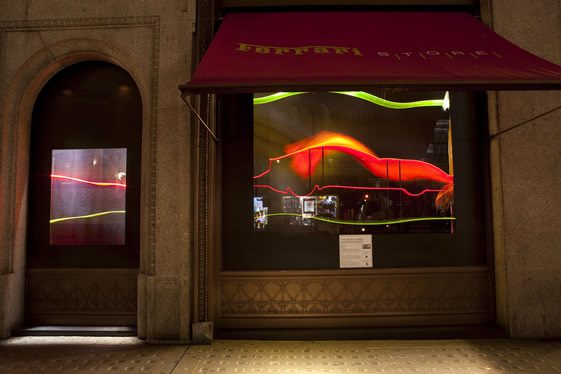
Ferrari
Feix & Merlin
Photo © Agnese Sanvito
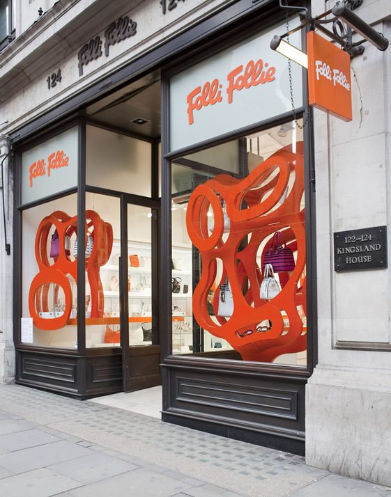
Folli Follie
Egret West
Photo © Agnese Sanvito
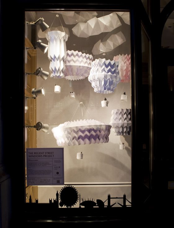
T.M. Lewin
Liddicoat & Goldhill
Photo © Agnese Sanvito


