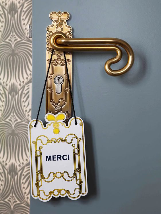
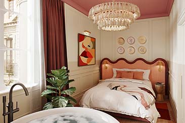
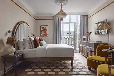
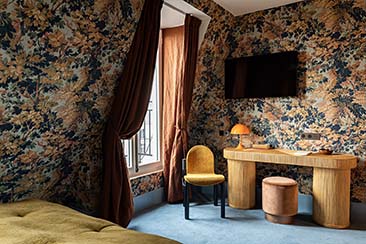
In the same vein as The NoMad Hotel in Manhattan we featured last month, the Hôtel Thoumieux couldn’t be further from the ‘less is more’ design dogma. With its closely designed retro-kitsch rooms that could be perceived as homage to William Morris, they are plastered with the loudest flower print wallpaper from which even 1960s flower-power Britain might have shied away.
Designer India Madhavi has let completely loose on Thoumieux terrain, where she worked alongside design duo, M/M (Michael Amzalag and Mathias Augustyniak). Mixing and matching the unlikeliest combinations of fabrics, prints and colours, Madhavi’s daring streak is what makes the Thoumieux a place that won’t be forgotten in a hurry.
Starting out in the early 1900s as a typical French brasserie, the Bouillon Chartier, it was snapped up by the Thoumieux family in 1923 and became a mark of exclusive taste in the French capital. It has since remained a family business that has been passed down from generation to generation, which has kept the establishment on the list of top-ranking Parisian restaurants.
It was in 2009, when the establishment was taken up by the high-profile duo, celebrated Michelin-starred chef, Jean-François Piège and trend setting designer Thierry Costes, which resulted in the opening of the Restaurant Jean-François Piège and in 2011, the Hôtel Thoumieux.
Photograph © Stéphane de Bourgies
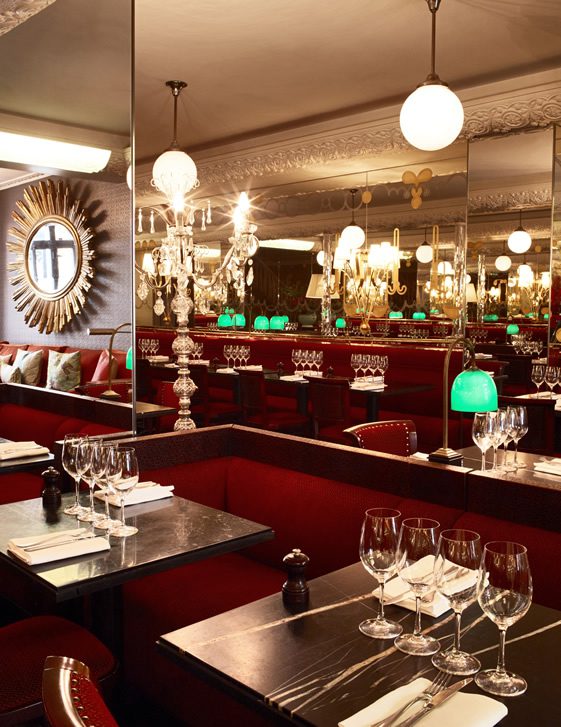
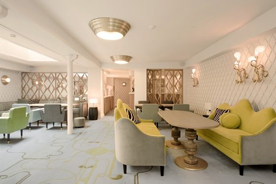
Contrary to what one might expect of such a high-profile venue, mainly due to Jean-François Piège’s Master Chef success, as well as his days alongside Alain Ducasse at the famed luxury Plaza Athénée Hotel and later at the Crillon Hotel, the Thoumieux is extremely low-key and understated.
The unassuming building boasts a vertical red neon sign announcing the presence of the hotel, reminiscent of its ’30s Art Deco hey-day. The tiny lobby leads to the small dining room that exudes Madhavi’s flair for the latest in contemporary comfort and style. The clean lines and bonbon colours used in the dining room are contrasted by the occasional lopsided lampshade and tiger or leopard print throw casually draped across an armchair.
Photographs © Stéphane de Bourgies
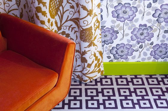
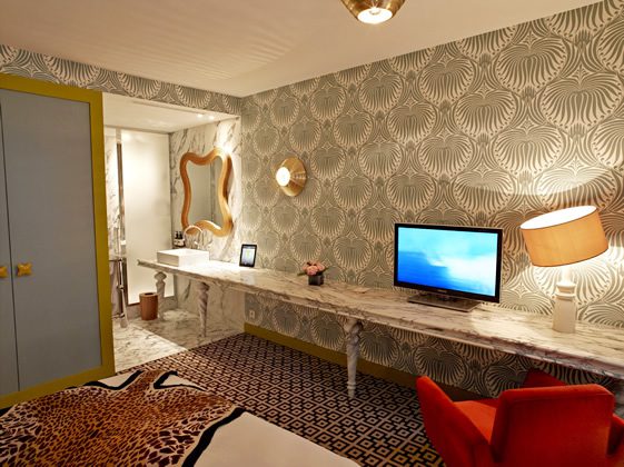
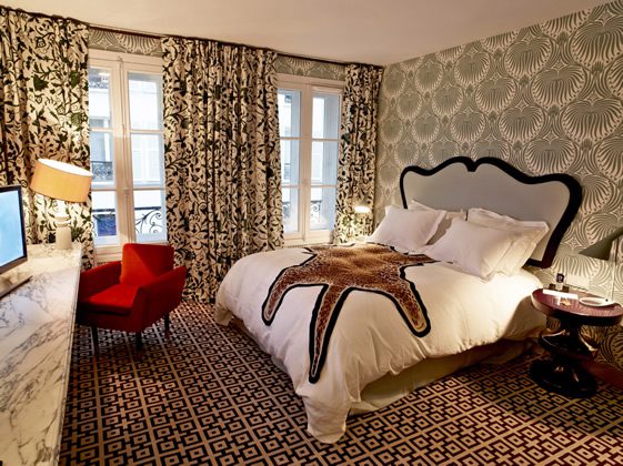
Upstairs the same calibre of fabrics and materials has been used to create a much more audacious style that bears some resonance to that of the soft subtle design of the dining room. Splashed with repeat patterns of violet flowers the walls contrast glaringly with the heavy drapes that boast a different floral pattern, in turn contrasting with the heavy geometric print in the carpet; all topped off with a faux animal print throw.
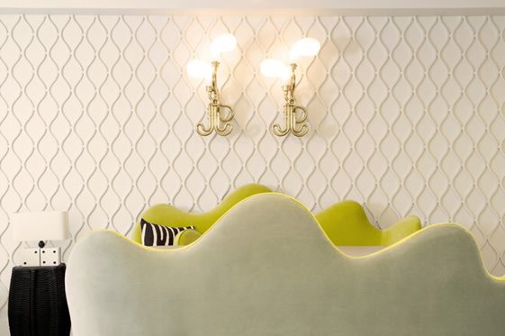
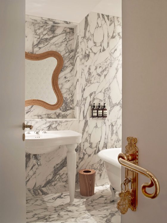
And surprisingly, the combination works. Subtle touches like the wooden ‘M’ shaped mirrors, handles and coat hooks by M/M, tie the entire affair together nicely by bringing the retro side out in the décor, while keeping the kitsch tamed.
