For such a wee place, just eight million inhabitants in a landlocked country that’s dwarfed by many other European nations, Switzerland has a hard-hitting global reputation for its graphic design. Like the Scandinavian’s reputation for product design, Swiss graphic design has become a byword for all that is graphically superior; epitomised by the International Typographic Style (aka Swiss Style) that was developed in the 1950s.
But, what is Swiss graphic design? Minimalism, playfulness, handcrafted… there are common practices that unite the Swiss’ graphical output, but other than the typography of Swiss Style, it’s hard to pinpoint a particular national aesthetic.
Running since earlier this year, at Zürich‘s Museum für Gestaltung, 100 Years of Swiss Graphic Design is an intriguing visual analysis of an aesthetic that everyone thinks they know, but upon further inspection may not even exist.
Ending on 3 June, it’s your last chance to catch the exhibition. But with a book to be published next year, the museum’s definitive history of Swiss graphic design looks set to live on, as a reminder that a common approach is as important to a scene or style as a common aesthetic.
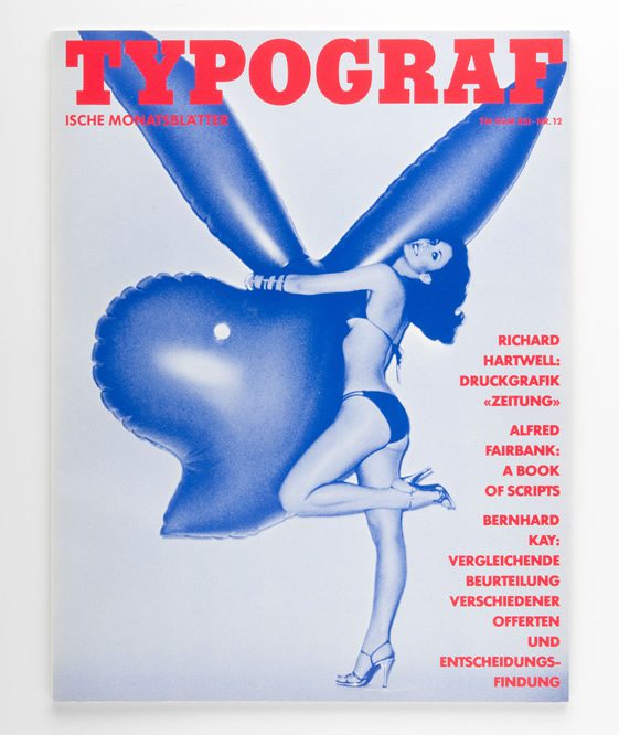
Hans-Rudolf Lutz, Typografische Monatsblätter 12/1977,
Cover, 1977, Museum für Gestaltung Zürich,
Graphics Collection, © by the authors
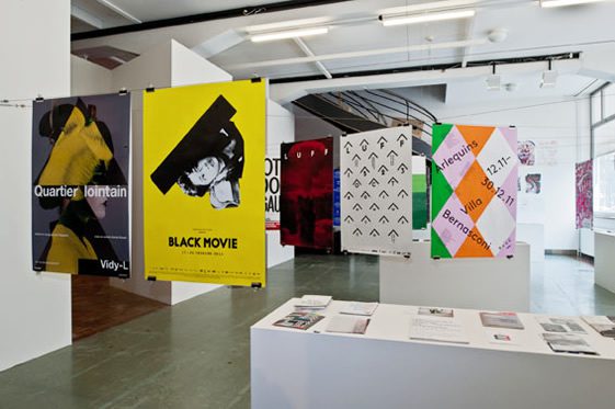
Exhibition “100 Years of Swiss Graphic Design”, Museum für Gestaltung Zürich,
10 February to 3 June 2012,
photo: Betty Fleck, © ZHdK
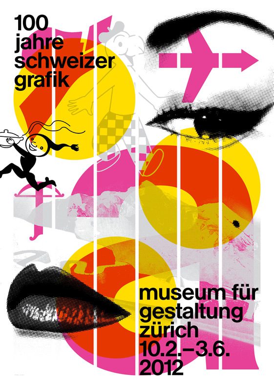
Norm, Poster “100 Years of Swiss Graphic Design”
of the Exhibition at the Museum für Gestaltung Zürich, 2012, © ZHdK
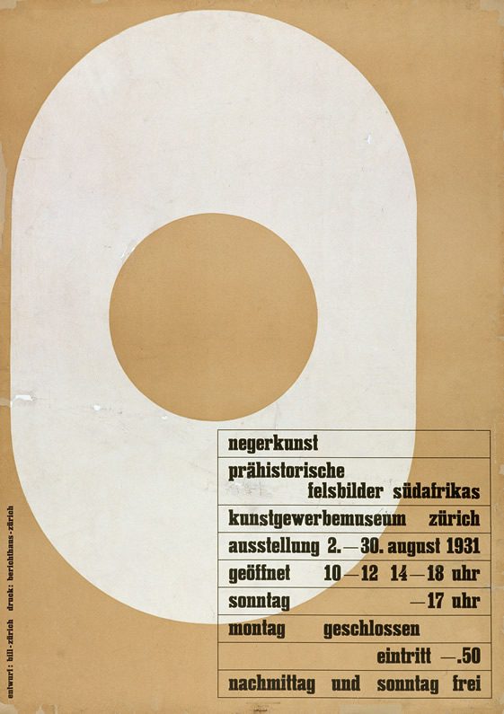
Max Bill, Negerkunst – Prähistorische Felsbilder Südafrikas – Kunstgewerbemuseum
Zürich, Poster, 1931, Museum für Gestaltung Zürich,
Poster Collection, © by the authors
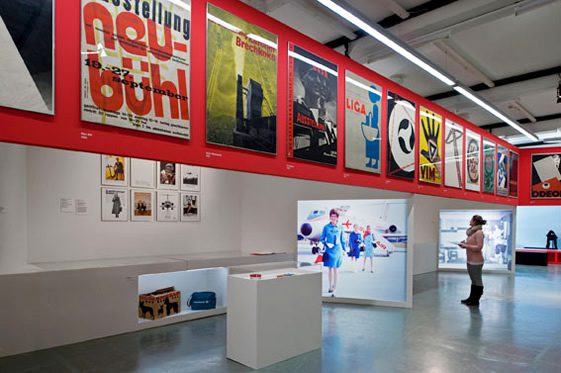
Exhibition at Museum für Gestaltung Zürich,
10 February to 3 June 2012,
photo: Betty Fleck, © ZHdK
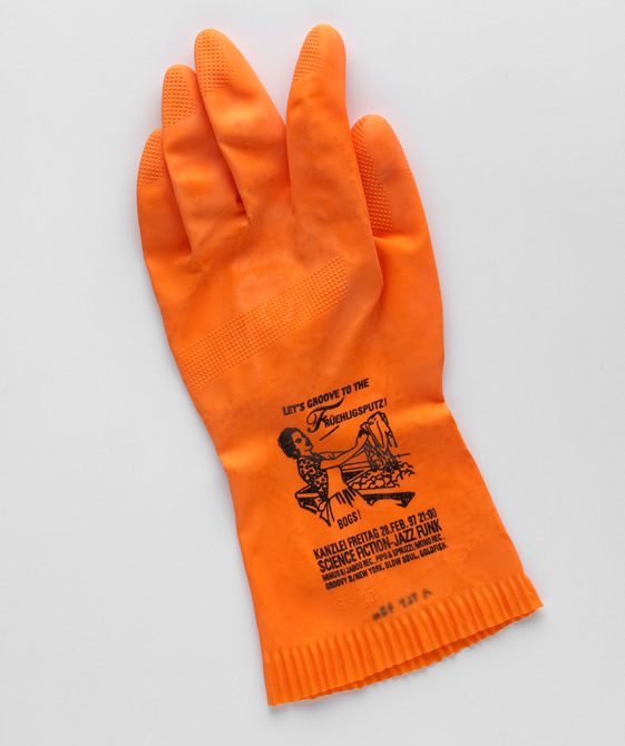
Anonym, Let’s groove to the Früehligsputz!,
Party-Flyer, 1997, © Museum für Gestaltung
Zürich, Graphics Collection, © ZHdK
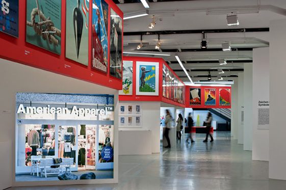
Exhibition at Museum für Gestaltung Zürich,
10 February to 3 June 2012,
photo: Betty Fleck, © ZHdK
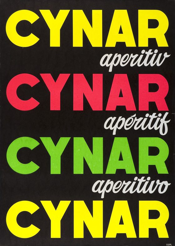
Lora Lamm, Cynar Aperitivo – Cynar Apéritif – Cynar Aperitif, 1962,
Museum für Gestaltung Zürich, Poster Collection,
© by the authors
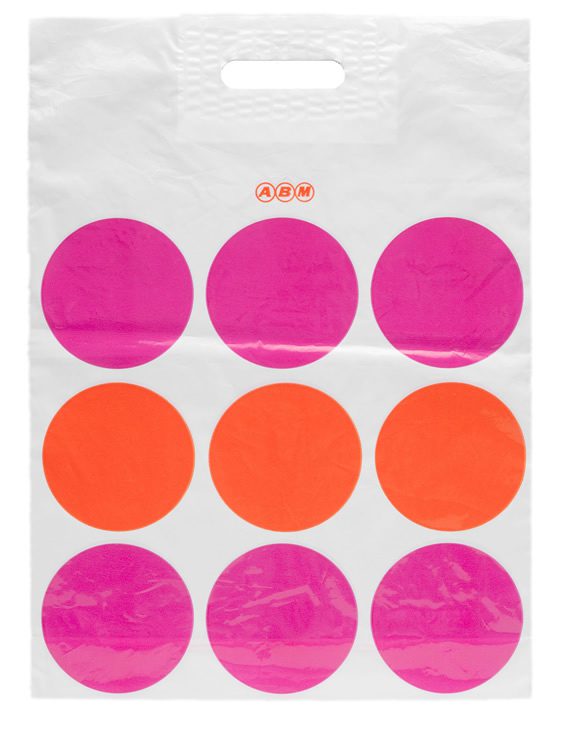
E+U Hiestand, ABM Plastic Bac, 1960s Jahre,
Museum für Gestaltung Zürich, Design Collection,
photo: Umberto Romito, © ZHdK


