Having followed their work, since featuring their pop-up collaboration with fashion designer Richard Chai early on in We Heart’s existence, New York duo Snarkitecture have continued to wow us with their playful fusion of architecture, design and art. Their first solo exhibition, Funiture, recently opened at Chicago’s Volume Gallery, and showcases their first foray into more traditional product design.
Of course, it’s really anything but traditional – their pieces toy with contexts, and leave their viewers a little disoriented; as familiar objects appear broken and unbalanced. It’s a typically mischievous entry into the world of product design, and they carry it off with confident swagger and a wry smile; we spoke to the duo to find out more…
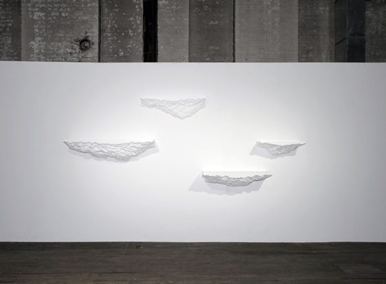
Shelve
2012
Lacquered wood, fiberglass
Available in lengths of 24″, 36″, 48″ and depths of 6″, 9″, 12″ and 15″
Photo courtesy of Volume Gallery
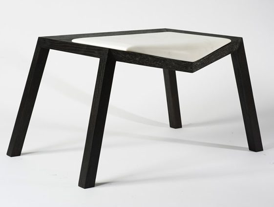
Pour
2012
Stained oak, marble
18” x 33 3/8” x 21” (H x W x D)
Edition of 8
Snarkitecture is Alex Mustonen and Daniel Arsham – who are you, and what do you each bring to the table?
Alex: Daniel and I went to school together at Cooper Union, where I studied architecture and Daniel studied art. I think we both retain each of those sensabilities, Daniel maybe more so because he maintains an art practice and is maybe more entreated in that world. I think that our talent and skill sets derive from those backgrounds.
Daniel: To start with, the practice is a collaboration, which inherintly gives us a different sense about what we do. We function in both worlds, and neither at the same time.
We featured your retail space for Richard Chai back at the end of 2010, can you briefly summarise what you’ve been up to since then – and what’s been the biggest highlight…
D: We did a sort of related project to the Richard Chai space, at Storefront for Art and Architecture, in Spring 2011. Where the space for Richard used a very specific tool to erode that foam and created a specific formal language in the marks of the surface, this project began as a solid form… so we filled the gallery with foam and I spent about six weeks excavating a space out of it, with the back of a hammer. The language in the mark makings on the surface was defined by the tool in a way.
A: Another big project that we’ve been working on from the same time as the Richard Chai project was a public art work in Miami, Florida. This project just opened a couple of weeks ago, and is called A Memorial Bowing… located at the Marlins Ballpark, a new stadium built on the side of the former Orange Bowl. This artwork is commemorative in nature in that it takes the former sign form the Miami Orange Bowl (which literally says Miami Orange Bowl), takes those 15 letters and recreates them in full scale – scattered across a plaza in a nonsensical order. That’s something that just opened and I think was a highlight.
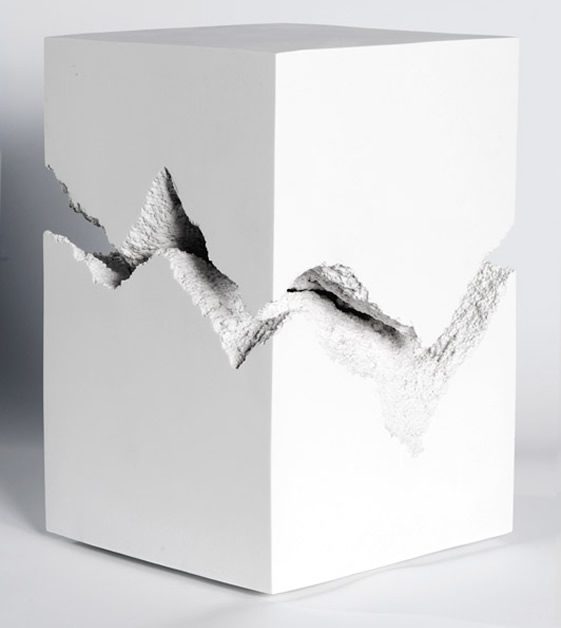
Split
2012
Cast marble
18” x 12” x 12” (H x W x D)
Edition of 16
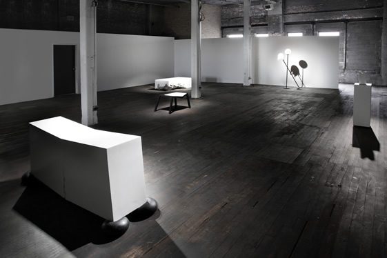
Photo courtesy of Volume Gallery
So Furniture is your first solo exhibition, can you tell us a little about the theme of the collection, and the pieces that comprise it?
A: There’s no theme. Obviously there’s certain relationships between different works in the show but it didn’t start as a single body that we were developing. It started really from a self imposed residency that we originally started a couple of years ago, and this recent body of work came out of a studio-wide exercise from late summer 2010.
D: These functional objects began by asking everyone in the studio, including the people working in my practice, to sit around a table for two weeks and generate forms and objects, based on a series of props – things that have to do with instability, erosion, breaking, repairing, collapse, construction, ruin… and, taking these ideas and basing/combining them with a set of objects, tables, lamps, chairs, benches, stools and sideboards.
A: Also, through this process we have distilled probably a thousand preliminary conceptual ideas into maybe 20-25 schematic or concept pieces, and from that the show for Volume was kind of distilled. They entered the picture mid-process so I think what ended up happening was that the works that went into the show were selected from that and organised in a way that made sense as a body of work, but came out of this longer process.
Your works often seek to confuse the viewer, what’s the response you’re looking for – if any?
D: I think that we are often trying to create a scenario where we give people things that they know, and we cause them to perform or act in ways that they’re not supposed to, or that the viewer is not used to, or hasn’t seen them act in that way. There is no specific response that I think we’re looking for, rather that we are trying to open up these objects to various readings or possibilities.
A: I think a lot of the work we do, to some extent, is visible, and the pieces for the Volume show have a sense of play and it’s a harder response to make happen in a gallery setting. But, for instance, this piece that we’ve just done at the Marlins Park, which is the public artwork, because so many types of people engage with it, they all have these very different responses… one of my favourite things was just to see these kids running around on the letters and being genuinely excited. It’s like a playground for them, and in some ways, that’s what I would like some of these objects to be aswell.
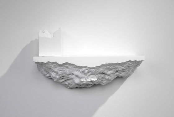
Shelve & Split
Photo courtesy of Volume Gallery
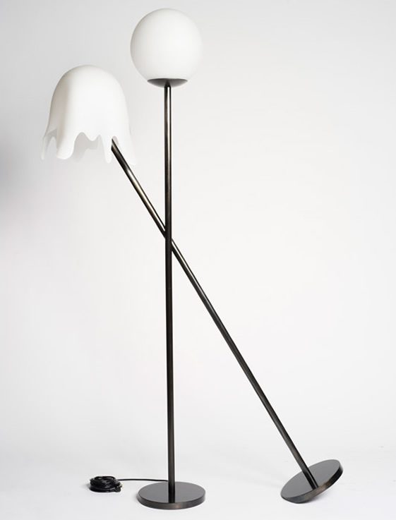
Lean
2012
Blackened steel, blown glass
70” x 42” x 10” (H x W x D)
Edition of 8
Are all of the pieces in Funiture functional? Break, for one, looks unlikely to be of much use – is function an essential factor in the collection?
A: I would say yes, and that Break is completely functional. So, it’s funny that you say that, and in someways, one of the base constraints when we design these objects is often that they are functional and that should be a requirement. Sometimes we’re pushing against that and making them either appear to be functionless or challenging the function of them. For instance, there are some pieces in the show that have multiple functions or the function is unclear when you first approach the object.
D: Speaking about that work in particular. That break that you see in the centre of the piece is entirely sculpted in the millwork of the piece, and built on that angle. The paint finish or the lack of finish that is on the surface, combined with the angle, is calculated in a way that objects placed on that surface will not slide towards the centre, and the doors that you see on there open up like any cabinet… the interior of which is finished and similarly treated with a sort of non-slip, kind of matte surface.
A: There is actually adjustable shelves inside of there. It was designed as a bar but can really be used in a very functional way for any number of programmes.
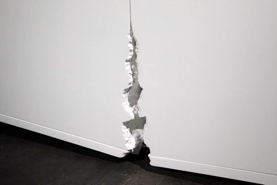
Break
2012
Lacquered wood, cast silicone
30” x 69” x 15” (H x W x D)
Edition of 8
Photo courtesy of Volume Gallery
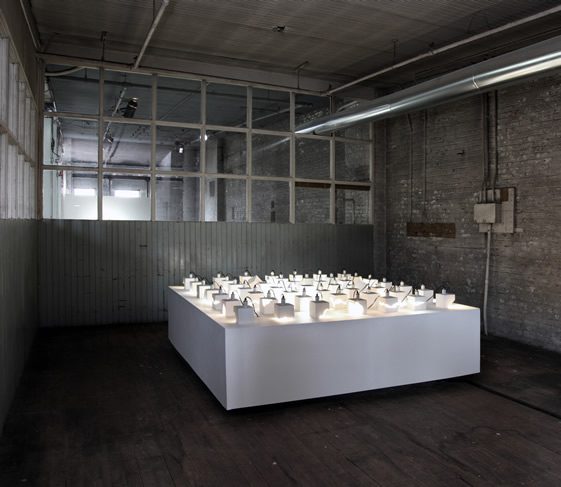
Installation view
Photo courtesy of Volume Gallery
Is product design an area you want to explore further?
A: I don’t know – maybe…
D: I think so.
What are you working on at the moment?
A: We’ve been working on a project right now (and in the studio around us are the many components of it), an installation for the store Odin – which is a fashion boutique in New York City. We’ve created a temporary retail installation which focuses on their fragrance collection, it opened May 1st in the East Village.
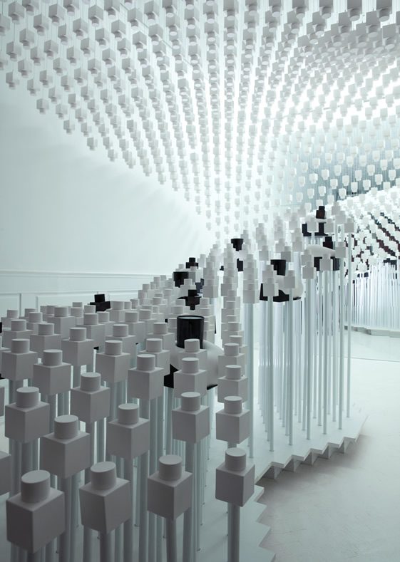
Odin Retail Installation


