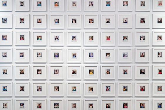
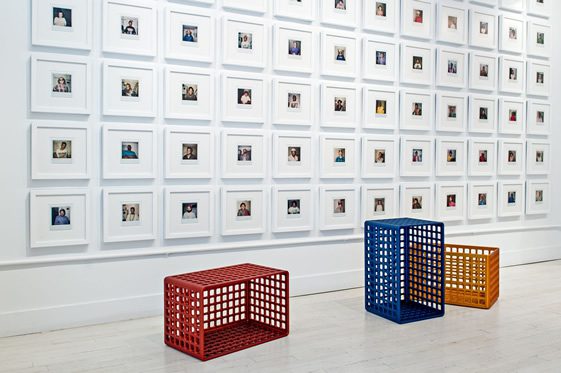
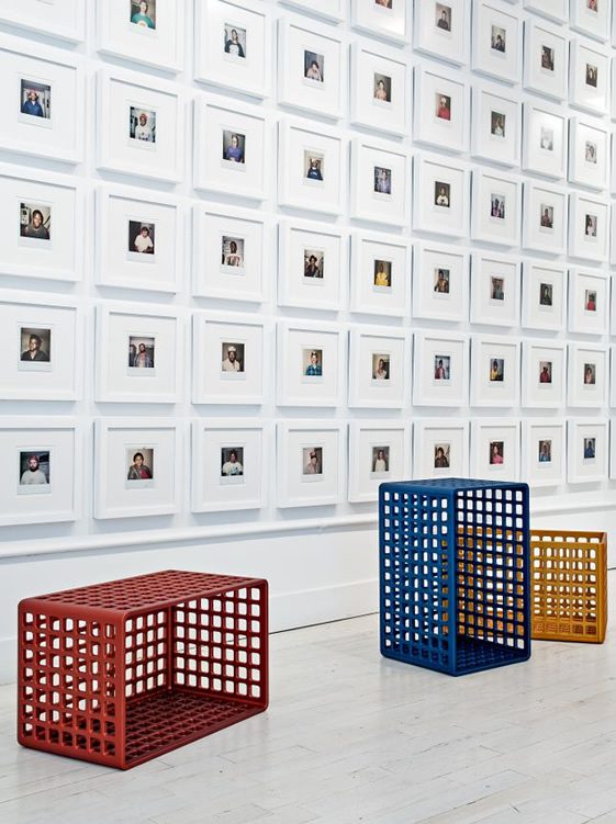
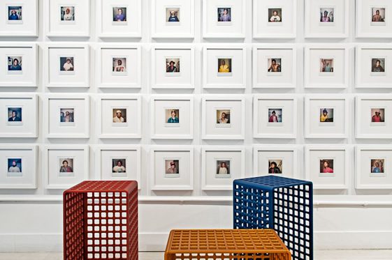
Contemplative, beautiful, utterly absorbing… New York-based artist Frederick McSwain’s Cells – shown as part of New York Design Week, at Gallery R’ Pure – is a fascinating marriage of art and design. Recalling a childhood experience – in which his mother (a bail bondsman) takes him to a jail after school, he waits (on a plastic dairy crate), they leave, and she hands him a Polaroid (of the prisoner she was presumedly dealing with) – Cells does so much more than just visually recollect this curious little story, its presentation poses all sorts of questions about identity, society, and our incessant need to pigeon hole.
As thought-provoking as it is, McSwain’s work is incredibly easy on the eye too – demonstrating his natural ability as a designer. Genuinely captivated by his work, and keen to find out more, I spoke to Frederick about his work, his city, and his future plans…
Cells was shown at Gallery R’Pure as part of New York Design Week, your second appearance in as many years there. Last year you presented Die, an emotional portrait of recently deceased artist (and your friend) Tobias Wong, that used 13,138 die to mark the days he had lived. It caused a big stir around the internet (and I believe even broke a world record?), can you tell us a little about that experience?
The news of Tobias Wong’s passing came as a shock to everyone, rattling the NY design community to its core. A tight knit group of designers/collaborators (including myself) convened in a neighborhood bar a matter of days after, hoping to make sense of the tragic turn of events. Without hesitation, the consensus was to organise an event in homage not only to Tobi’s profound body of work but also to celebrate his life, which impacted each of us differently. These early conversations would evolve into what became 2011’s Brokenoff Brokenoff exhibition. Still in the planning stage, we shared the concept with Odile Hainaut of Galley R’Pure.
Essentially overnight, she offered us carte blanche during last year’s NY Design Week. Whether you knew Wong or not, the emotional content presented in that showing resonated on a basic human level, gaining interest outside the microcosm of art and design. Ironically, Die, which was originally conceived as fragile and ephemeral in nature, is now traveling North America via Bernhardt Design, holds a “world record” (if it hasn’t been broken already), and has been continuously gaining real estate in cyberspace.
I’m sincerely honored by the level of attention garnered and attribute much of its success to Tobias Wong’s spirit, sense of humor, and inspirational body of work (the catalyst for which my installation was based). He is deeply missed.

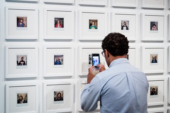
In Cells you talk of the varying connotations of the word, from spreadsheets to prisons, the layout of the Polaroids seem to play with this too – do you think we need to put things into a box just to make better sense of them?
For this year’s exhibition, “Love It or Leave It”, ten New York-based artists/designers were asked to comment on ideas, objects, or icons that have shaped their individual perception of the American landscape (funny enough, we toyed with the name, “America in a Box,” referencing society’s insistent need to categorise). Building on a theme of nature versus nurture, Cells is a dramatisation of a childhood memory told through objects and images. Universally, early adolescence is a unique time of change, challenge, and potential. Looking back, I wanted to revisit personal experiences from my own life and loosely examine how they manifest themselves in the psyche decades later (e.g. do fears become phobias, does collecting hint at compulsive hoarding, etc.).
Whether it’s memories in the mind or toys in the attic, I became very interested in how things are processed, organised, and stored. Referencing popular culture, I chose the multifunctional and iconic form of a dairy crate to symbolise this idea. Originally designed to transport milk and other products from dairies to retail establishments, the plastic containers are now synonymous with disc jockeys, flower districts, and street vendors.
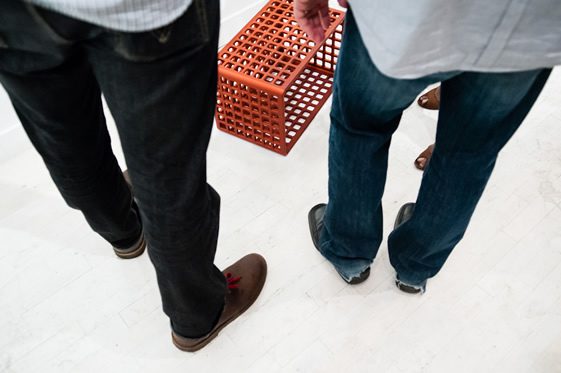
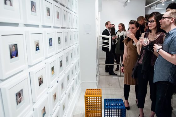
To elevate their value and importance, I created a simplified version, machined and constructed from solid aluminum then anodised in variations of the primary colors (a table, a seating element, or a storage unit). These lay scattered on the floor, ready for use, while the gridded snapshots of the past appear to be set in stone.
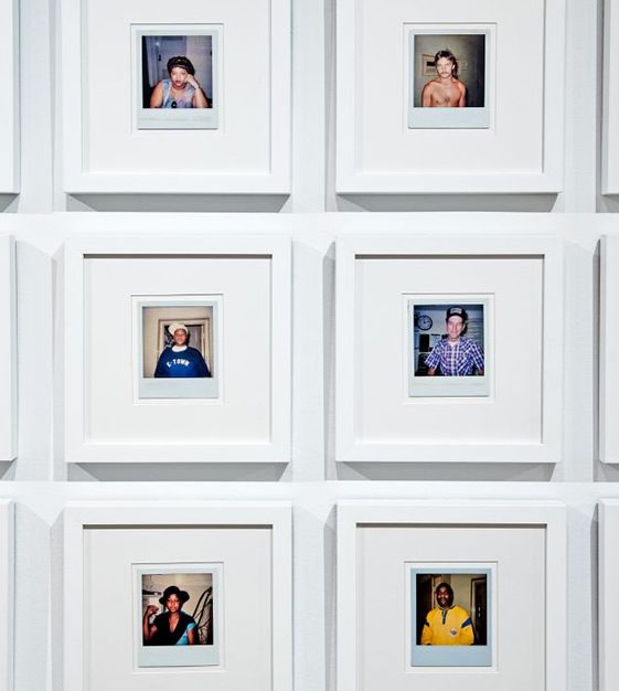
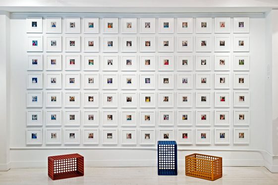
It’s fascinating to imagine the lives behind the pictures… the Polaroids were taken by your mother, a bail bondsman, did you ever find anything out about their stories?
Small-town gossip can almost be a form of currency. So to answer your question…yes, I would definitely hear/know details about some of the characters. By my mid-teens, the mugs of friends and schoolmates began to make appearances in my mother’s briefcase. Honestly, most of the charges were only misdemeanors such as failure to appear in court, intentionally writing worthless checks, and driving under the influence.
More interesting to me, is the raw emotion captured on their now anonymous faces (some scared me to death, others made me laugh). Almost a case study on the human condition, the Polaroids offer insight into the demographics and culture of a community during an isolated timeframe. While I have a collection of a few thousand, I used an abbreviated 84 in the Cells installation, a number also referenced in the profile view of the aluminum crates.
Do you see yourself more as a designer or an artist, and what does that even matter anyway?
I’ve always enjoyed Massimo Vignelli’s quote, “If you can design one thing, you can design anything.” Taking this statement out of context, I do believe that a freedom exists for creatives to cross-pollinate between the disciplines of art and design.
When ideas become the medium of choice as opposed to a physical material such as wood, paint, metal, or plastic, the dividing line is extremely blurred. All too often, the word “design” is associated only with mass produced goods offering a specific function. “Art” on the other hand, is commonly viewed as handmade one-of-a-kinds that serve as a vehicle of expression.
Personally, I feel the most exciting work is an amalgamation of the two, gallery or retail environment alike. As long as it communicates, the label doesn’t matter.
What inspires you?
Stepping out of my front door, it’s impossible to predict… there are so many interesting people, places, and things.
Where’s your favourite New York spot to relax?
New York City is such an environment of over-stimulation, many times it’s difficult to find peace and quiet outside the comfort of your apartment walls. Subconsciously, one must block out 99% (not a pun on Occupy Wall Street) of the continuous chatter just to stay sane.
Growing up among cotton fields and dirt roads, I frequently need breaks from the anxiety-inducing concrete jungle. On Sundays, I’m commonly found in Central Park’s Conservatory Garden on the edge of East Harlem. It’s a short walk from Museum Mile and not too far from Lennon’s memorial at Strawberry Fields.
…and to go wild?
Going wild is never planned, it just occasionally happens. While some of my fondest memories have the shabbiest backdrops, if I could schedule a night of revelry… it would happen on a quaint yet scenic NYC rooftop, sometime during the warmer months.
You told me that you’re hoping to make an appearance at this year’s London Design Festival, would it be your first time here during the design week, and can you offer us any insider information?
Yes, there are a few exhibitions still in the planning stage…fingers crossed, don’t want to jinx it! I’ve attended London Design Festival in the past but have never officially shown there. Currently, there seems to be such a strong energy exuding from the UK in the fields of art and design, it would be very exciting to participate. Also, I speak the language (always a plus!).
Photography; Miller Taylor


