Camper do nice stores. Really nice stores. Thing is, they’re usually big, bold and playful (take the Rotterdam and Tokyo stores we’ve previously featured), which makes Japanese designers Nendo an unusual choice. Famed for their minimalism, they can be playful, sure, but big and bold is not really in their vocabulary.
The interesting thing though, is how effortless simplicity can make a big, bold statement if the idea and execution is handled with a deft touch; and that’s just what Nendo have gone and done. Their Osaka store is a thing of floaty, whimsical loveliness; shoes slowly walking around, mid-air. Big and bold it may not be, but the punch that the concept packs, more than makes up for that. White, very white, airy, dreamlike – it’s typically Nendo, but Nendo at the very top of their game. Lovely.
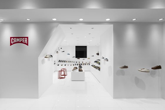
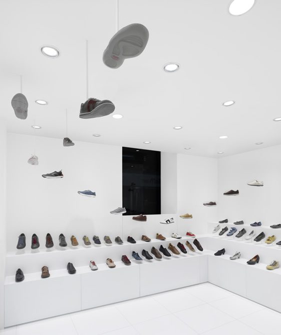
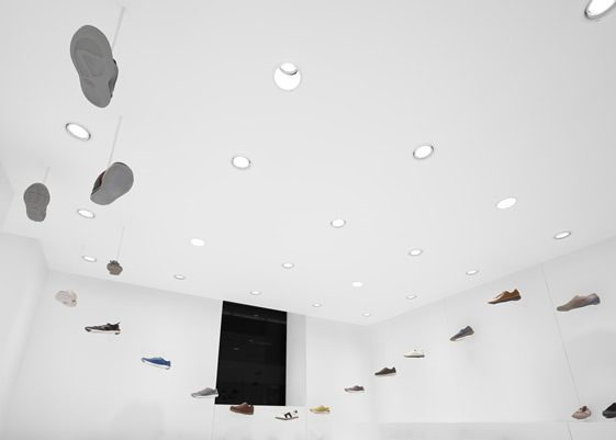
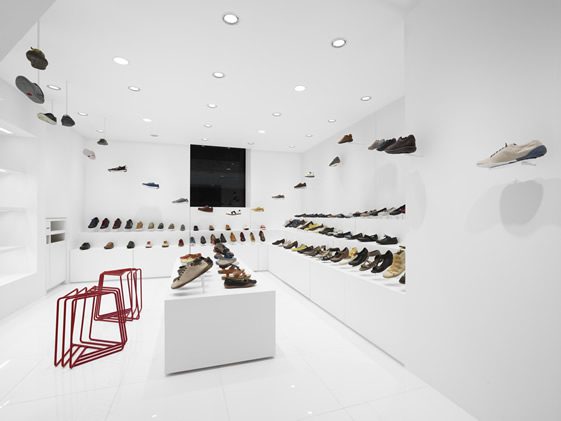
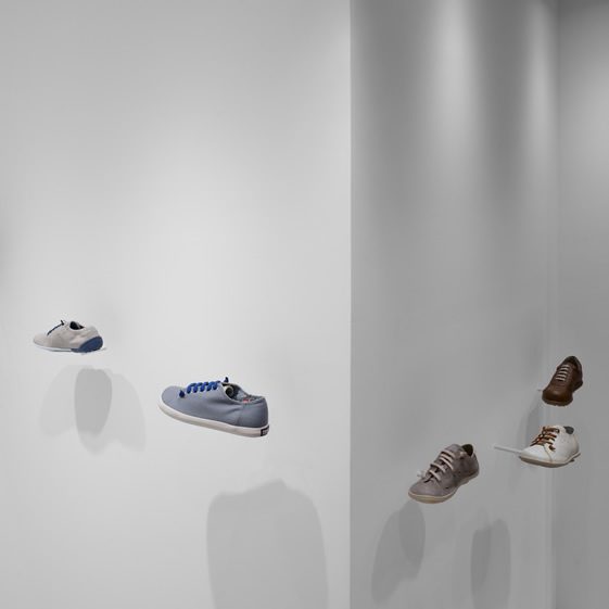
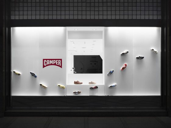
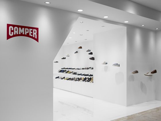
Photographs by Masaya Yoshimura
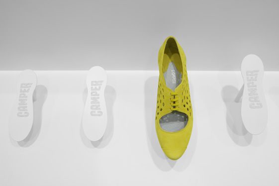
Photo by Kouji Fujii


