Interviewing a man whom you worked for, for seven years, can be slightly surreal – because you think you know him. Years of stories, drawings and enthusiasm could make one biased and slightly gushy when asking questions to answers you think you already know. This was not exactly the case when Brian and I met at one of his haunts, The Union in Soho.
Gin and tonic in hand (The Union does some of the best), amongst the familiar wall-hung ephemera and scruffy sofas, set behind powerful maroon colored walls, Brian looked slightly overwhelmed. Not only has Black Dog just published an ‘overview’ of his work – spanning a career of over forty years – but the book’s title; Brian Grimwood: The Man Who Changed The Look British Illustration could suggest slight trumpet blowing.
“I just wanted to create a document of my life, initially it was for my kids and my friends. I wanted to share it. You could say it’s vanity publishing, in some way it is, but hopefully, my children’s children will have a record of my life”.
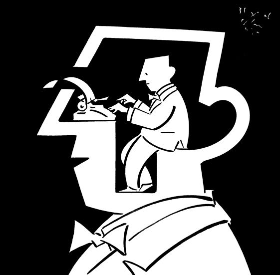
The initial book idea started at a lunch with Roger Walton. He gave Brian a series of questions (52 in fact) which became the structure of the book. Wonderfully revealing, yet humble, the book is as focused on Brian’s work as much as it chronically documents his life. It clearly documents the evolution of Brian’s style, resulting in Steven Heller writing those famous words; “Brian Grimwood, the man who changed the look of British illustration” for Print Magazine.
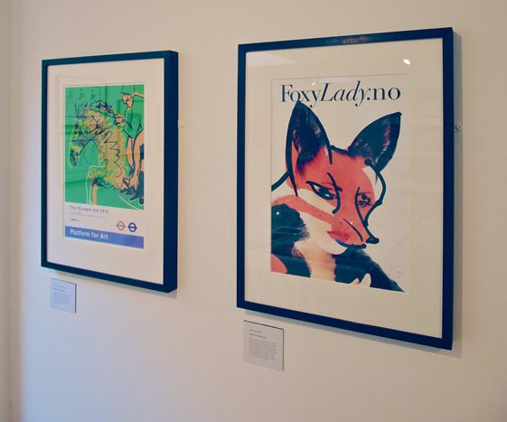
The Man Who Changed The Look of British Illustration,
WORK Gallery, London
Photo © We Heart
So this is the first complete overview, it literally touches on your life, your work and the people you’ve met. Are there any plans for future publications, maybe covering commercial illustration decade by decade?
Let’s put it this way, having had four decades as a commercial illustrator I’ve seen some amazing illustrators, which I have admired, somehow disappear. I’ve always been in it for the long run. There seems to be a ten-year cycle, all the art directors and contacts move on and you have to start again. You have to have energy.
This book really draws a line under those forty years, so now I can focus on the next ten. I’ve had some incredible feedback for embracing the iPad. It’s almost become a bit of an angle for me. One thing I didn’t want this book to be is a ‘swan song’ indicating I’m a has-been.
So was is difficult for you to embrace technology coming from a painterly style which is fluid and loose? Was it tricky to switch mediums?
I understood that technology was made for me – it was the layering process I had been using even in painting. You see the processes used in Photoshop are exactly how I worked with gouache and inks on paper. I could draw things in layers, take things away and add to them as I chose to. It’s still an exciting time to experiment on the computer. I’ve created hundreds of portraits on the iPad, playing around with textures, brush strokes, and I’ve only just begun discovering.
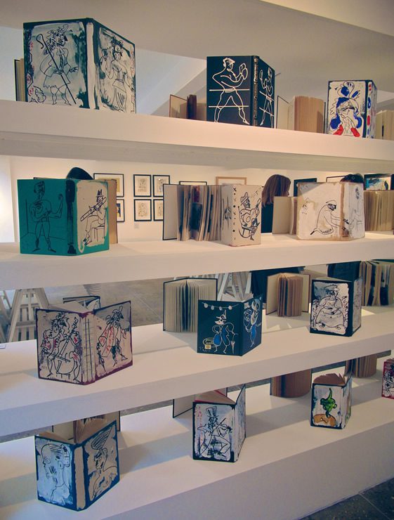
The Man Who Changed The Look of British Illustration,
WORK Gallery, London
Photo © We Heart
So what decade would you say was the turning point in your career?
This one!
I mean when art directors started branding you with the ‘new’ fluid style, when was that?
It was the 1980s. It was Steven Heller, a journalist and art director of many publications and books, he was the man to know in New York for graphic design. I was working for Club International at the time. He was working on a magazine called Screw, it was pretty errrr… pornographic to say the least! He asked me to do a cover, I thought it was a little dodgy until I found out that Milton Glaser, one of my all time favourites (at Push Pin) designed the masthead.
So I thought, hang on a minute, if he’s involved I’m in. After that we became friends and saw each other whenever I went to New York and that’s when he did a ten-page feature on me in Print Magazine. To have a ten-page feature was ridiculous! The publicity around it was incredible – so many people read that magazine.
I’ve always understood that what I do is a product… and I’ve got to flaunt that.
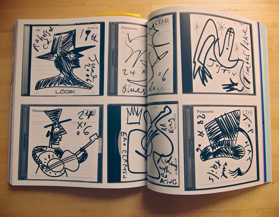
The Man Who Changed The Look of British Illustration,
Black Dog Publishing,
Photo © We Heart
Courtesy of Brian Grimwood
Bizarrely that leads me on to my next question, you’ve always said that what you do is a product, a business, do you think that stems from the fact you came from a working-class background?
Absolutely, you’re dead right. Although we did travel around Europe in an old banger when I was very young, both my mother and father worked. If I wanted something I’d have to save up to get it, from paper rounds to walking dogs for the local vets in Croydon.
So in the ’60s when most wannabe artists went to college, wearing sandals and growing their hair, were you more interested in establishing yourself as a commercial artist?
The ’60s were a particular good decade, in 1964 I was 16 – the perfect age for a young man! The Beatles, The Stones, fashion was going ballistic and I had my first job. I was curious about college but went into my first job doing what I loved. I wasn’t earning any money – I was on £5 a week!
At the end of the day I didn’t go into drawing thinking I’d be rich. I went into it because I loved it. Being paid for drawing for a studio was amazing.
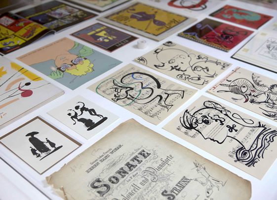
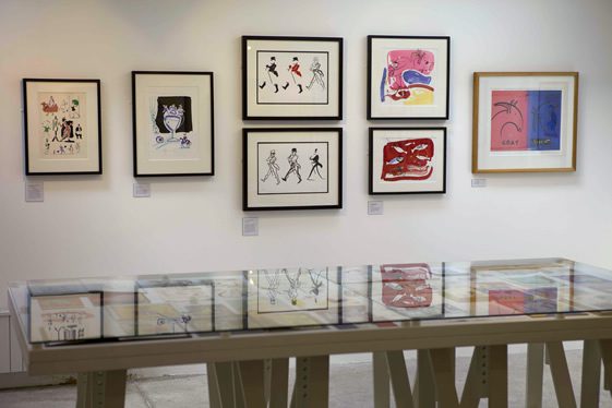
The Man Who Changed The Look of British Illustration,
WORK Gallery, London
Photo © WORK Gallery
So when did you know you really made it?
In 1984 I went over to Singapore. It was around that time that I was painting in a very loose way, giving talks and lectures over there. I remember going into one agency and saw one guy who started hiding his work, I asked him what he was doing and noticed he was copying my work! The fluid and free brush strokes – which they had picked up on. My look in advertising hadn’t existed over there and all of a sudden it was everywhere. It really took off in Asia.
Do you honestly think that you changed the look of British illustration?
The book is a bit tongue in cheek, I half expected people to challenge the title but no one has! Even people I admire the most, they have been very sweet and supportive. It’s all blag blag blag really…
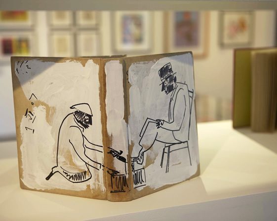
The Man Who Changed The Look of British Illustration,
WORK Gallery, London
Photo © WORK Gallery
It can’t be all blag because of all the work, your longevity in commercial illustration and someone did say it… it went to print!
It must be true then musn’t it?! (laughs). I wouldn’t defend it particularly… but the point is that the style cuts through everything. From corporate identities to wine bottles, the style was changing.
There were examples of works that looked like a ‘Grimwood’ but weren’t mine at all. Some of them great! There was a Madame Tussauds logo which I didn’t do but wish I had. It was beautifully done and everyone thought I did it.
What’s interesting is that your work has an artisan look but it has been used in a very commercial way…
Well I saw it as bringing art into a commercial setting. Like Pushpin in the ’50s using rough woodblock on book jackets. It was craft/art… very beautiful and not slick. This is what I began to understand. I was trying to make stuff look important, something rough and loose look classy. I guess I was trying to break down class barriers. Making things accessible to all.
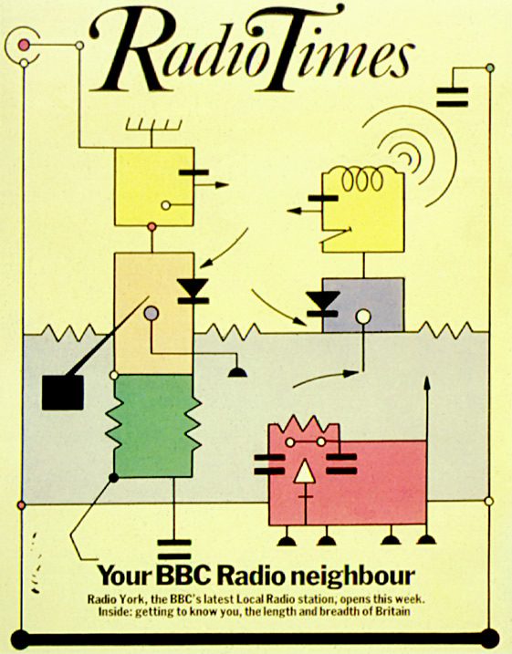
Courtesy of Brian Grimwood
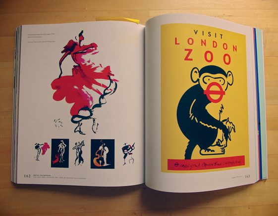
The Man Who Changed The Look of British Illustration,
Black Dog Publishing,
Photo © We Heart
Back in those days, outside of Western European popular culture people were creating all sorts of wonderful artisan art on the street of Havana or in villages of Shanghai, but the world of advertising didn’t really embrace it. Then you came along, a British chap who had a style and the balls (pardon!) to shamelessly promote himself and all of a sudden your similar version of naïve style became ‘it’.
Funny you should say that… when I was in Singapore, I said to some of the directors I met – that the local artists in your own country were producing wonderful local art and you should be using it. It’s all here, I said! But they wouldn’t use it because it was deemed poor and down market. I was producing work of similar style and they lapped it up.
~
Brian Grimwood: The Man Who Changed The Look of British Illustration is out now published by Black Dog Publishing. A witty, insightful and charming picture-book on the life and works of Brian Grimwood. You could read it in 90 minutes, but it takes longer to look at the wonderful array of work on show. Snippets from his sketchbooks, photos of family & friends, traveling adventures and his love of the Blues, the book “reinforces the importance of his contribution to the face of illustration the 1960s – both in Britain and the world over”.
A fantastic retrospective accompanies the title at WORK Gallery until November 3rd.
For further information on Brian Grimwood you can contact his agent Ben Cox, via The Central Illustration Agency.
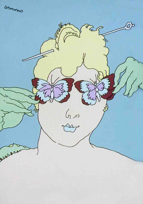
Courtesy of Brian Grimwood


