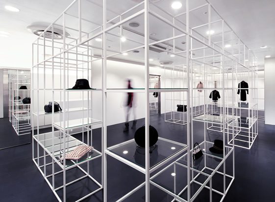
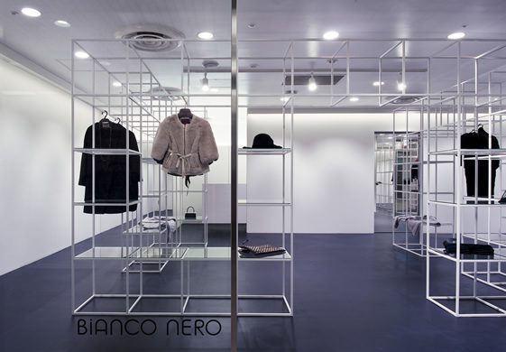
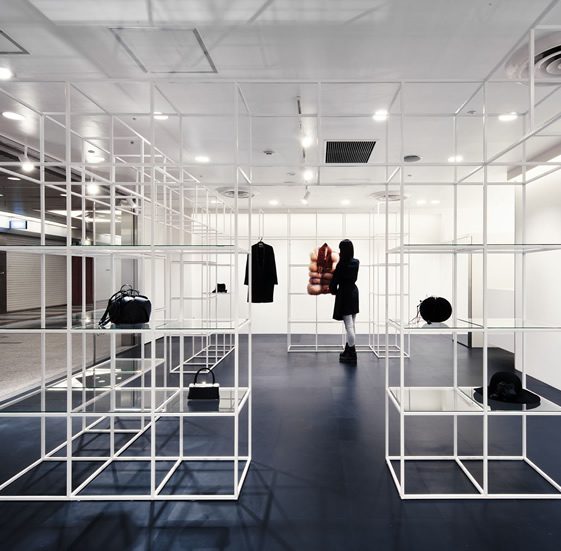
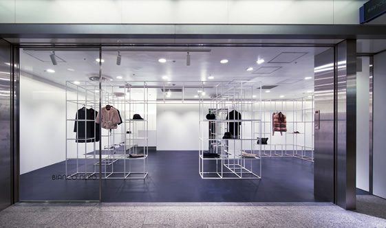
No one could accuse this shop interior in Osaka of going overboard on the flourishes; it’s about as stark and minimalist as it gets. That, says architectural firm Nico, was the brief, to reflect the monotone nature of the shop products, such as they are. I’m sure I can see something for sale over there, behind that shelf on the left.
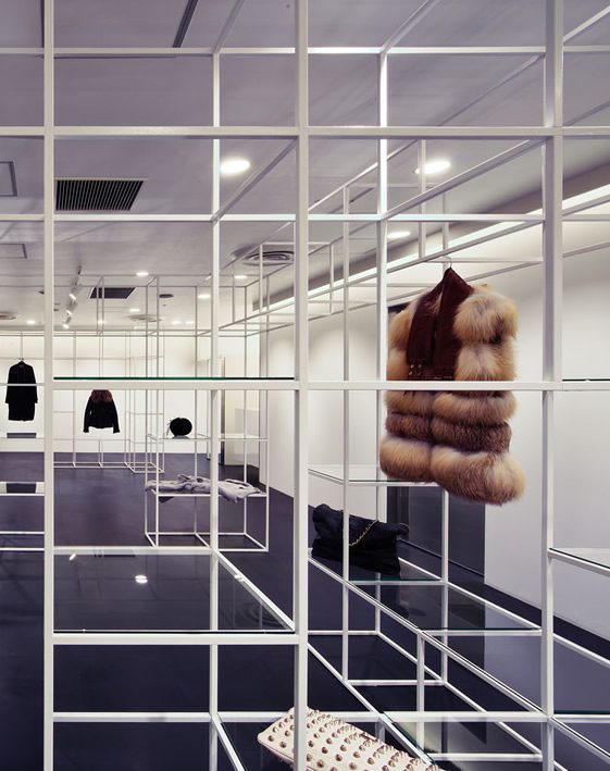
Actually, most of the products at Bianco Nero can be viewed from almost anywhere in the store thanks to the transparent shelving and thin steel frames that form the display units. Nico didn’t have a lot of space to work with in the underground shopping centre, and the lack of obtrusive fittings gives the place as big a feel as possible. They also say the compartmentalised structure maintains a distance between the salespeople and customer, and we’re all for that – I often think clothes shops would be infinitely improved if the sales clerks were removed completely and there was just some sort of Tesco-style self-service till instead.
The adaptable frame can be reconfigured, dismantled and moved about a bit like a Meccano set, so Nico hope their design, while minimalist, will enjoy a long lifespan.
Photography Yuko Tada


