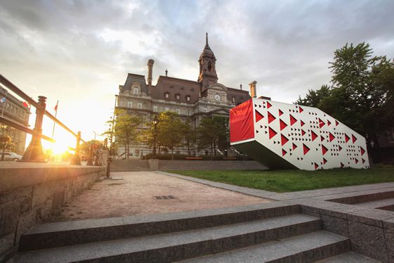
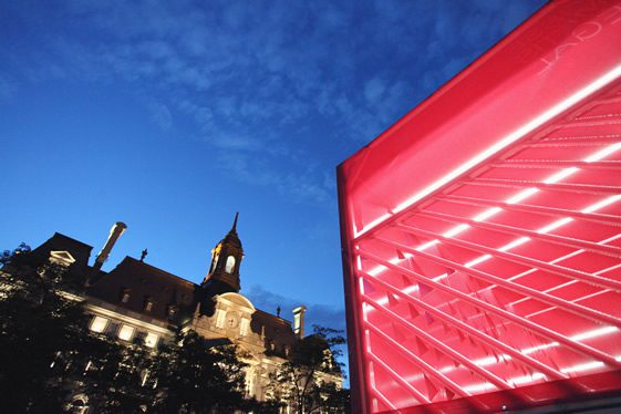
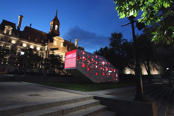
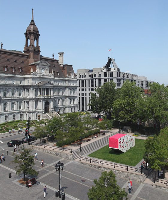
You’d be hard pressed to find two more visually different structures placed on purpose in such close proximity than Tisse Métis Égal in the grounds of the Château Ramezay’s Reford Gardens. Perhaps the Stedelijk Museum extension in Amsterdam has it licked, but this Montréal installation doesn’t seem to want to make the elder building look better by its own ugliness – it’s actually very attractive in its own right.
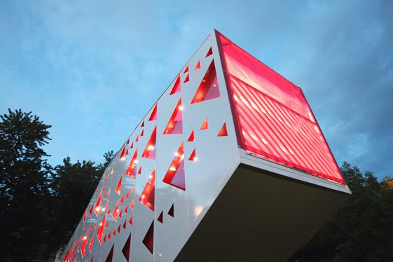
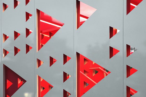
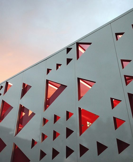
Designed by Plux.5, a collection of five creative types, TME (as we will henceforth call it to prevent spending our yearly diacritics budget) has a very modern look but one which harks back to the past of the region with its triangular apertures aiming to recall the arrowhead sash of the weaving tradition.
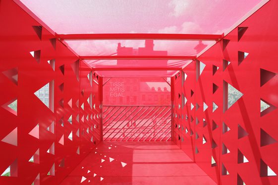
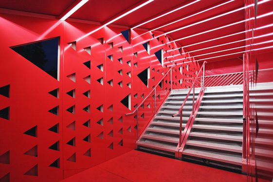
The outside is novel, but the installation comes into its own when we step inside. Those triangular openings in fact serve as viewing holes through which to view the old city in a new light – and a rose-tinted one at that. There are two levels internally allowing viewers to get the best possible vantage points, and TME’s location perched high on a grass pedestal adds to the possible scope. Eye-opening.


Photography, Alexandre Guilbeault


