Ladies and gentlemen, in the red corner, the owner of this beauty salon in Osaka, and in the blue corner, interior designers Yasunari Tsukada Design… Well, it wasn’t really that serious, but when two sets of passionate people meet, sparks fly. Thankfully in the case of the creation of end…Link it only served to be a force for positive change.
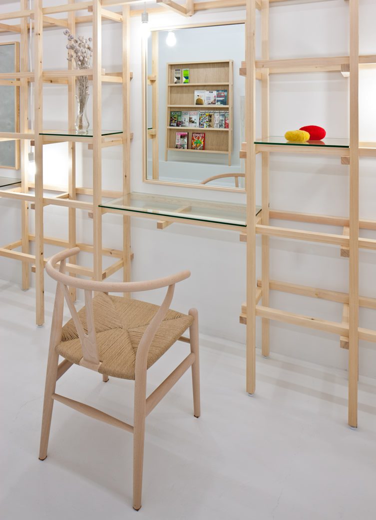
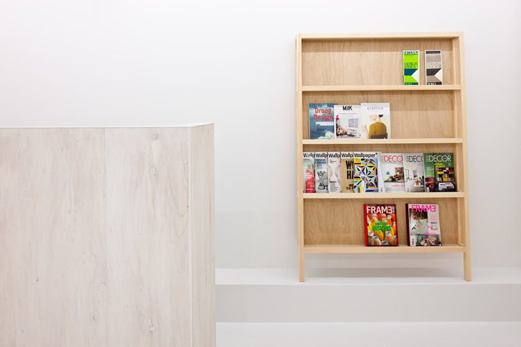
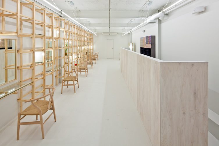
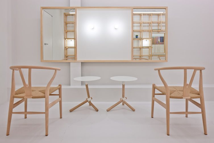
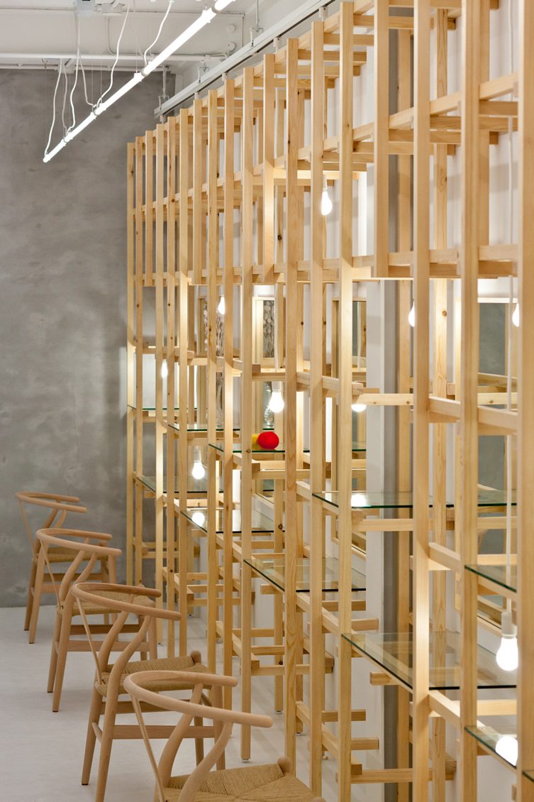
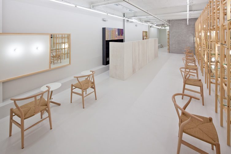
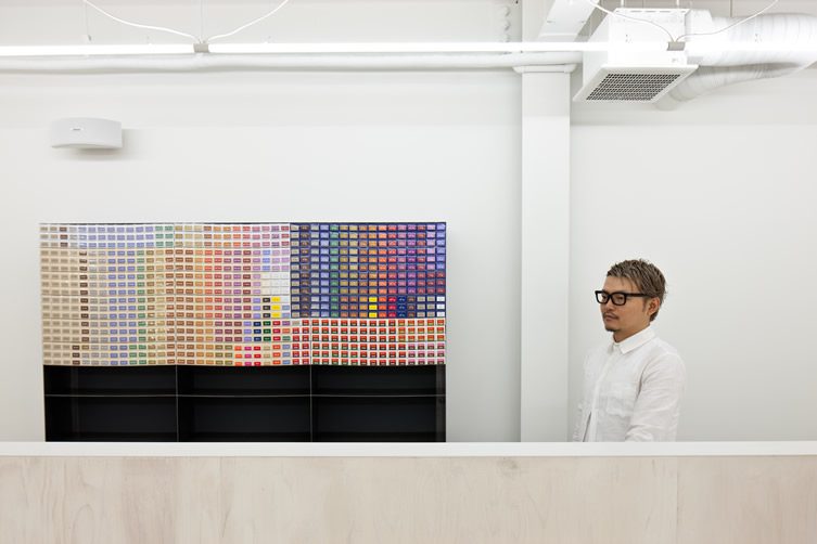
Contrary to the “heated” dialogue surrounding its inception, the salon’s interior beauty is of the understated, natural kind. The premises is long and thin, so Yasunari opted to use a white interior without partitions, and what intervention was necessary came from the construction of a pale wood frame. The addition of hooks and shelves serves to give the staff plenty of places to put their equipment and products without cramping the feel of the salon. Bare bulbs and the retention of some concrete aspects keep the space from feeling overdone, which in the world of beauty salons, is essential.
Photography, Stirling Elmendorf


