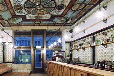
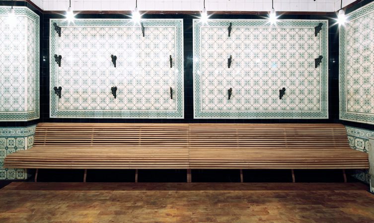
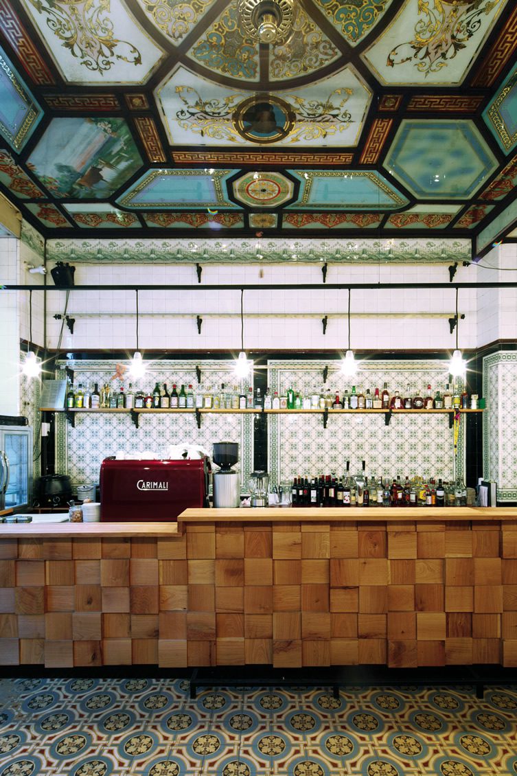
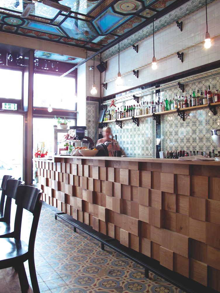
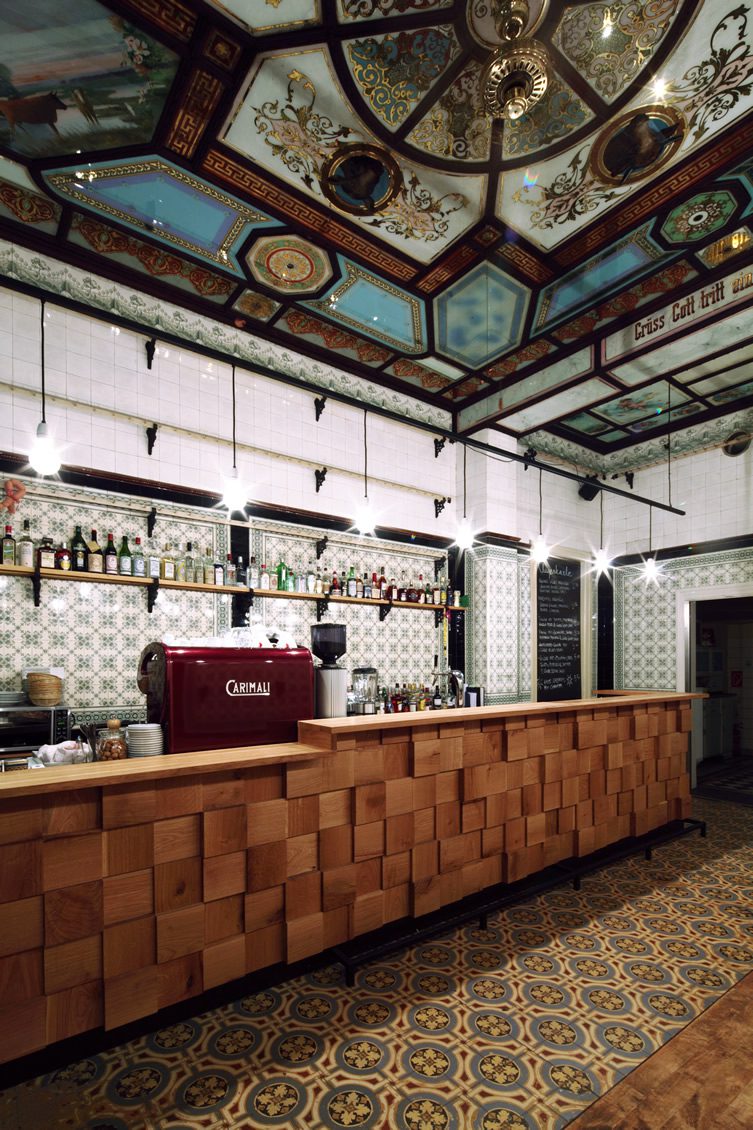
The interior of this ornate bar in the German city of Leipzig can be chopped up into three main elements: the bar on the right, the bench promontory on the left, and everything else. The first two elements at the Fleischerei Bar are recent additions designed to make the wall-to-wall tiling a little less sterile. The premises was a butcher’s shop in its previous incarnation, so there were a lot of wipe-clean surfaces to soften up.
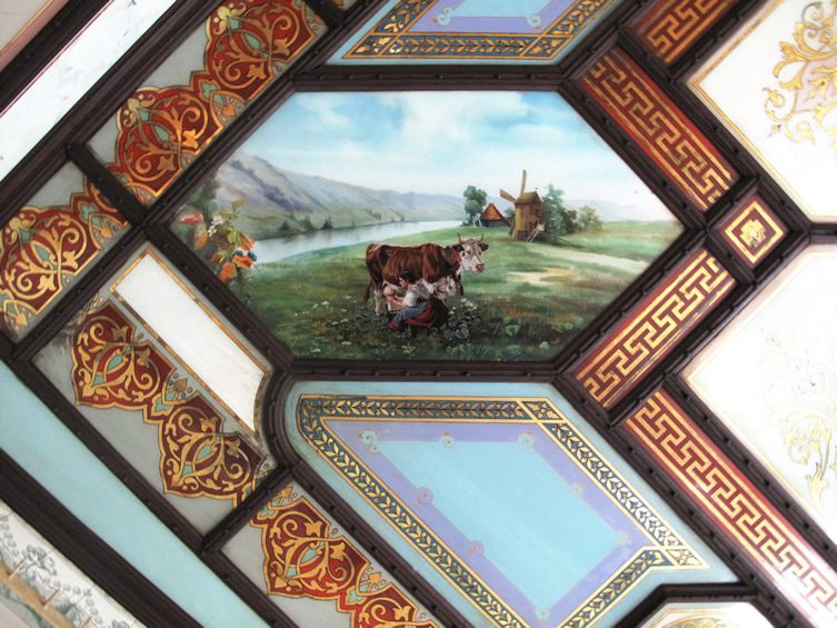
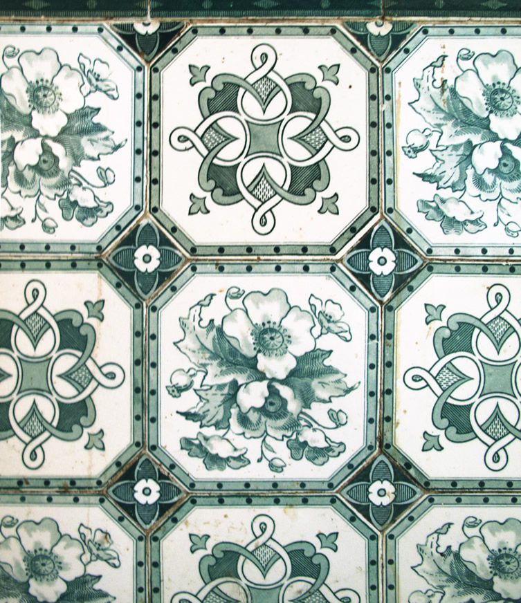
The bar is oak, and the most modern in look of thezimmer(aka Michael Grzesiak)’s interventions, while still keeping the tile theme alive with its cubic construction. Long strips of ash form the seating area opposite the bar, providing an area with a bit of warmth in which to sit and enjoy a drink. For the centrepiece of Grzesiak’s reimagined space, one must look up, for although the original Villeroy and Boch tiles would be the star of most interiors, it is Fleischerei’s ceiling that steals the show in this case. The feature, made of reverse-painted glass panels, is decorated with pictures of the animals that were once butchered here. The perfect meat-ing place? Sorry.
© Michael Grzesiak
courtesy thezimmer, Leipzig
© photographiedepot.de
courtesy thezimmer, Leipzig
© photographiedepot.de
courtesy thezimmer, Leipzig
© Michael Grzesiak
courtesy thezimmer, Leipzig
© Michael Grzesiak
courtesy thezimmer, Leipzig
© photographiedepot.de
courtesy thezimmer, Leipzig

