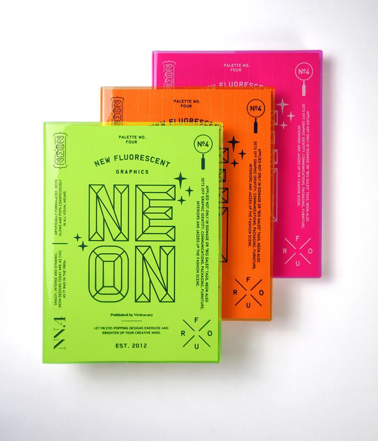
For those who had a heavy weekend, a word of warning: put some shades on immediately. The most recent of publisher viction:ary‘s Palette series – Palette No.4: Neon, New Fluorescent Graphics – is looking at what are commonly called the neon colours – those shocking pinks, greens and yellows that grab the attention thanks to some special properties to do with light wavelength absorption. This 296-page book, you’ll probably be glad to hear, is light-to-non-existent on the physics equations and heavy on the applications of fluorescent colours in the design world. Why else would we be telling you about it?
Among the fields making use of these special colours are branding, interior design and fashion, and there are 110 extremely loud projects by designers across the globe featured in the publication, including some that have grabbed our attention before, such as Studio Myerscough’s Movement Café in Greenwich. Previous editions of Palette have focused on black and white, multicolour, and gold and silver, if that’s what stimulates your rods and cones, but for real colour aficionados it’s essential to collect the whole spectrum.
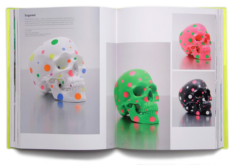
Sugared,
by Jiri Geller
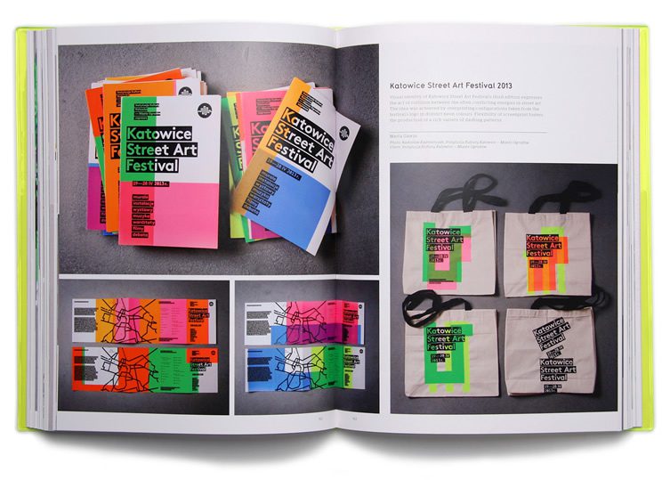
Katowice Street Art Festival 2013,
by Marta Gawin
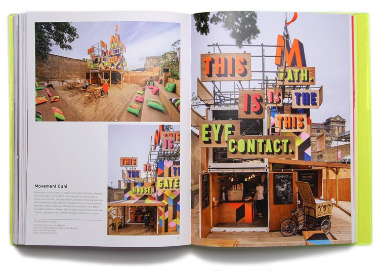
Movement Cafe,
by Studio Myerscough
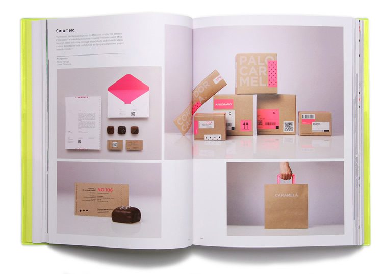
Caramela,
by Anagrama
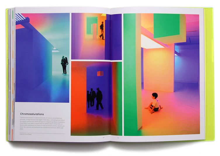
Chromosaturations,
by Carlos Cruz-Diez
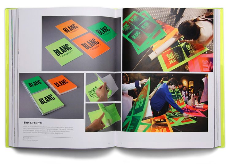
Blanc. Festival,
by Forma & Co.
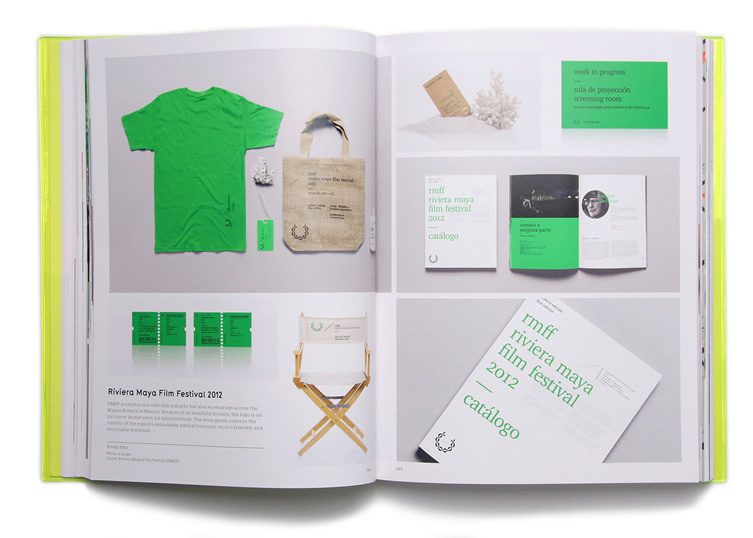
Riviera Maya Film Festival 2012,
by Anagrama
