Imprint was Craft Central’s contribution to this year’s London Design Festival: an exhibition exploring print in all its glorious forms, from lace-debossed ceramics to printed-on furniture, textiles and found materials. But there were three artists simply adding ink to paper and each creating something wonderful. I thought it would be rather nice to look at what they were doing in a little more depth.
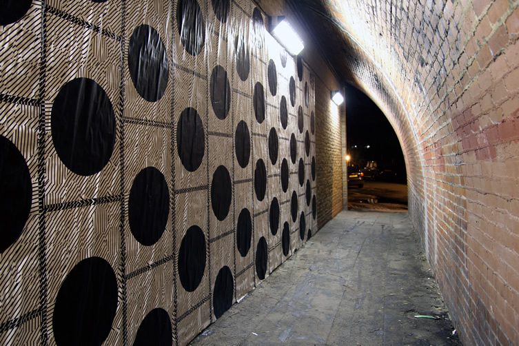
Katy Binks’ prints are gorgeously colourful, but not just for the sake of being colourful. Having spent a six formative years living in Korea, her work is heavily inspired by the five cardinal colours traditionally used in Korean art. In Korea, even the rainbow is described as having five colours rather than the seven Westerners see in it. The five colours are blue, red, and yellow, plus white and black and are considered to be closely related to the five cardinal elements: blue to wood, red to fire, yellow to earth, white to metal, and black to water.
The other big influence on Katy’s work is pattern and symmetry. She is interested in the emotional impact the shapes she makes in each print have on its viewer. Previous exhibitions such as Things That Make Your Eyes Blink – described as “retina shaking” by Design Week have pushed this idea further than her work for Imprint, which is more in line with the Independent’s description: “heartily hued paintings.” There’s certainly something hearty about them, perfect for a cold September day.
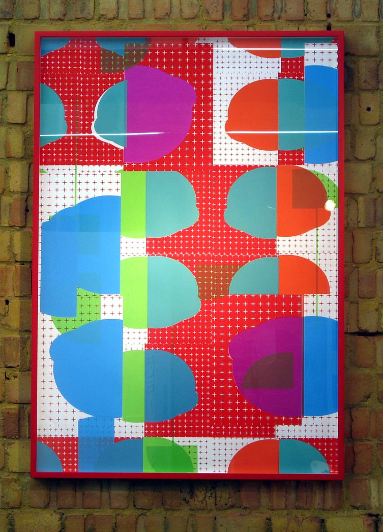
Katy Binks
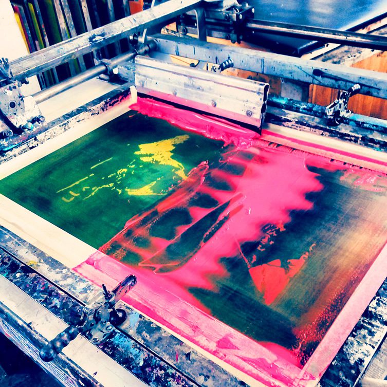
Hannah Victoria Locker
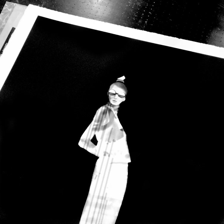
Joanna Ham
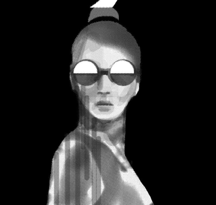
Jo Robinson is the brains behind HAM, a design brand of screen printed rabbits, pigs and horses. Fabulous thought they are, they perhaps bely her artistic talent – she graduated with a Bachelor of Fine Arts from The Ruskin School, University of Oxford. A new range of prints launched under her maiden name, Joanna Ham, is about to put that right.
Each one starts as a meticulously crafted mixed media collage. This is then exposed onto photosensitive paper in the darkroom to create a photogram. Joanna scans this into the computer, allowing her to deconstruct and reconstruct the image until she’s happy with it. She adds some final details by hand before transferring the finished image onto a silk screen. The prints are then hand pulled with incredible accuracy and detail. To peer at them too closely is to realise just what’s possible in the medium of print.
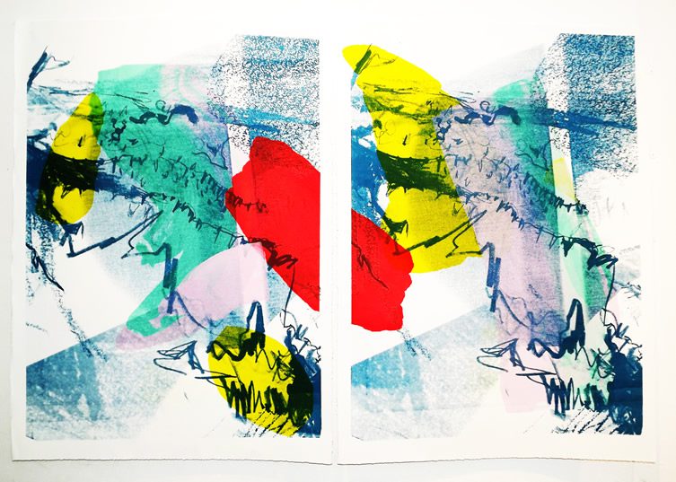
Hannah Victoria Locker’s prints are painterly, layered and textured in a way that’s quite unusual in the neat world of print. Screen prints are created one colour at a time to build up the final picture, so a different screen has to be created for each colour. What I find really interesting about Hannah’s work is that she’s taken this idea of layering further and created a series of prints on translucent paper that work as a set layered on top of each other. She then even sometimes cuts into sheets to reveal more detail in layer below.
Hannah recently graduated from Leeds College of Art and her playfulness, her willingness to experiment during the printing process and her use of her own unique systems of drawing, painting and silk-screen printing make her work incredibly fresh and exciting. She says she “aims to create pieces that excite and intrigue her audience” – she’s certainly succeeding so far.
Imprint did an incredible job of showing the very edges of what’s possible in print – inspiring and intimidating in equal measure!
***
Hannah Victoria Locker
Katy Binks
Joanna Ham
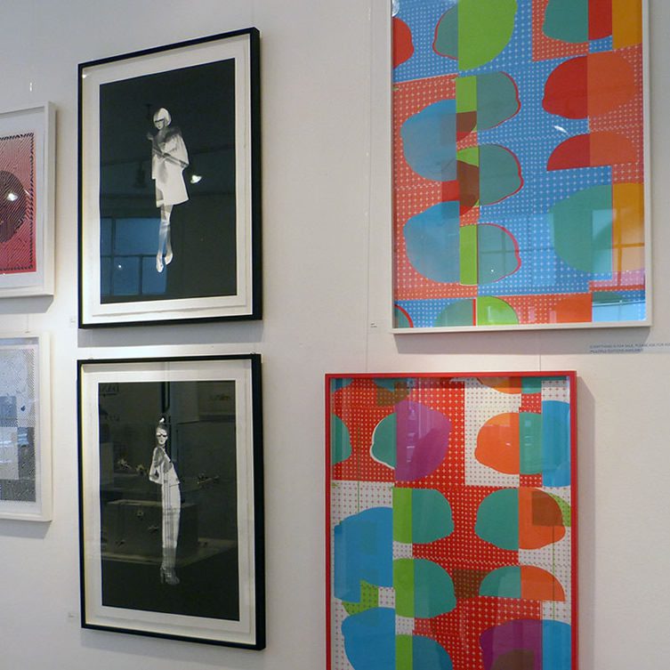
Imprint, an Exhibition of Printed Design
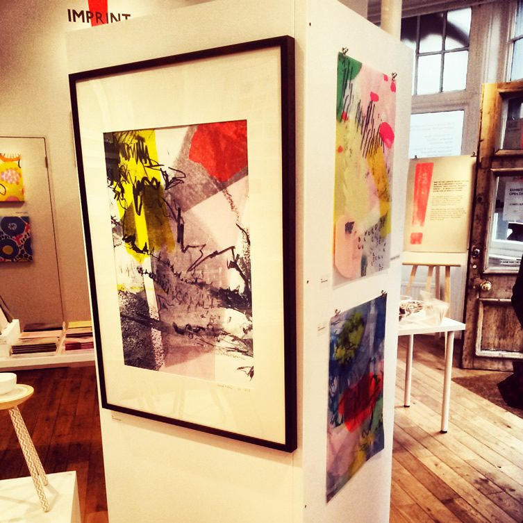
Hannah Victoria Locker
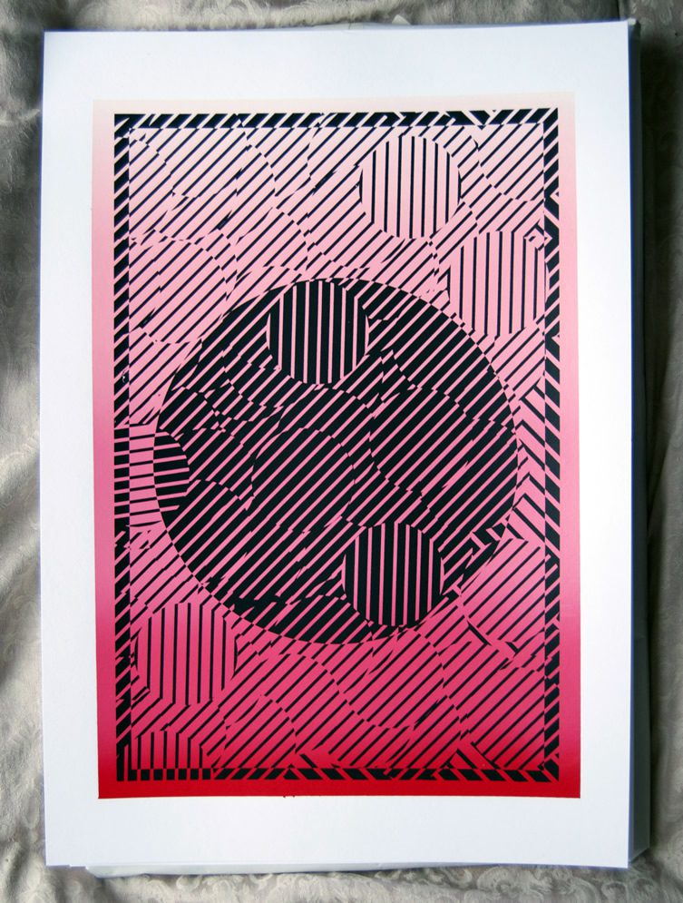
Katy Binks
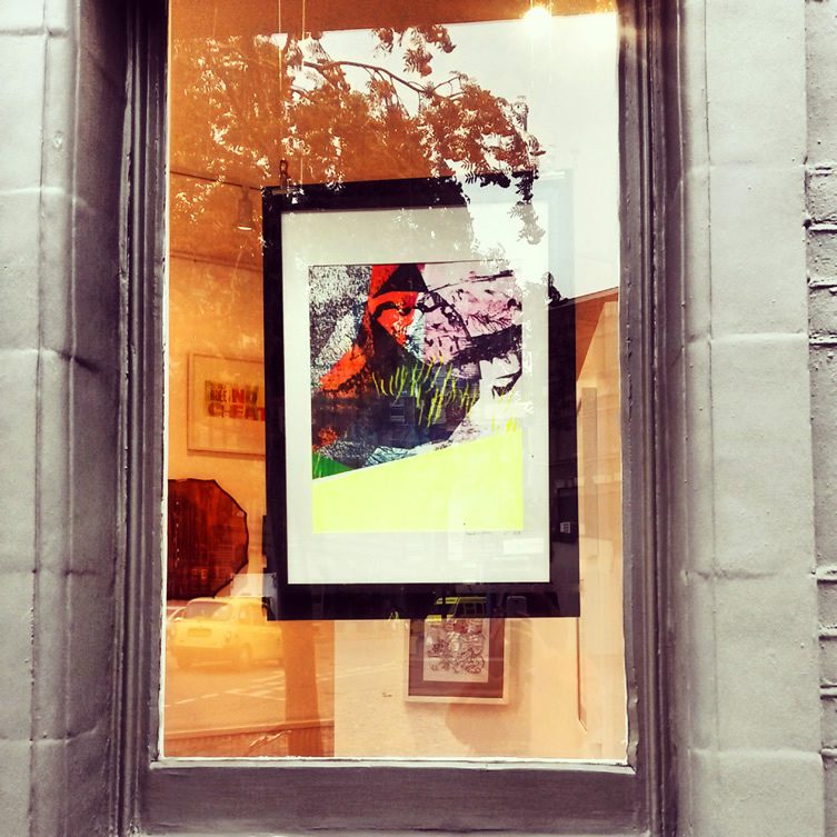
Hannah Victoria Locker
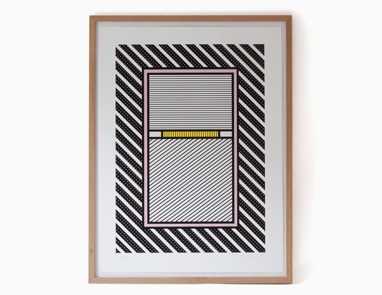
Katy Binks


