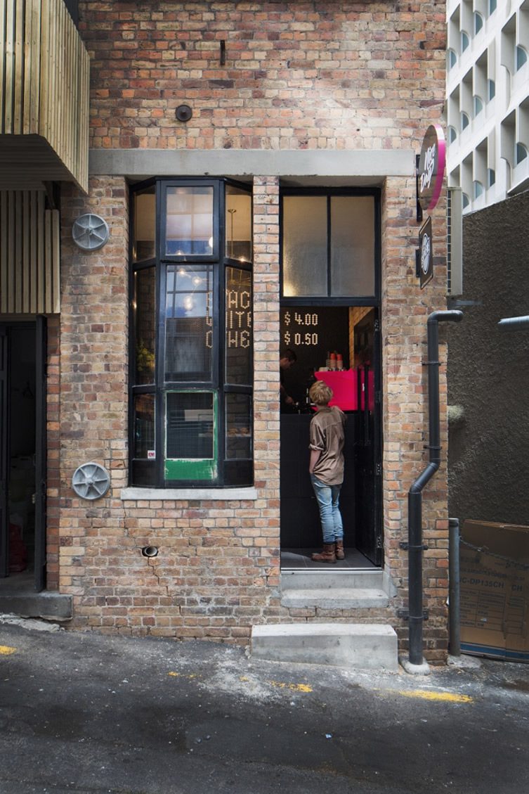
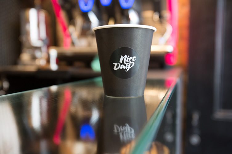
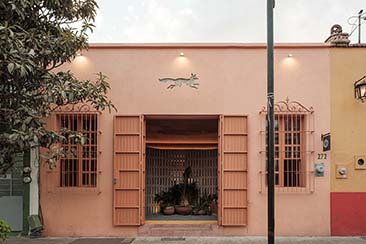
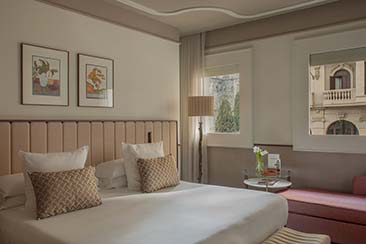
Well it shouldn’t take long to give you the tour of Nice Day in Auckland, New Zealand, being as the place is only seven square metres – but the compact layout of this hybrid between mini-café and hole-in-the-wall is all part of the charm. Although it’s not quite one-in-one-out, if any sort of queue builds up you’ll be hoping the weather’s nice outside while you wait. Still, there’s a nice little bay window to press your nose against and decide which pastry to have in the meantime.
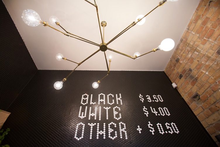
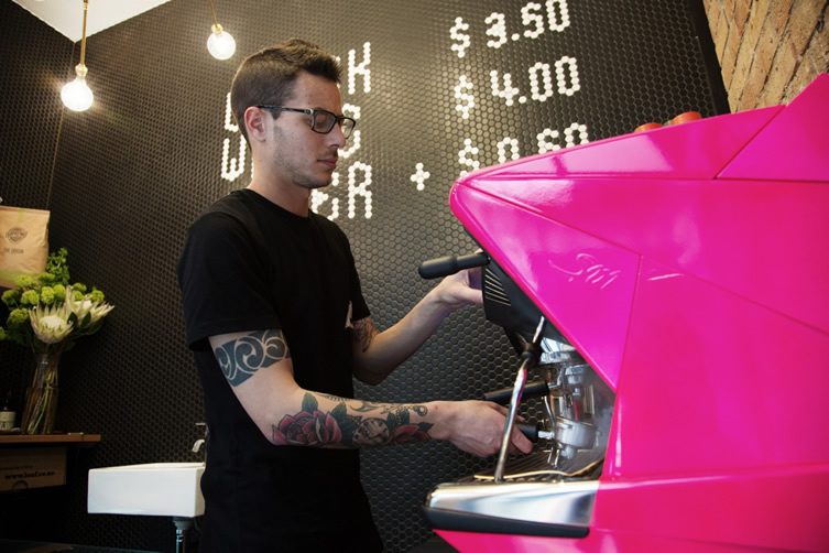
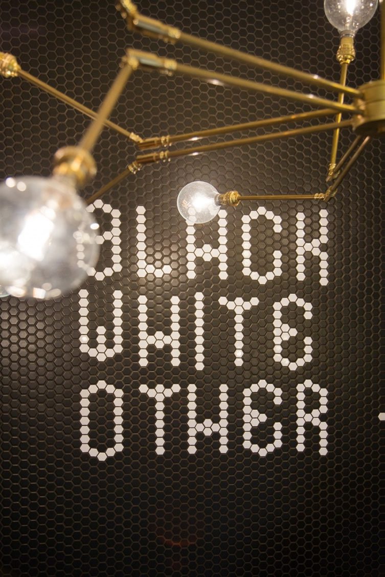
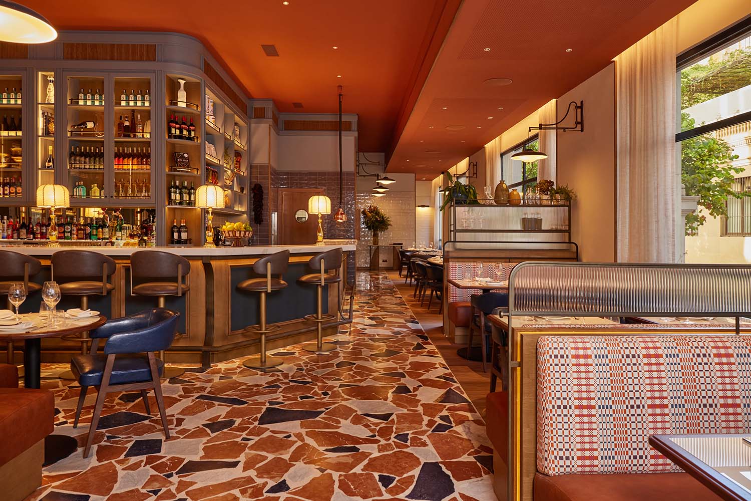
Nice Day is a collaboration between two agencies – interiors firm Material Creative and engineering collective Post Creative – and the team has gone for a Melbourne meets New York look. As with New York and many other places where space is at a premium, things tend to go upwards, and some extra volume has been created by putting in a very high ceiling; it’s been well-used to mount an attractive bespoke brass light feature. One brick wall has been left bare while the others are completely covered in a black honeycomb, and the counter is tiled in black too (very slimming). The price list on the back wall kind of encapsulates the whole ethos of the place – simple but stylish.
