What does the phrase “Blood, Sweat and Tears” mean to you? The brief presented to this group of young up-and-coming graphic designers was to produce a representation of those four words (or three words and an ampersand) – something which captures the essence of toiling your guts out producing a portfolio that will get noticed by the big cheese creative directors.
One brief, but 12 very different approaches. Kyle Read made sure he put in the effort in the literal sense, choosing to go low tech and high effort with a pencil on paper drawing that required hours of painstaking shading and etching to bring the baroque floral scroll work and lettering to life. Owen Gildersleeve’s submission reflected the liquid nature of all three elements. He cut out the fluid hand-drawn text design from a piece of cream paper then laid it onto a layer of red swirls before photographing the complete work. Emblazoned on the back of a found leather jacket, Jen Mussari’s design pays tribute to those who “take the long, hard, stupid way around”, and highlight their effort ostentatiously as a point of pride. On the other hand, Max Kaplun felt a portfolio ought to have an unmistakeably personal, intimate identity, so his lettering is formed from the whorl of a fingerprint.
* The 12 Blood, Sweat and Tears works were commissioned by the Art Directors’ Club for its Portfolio Night recruitment event.
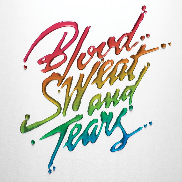
Alex Trochut
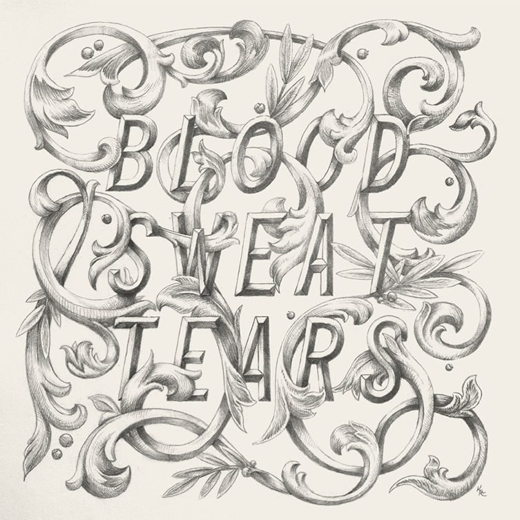
Kyle Read
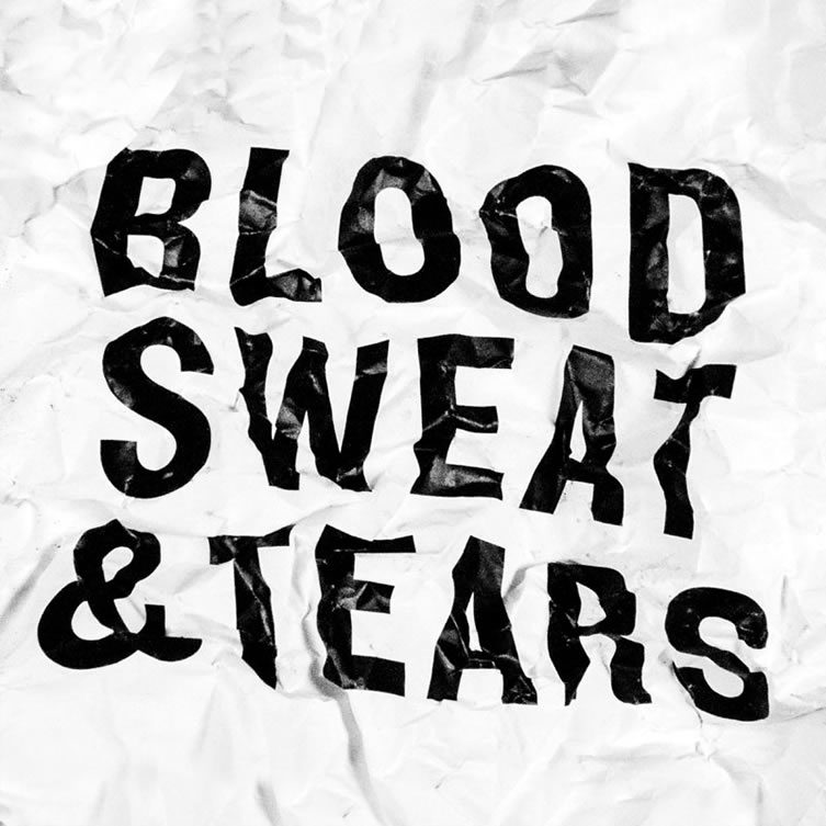
Chris Rubino
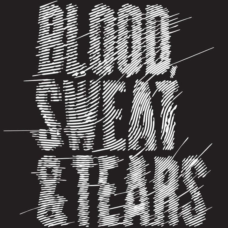
Max Kaplun
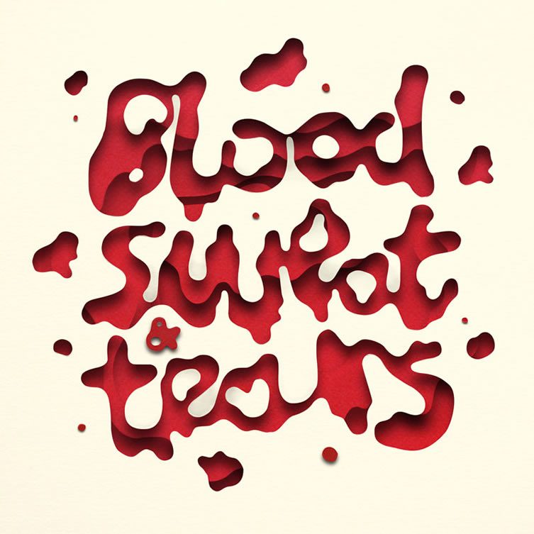
Owen Gildersleeve
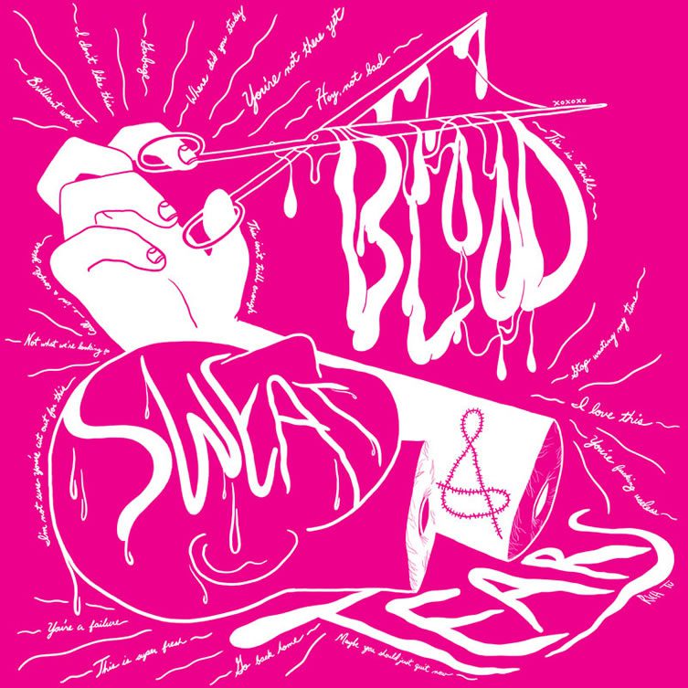
Rich Tu


