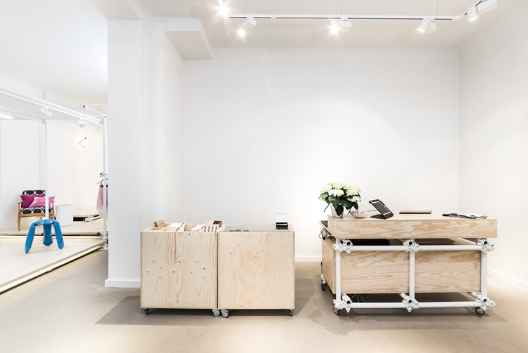
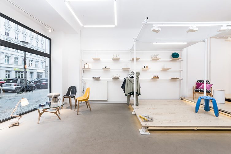
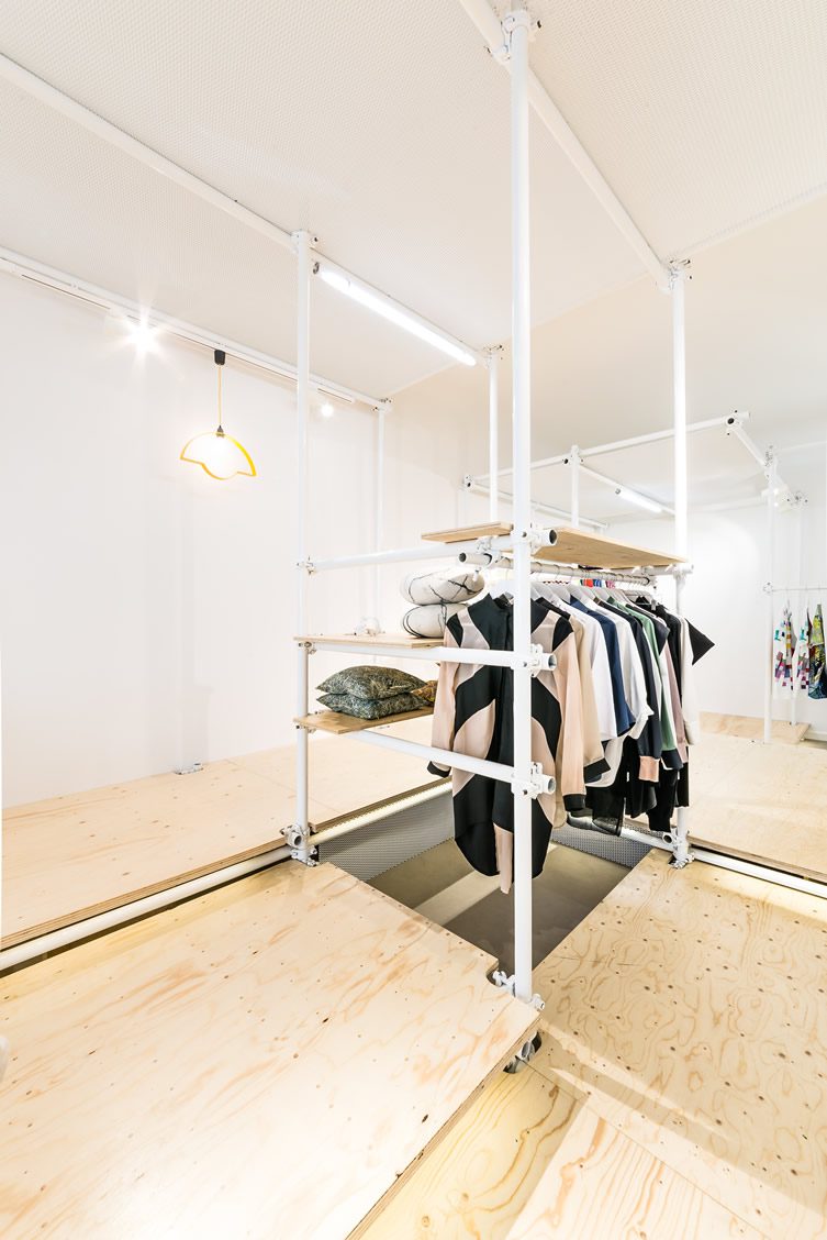
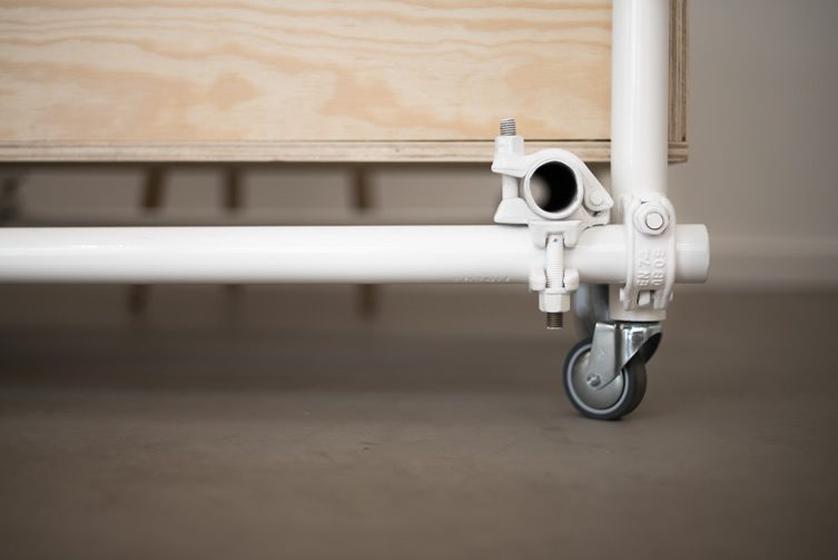
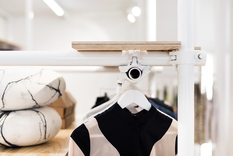
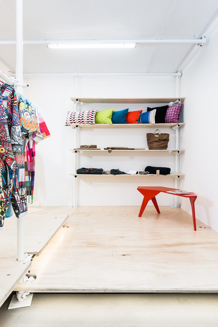
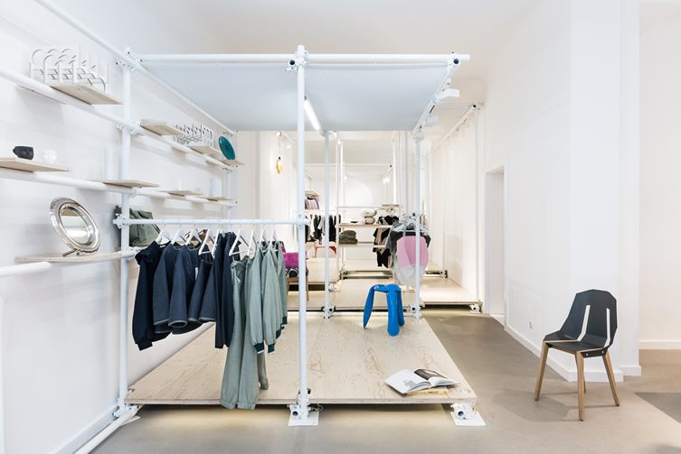
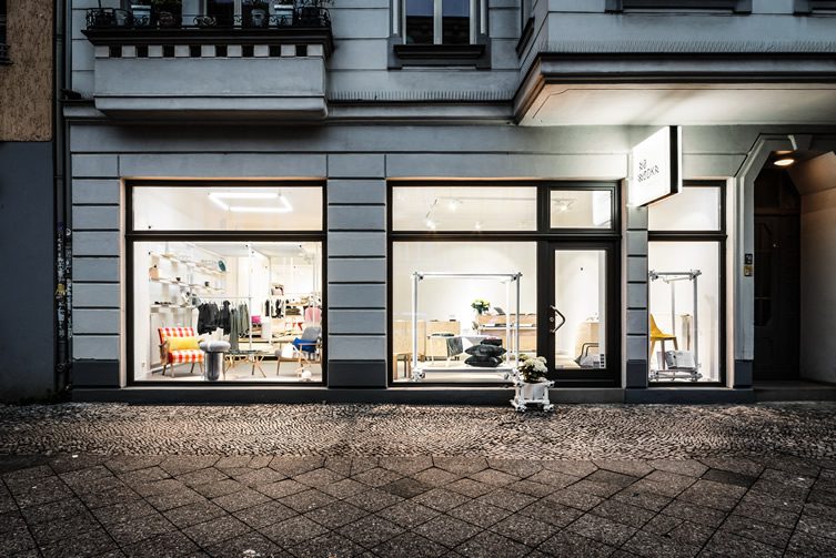
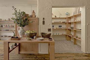
NO WÓDKA is a showcase of Polish art and design that aims to break through some stereotypes about the country, starting with the name. Don’t let the lack of booze put you off though, as the Berlin pop-up concept store has got plenty of other attractions to recommend it. It’s designed around the idea of a walk-in wardrobe; rather than use traditional wall-mounted shelves, interior architects KONTENT constructed a self-supporting interior frame made of scaffolding which brings several benefits.
Using the frame structure, the retail space has been divided into two separate areas. The front section contains moveable parts, such as the counter and window displays, which can be reconfigured as necessary. The weight-bearing rear section also provides a degree of flexibility, as the plywood floor which sits on the beam connectors can be adjusted to alter the spatial volume. The colour palette has been kept white to highlight the products and provide a suitable backdrop for a planned programme of exhibitions (kicking off with Sonia Szóstak‘s Longboards, Tattoos and a Journey to Mars); the flooring and framework make it possible to use the space as a catwalk, dance floor or stage, and it’s been designed to be a two-person job to switch things around with just a scaffolding key.
