Regular readers may remember that back in May we called in at a temporary retail space in Amsterdam, commissioned for Frame Publishers and delivered by creative studio i29. The studio’s work stood out for its clever use of mirrors to maximise the distressed yet still undeniably grand architectural features of the former government building in which it sat, but when Frame decided to set up a permanent retail premises at a new address recently, they presented i29 with a different proposition altogether. At Herengracht 178 there were no soaring pillars or ornate windows to work with. Rather, the new shop was a blank slate, clean and white and ready for anything. Whereas the previous venue used mirrors to create an interesting visual experience for the viewer, here it’s all about a clever use of perspective, where the customer’s position in the store at any one time plays an important role in what they see, how the goods are presented and what messages they receive.
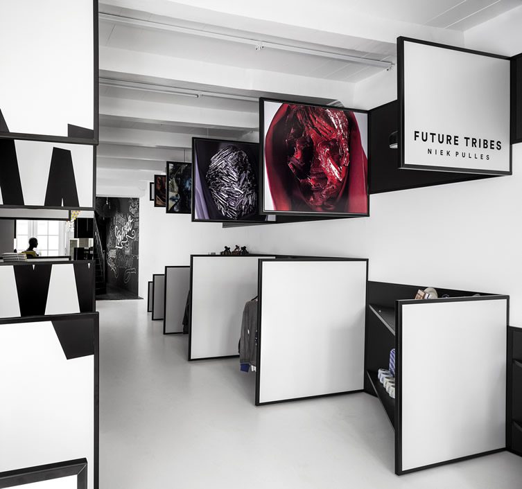
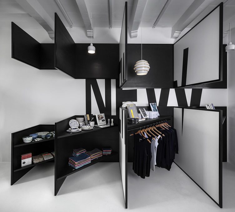
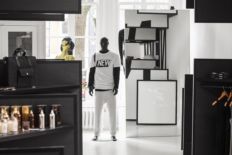
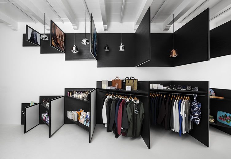
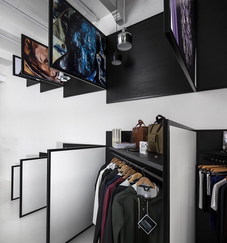
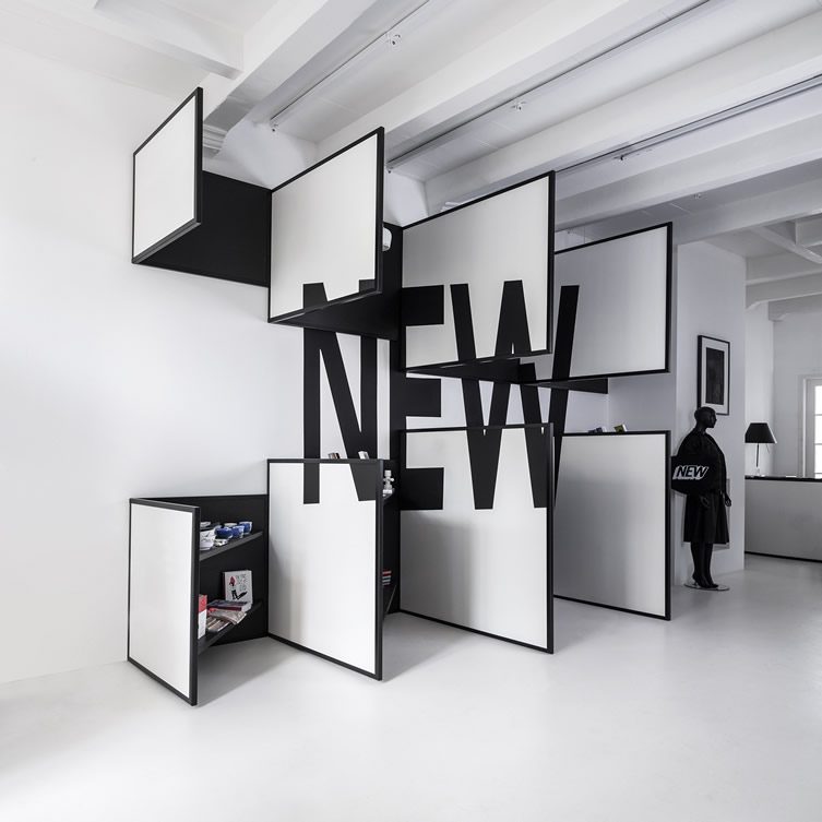
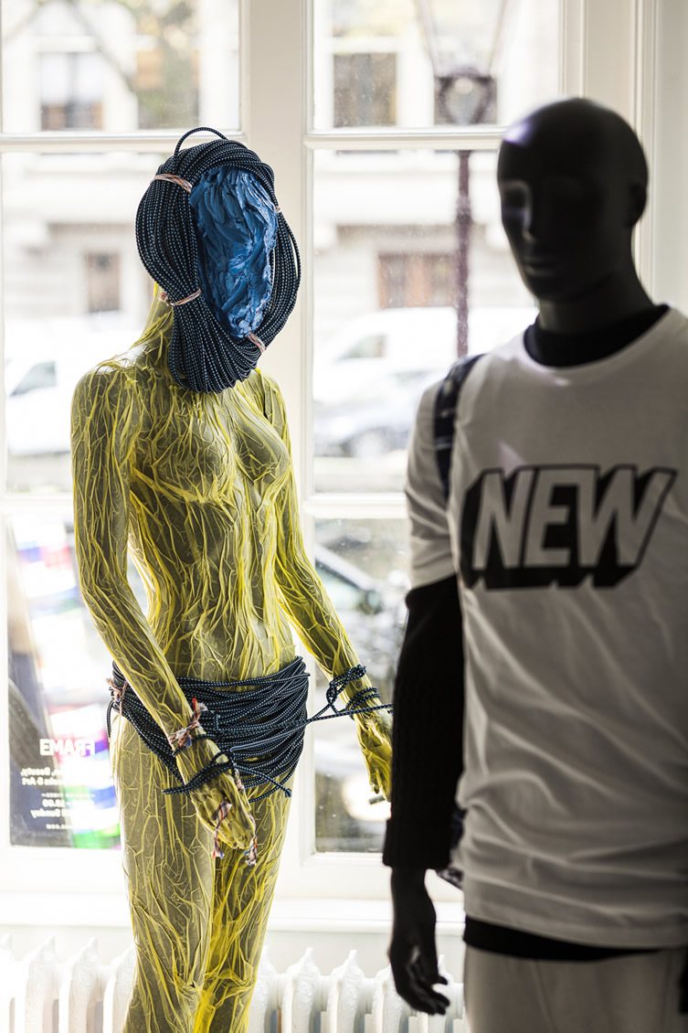
The shop has been designed as two spaces in one, depending on whether it is seen from the back or the front. Seen from the front, an installation of white panels and black frames floats in the all white space. Hanging from walls, floors and ceiling these panels intend to function as a white canvas, and the content applied to the replaceable canvases can be easily changed. Text and graphic art refers to the Frame magazine, and also enables visiting artists to completely take over the space; conceptual artist Niek Pulles presented a series of masks called Future Tribes for the opening seen here. Looking from the back, triangular shaped display boards in black stained wood show the products behind the front panels, creating a surprising contrast with the contradictory features of black versus white, square versus triangle and empty versus full.
Photography, Ewout Huibers


