With largely identical fleets offering same-same in-flight services, international airlines know that they must do their utmost to keep costs down by every means possible. Ticket cost is the number one concern for the majority of would-be customers, and to stay competitive in a cut-throat market, carriers must explore ever-more clever ways to reduce weight and squeeze as many miles as possible from their fuel loads. Clearly this cost-cutting is not always to the benefit of customers, but most — especially those who fly economy — are willing to grin and bear it and keep as much holiday spending money in their pockets as possible.
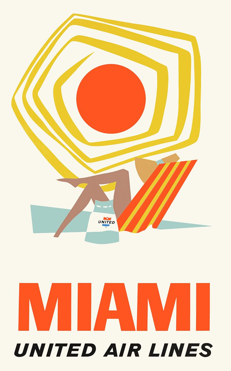
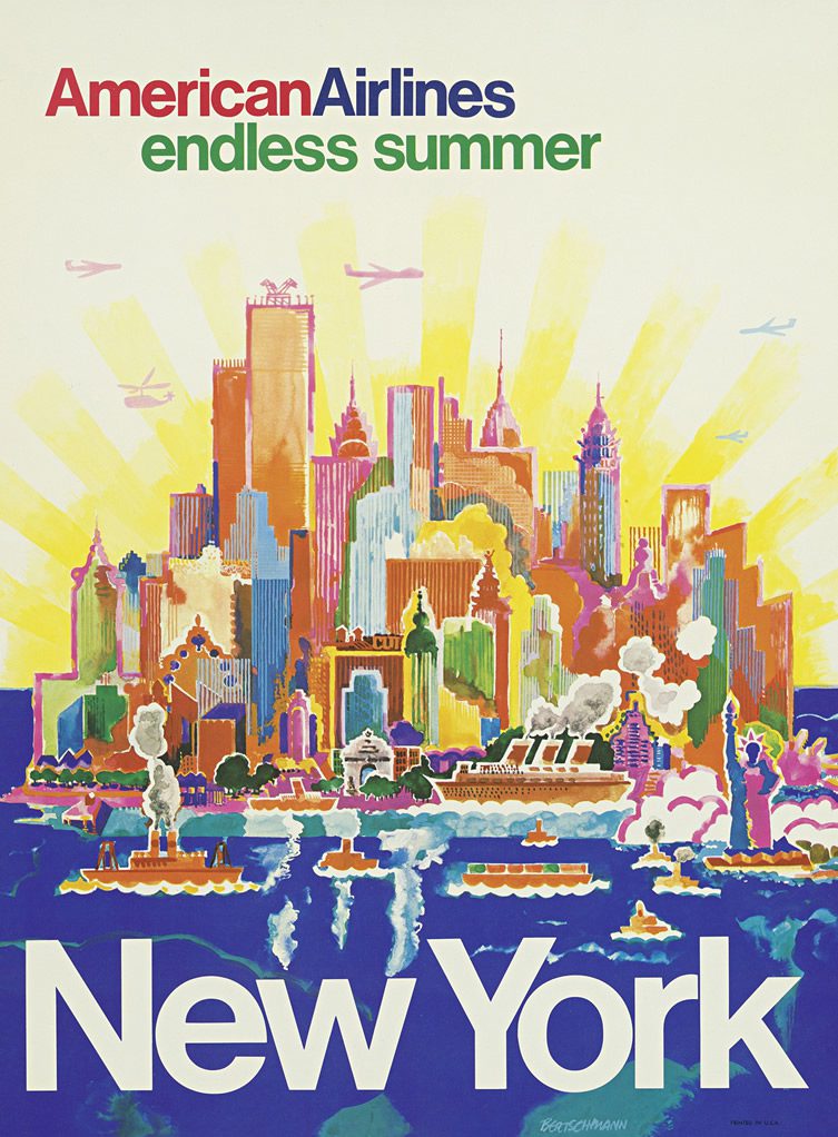
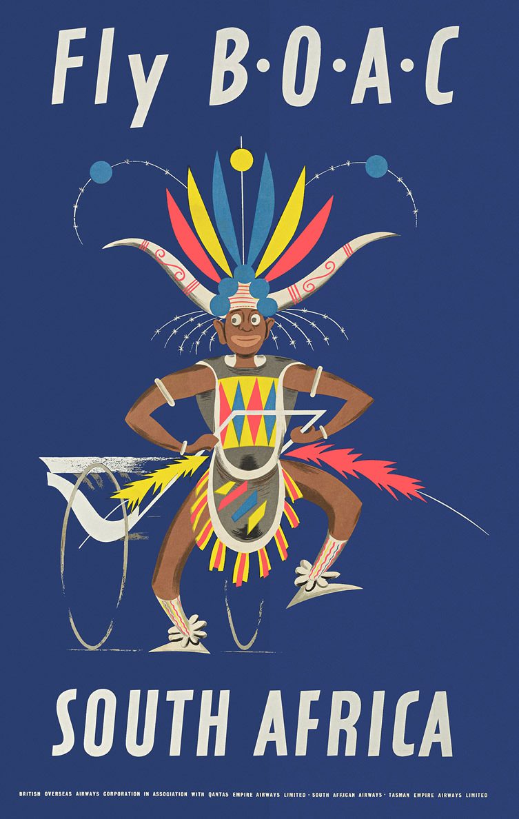
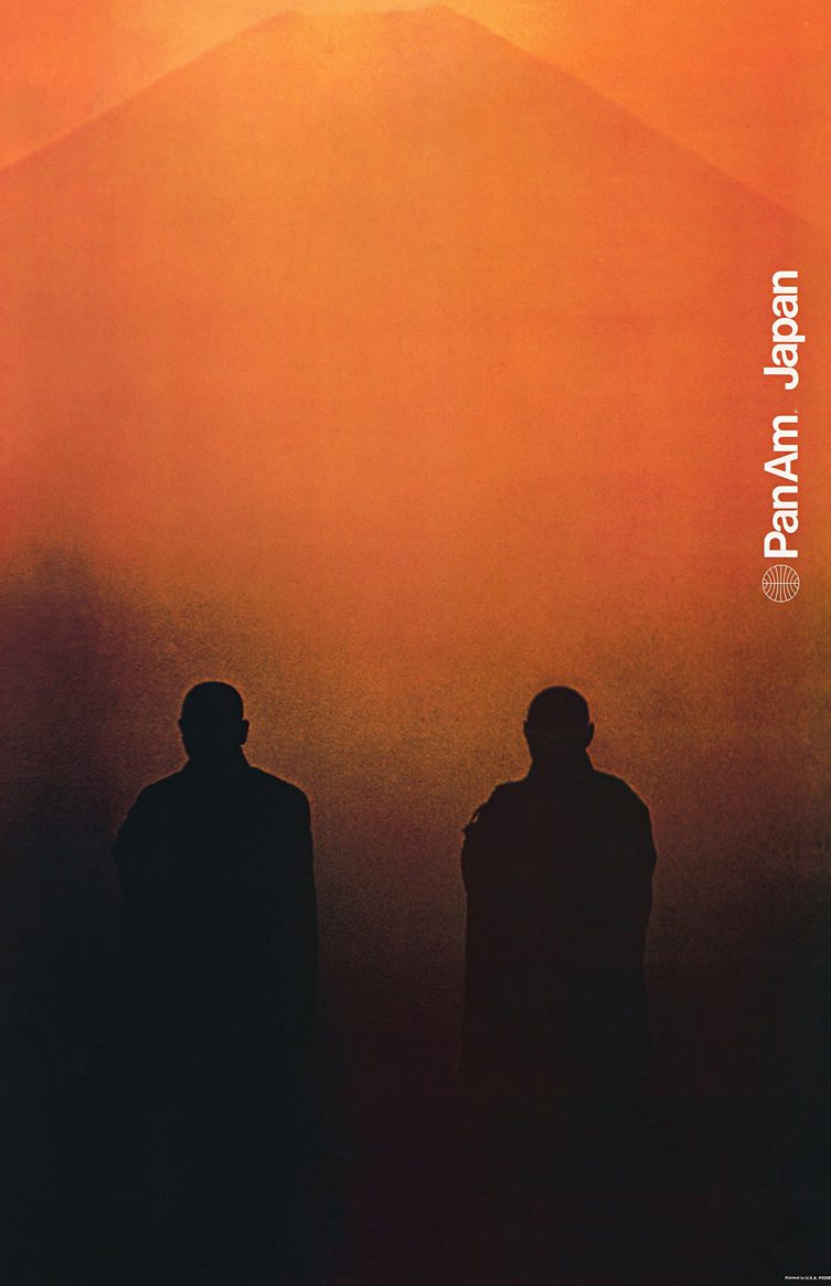
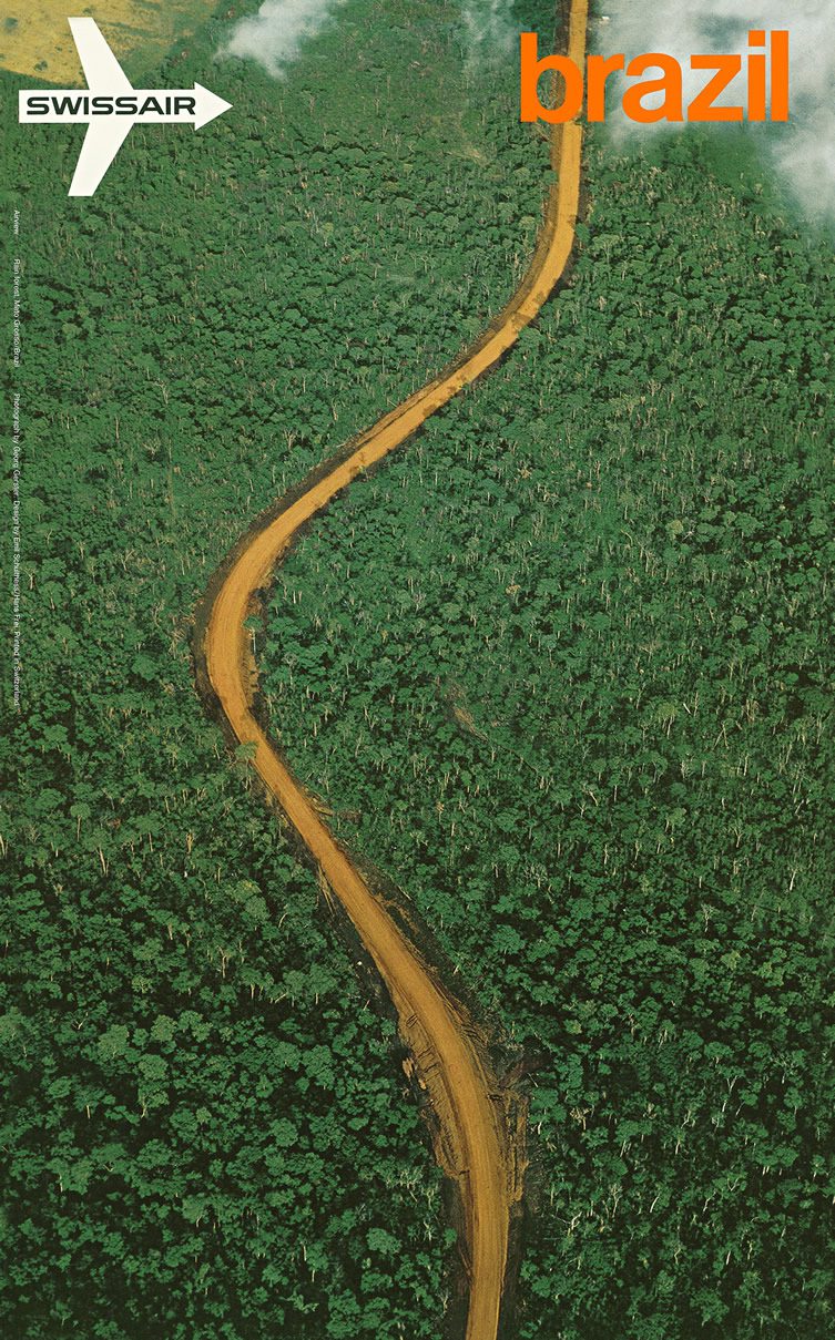
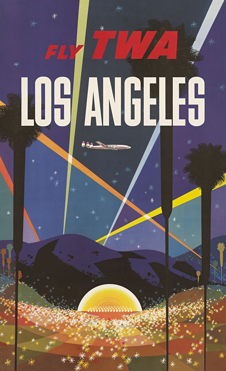
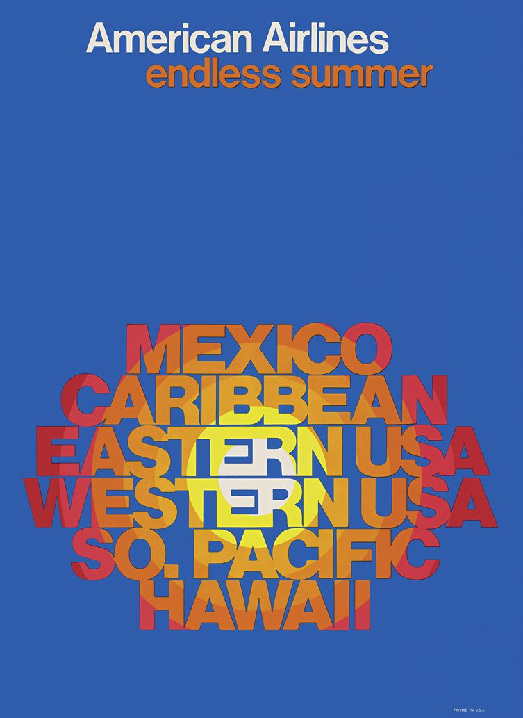
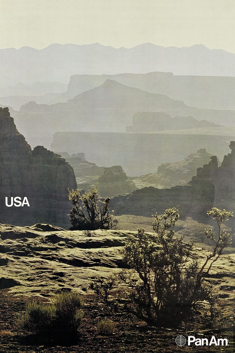
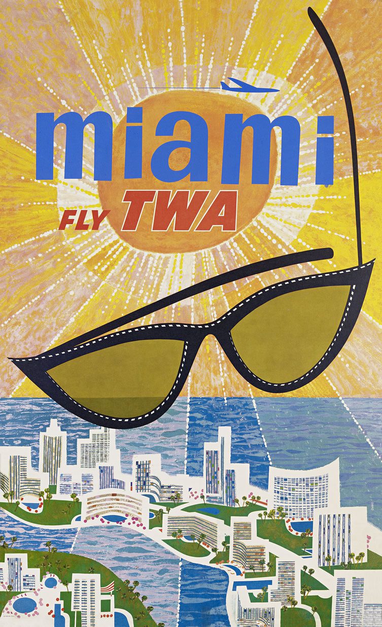
It can seem strange to modern passengers used to cheap and cheerful budget airlines that low prices weren’t always such a priority. In fact, in the early days of international flights, airlines promoted themselves on the level of luxury they could offer, selling the glamorous new mode of travel along with the exotic destinations as an enticing package. To capture the imagination of a young but adventurous market, airlines such as Pan-Am, American Airlines and BOAC employed the finest talents in advertising and marketing to create brand images and promotional material that would intoxicate the booming tourist sector with promises of sun; sea; sand; and a bit of the other too.
Matthias Hühne’s new book Airline Visual Identity 1945 – 1975 looks back at the glory days of air travel and the first wave of giant carriers, faithfully reproducing the work of industry luminaries such as Massimo Vignelli, Mary Wells Lawrence and Saul Bass. The effort that went into these pre-digital promotional materials was amazing; to recreate it, Hühne’s volume (made in collaboration with a team of authors, graphic designers, typographers and print specialists) uses seventeen colours, five types of varnish and two different methods of foil embossing and printing. A fascinating book for anyone interesting in aviation or retro design, it’s available from Callisto Publishers.
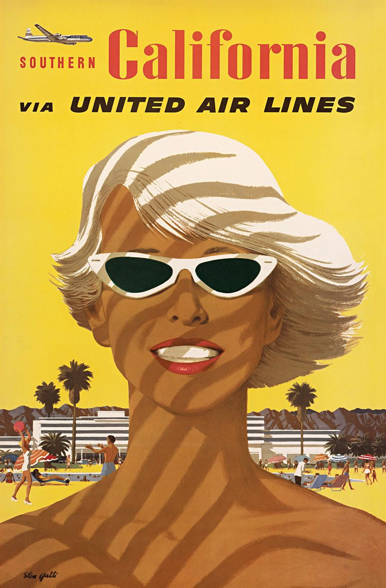
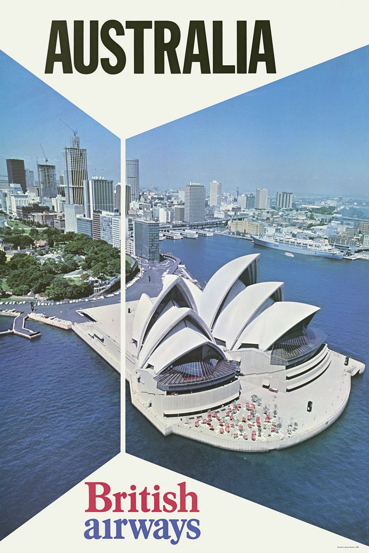
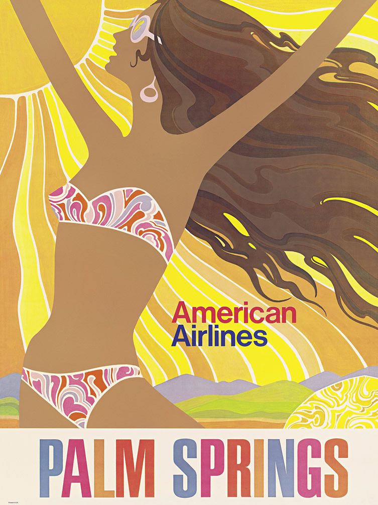
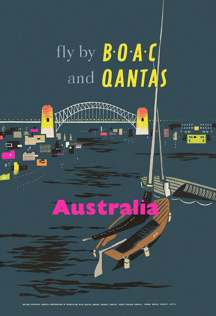
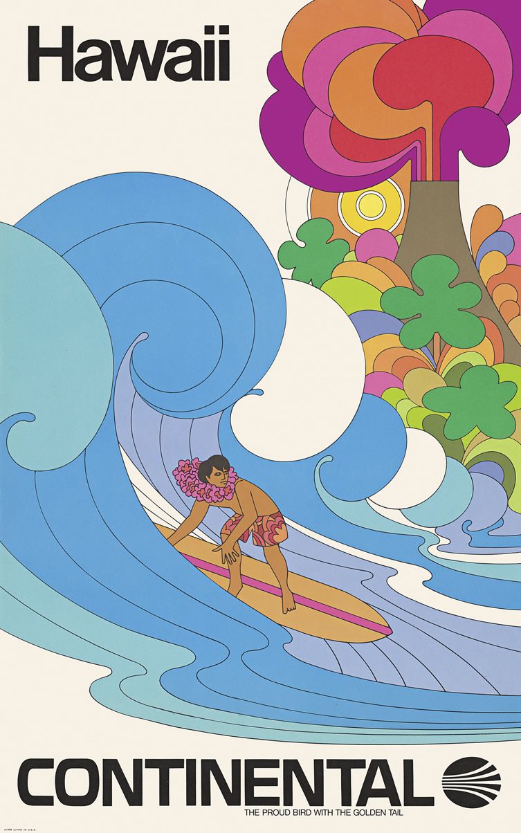
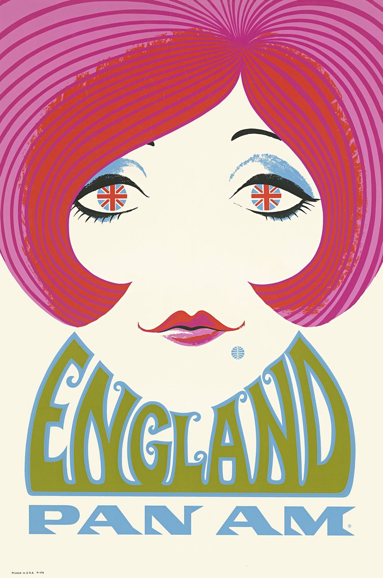
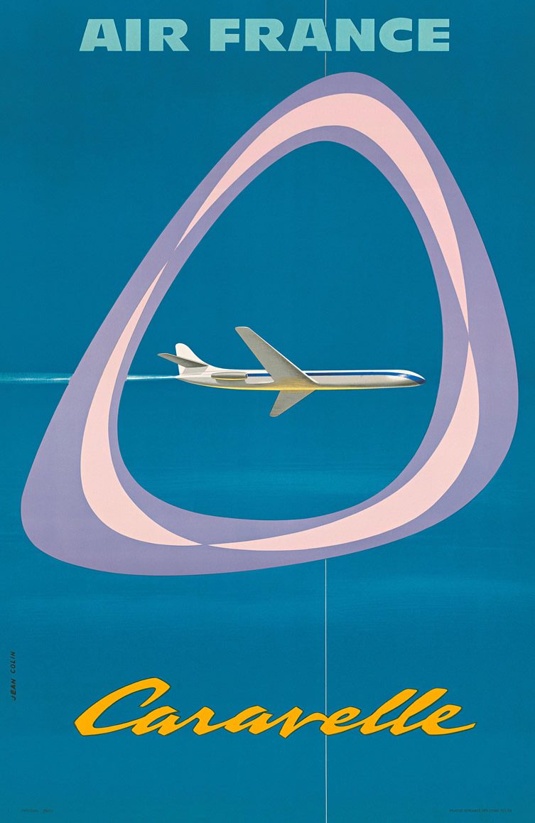
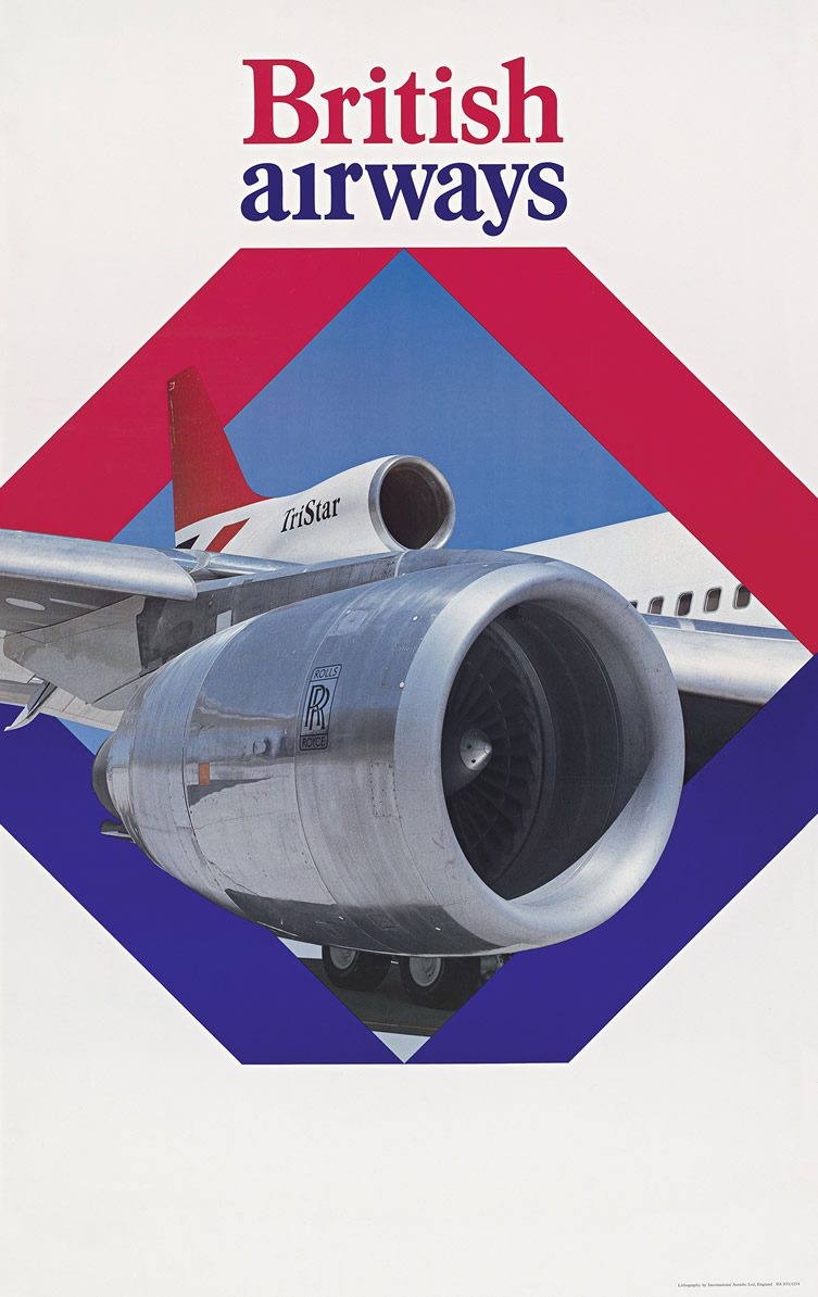
Courtesy, Callisto Publishers


