Ricardo Gonzalez left his native Mexico less than a year ago for new ventures in New York City. Within a short timespan, the letters he pens have reached many. Motivated by translating words into something that both simple and visually impactful, Gonzalez finds words others may overlook — a challenge he enjoys.
Both his work and personality exude positivity and good vibes, crediting family, friends and others within creative communities as the support that drives his work. Dividing his time between type design, education and the agency he works at — Sideways Inc. — Ricardo is constantly refining his craft. His inspiration is to continue to blur lines, explore, and to inspire others to do similarly with their lives.
Since moving to New York, what type of projects have you been working on?
Its been an unreal year for me. I am super grateful to have been in New York for less than a year and have had the opportunities and support that I’ve had. I wish I could work more. A lot of the freelance projects I’ve worked on lately have been with brands and agencies; creating logos, fonts and hand-lettering.
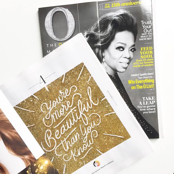
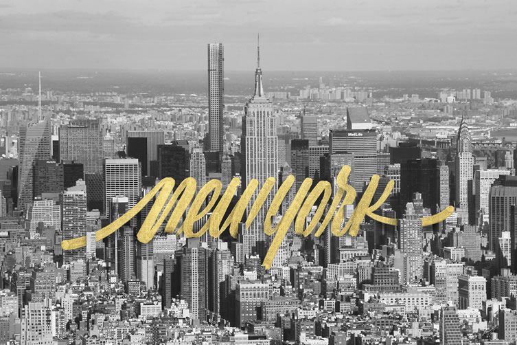
Oprah Magazine recently contacted me which was an unexpected gig. When I first got the email I literally jumped off the chair (especially because the lettering was going to be full page). The project was directed by Lauren Stine, and it took about a week to turnaround from concept to completion. I wanted to take a different approach — so I proposed gold glitter, which I thought would go so well with the phrase “You’re more beautiful than you know”. When the issue finally came out and it was in my hands, that was an amazing experience, not just seeing the work in print but also that I was sharing pages with many artists whose work I admire. The Oprah Magazine team were so great to work with.
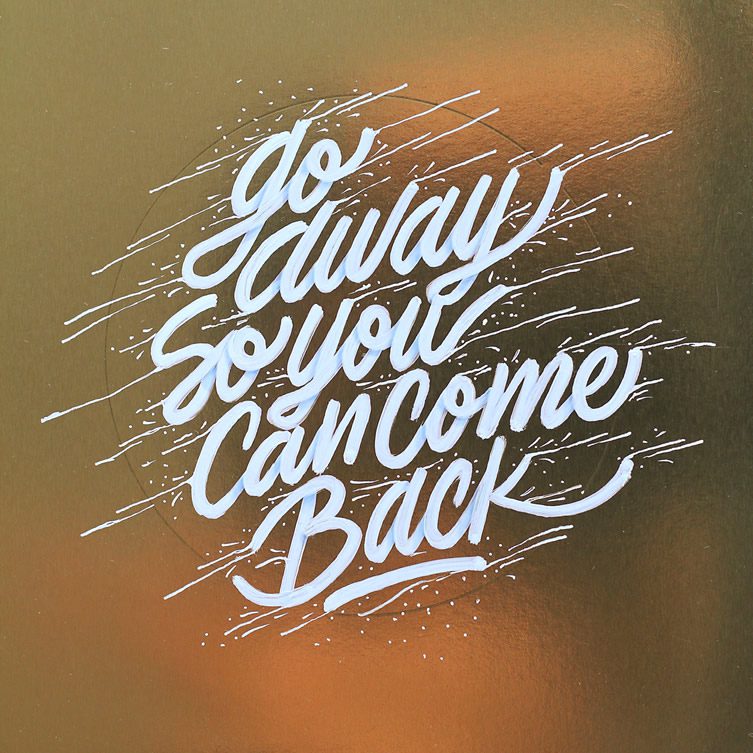
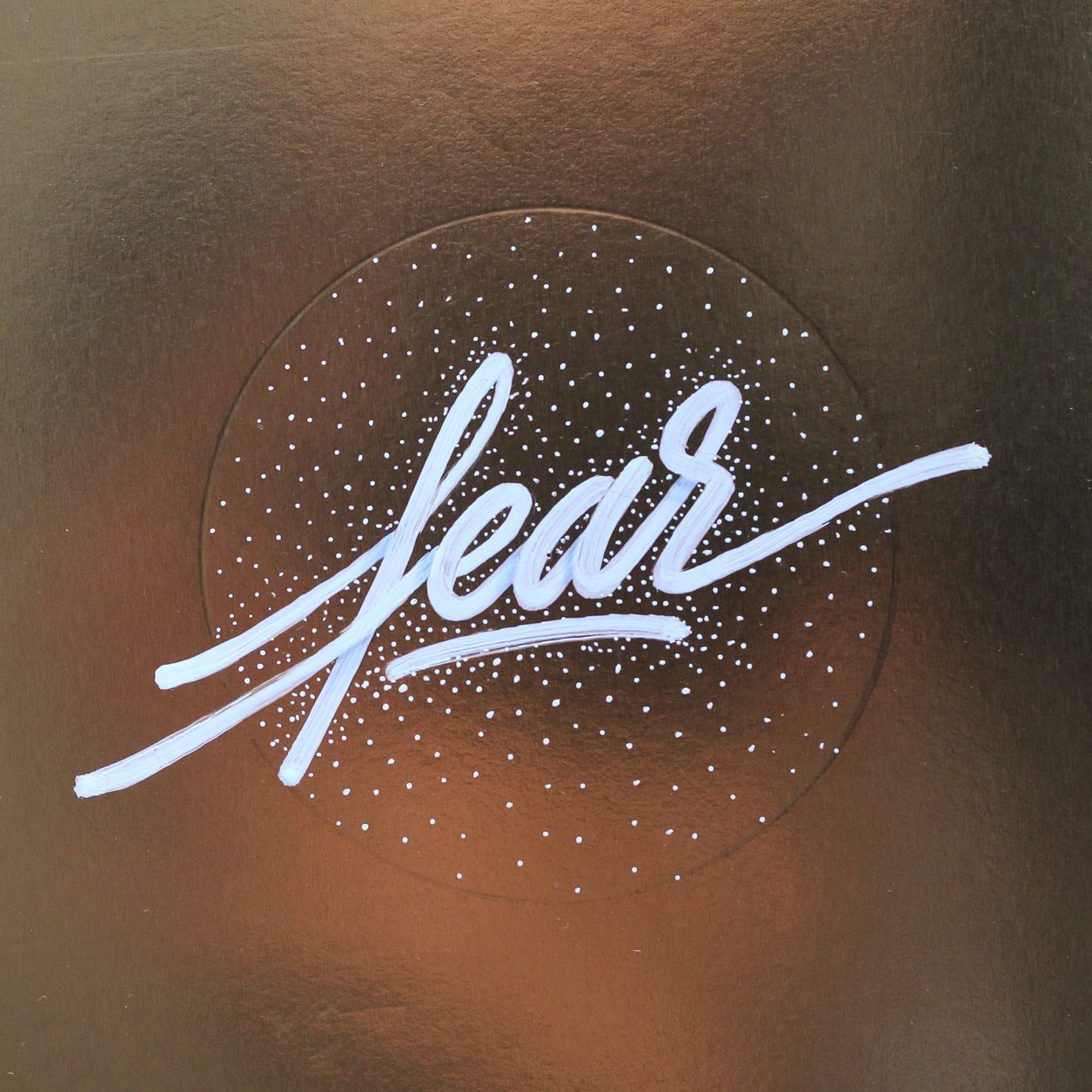
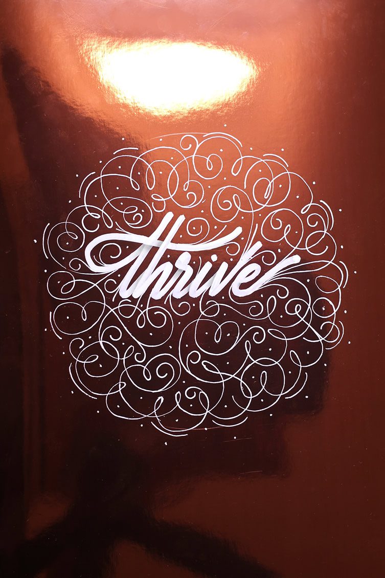
Recently I contributed to AIGA’s blog for a project called Quoted, where I selected five design quotes and illustrated them the way they felt to me. I love it when I have the opportunity to have complete freedom in what I do, and what made it even better was that it was for AIGA. This was a great opportunity to be part of a great community of designers and illustrators. (Thanks to Perrin Drumm for inviting me).
I’ve also been continuing to work with Krink — a long time supporter of what I do, and vice versa — on various projects that explore different surfaces and spaces. I’m ready to take on walls, and the environments they exist in.
What does “It’s a Living” (your website URL and Instagram handle) mean to you?
I have been working with type as a profession for a few years, but I discovered calligraphy when I was in middle school. Since then, I was always doodling on my notes — and graffiti has continued to be an influence. I was experimenting all of the time.
Its funny because around the time I was looking for a name, I was watching Coachella on YouTube. This was maybe 2011 and I was watching Death From Above 1979 play. I noticed the drummer had “it’s a living” tattooed, and it resonated with me. I wanted to do everything I loved. I wanted to travel; skate; make work, and for it to all connect. One of the best things in life is to do what you love for a living. It’s simple but meaningful and not just for me, for everyone. My hope is that people can connect with it.
You recently worked with MTV on the 2015 Movie Awards, how did that happen?
I was commissioned by MTV to create their tagline for this year’s Movie Awards. My lettering was designed for their promotional videos, which I was stoked to see air. This was something new for me, so I enjoyed exploring the idea. The tagline was “Winning is Everything” — so there was a lot of freedom throughout the process. Their art direction was on point, and they were fun to work with. A big thank you to Michelle Fonseca and Noah Phillips for that opportunity.
What has influenced your style?
A weird mix … somehow I manage to merge my interests and draw inspiration from them. I started to do calligraphy on my own earlier on in life. I was lucky in Mexico that this was taught to us, starting in elementary school. I never thought it was a profession, so I just did it because I enjoyed it. I was also exposed to lettering through my grandfather — after seeing photos of his work in the 1940s and ’50s.
I studied graphic design in school, which gave me structure and sharpened my technical skills. As well as having the opportunity to go to school for typeface design and attending workshops.
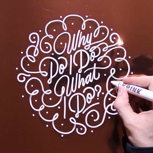
Some of the tools I use to create come back to graffiti and how it has influenced me over the years. I also like to experiment with the combination of digital and analog; handmade and contemporary. People also don’t realise what goes into the post production side of the work before it goes digital. The photography; lighting, etc. — I try to combine many elements when I produce work.
For example, I really love gold and the history behind gold leafing, I can’t typically work with real gold, but I find ways to introduce it into a piece. Last year, I worked with BingBang NYC, where I was able to work on a 14K necklace as well as some other fun accessories and artwork. Working with them was an opportunity to do something completely different to anything I’d experienced before. The unexpected. I loved how it turned out.
You’re a big fan of graffiti — were you inspired by what is happening in Mexico, or here in New York?
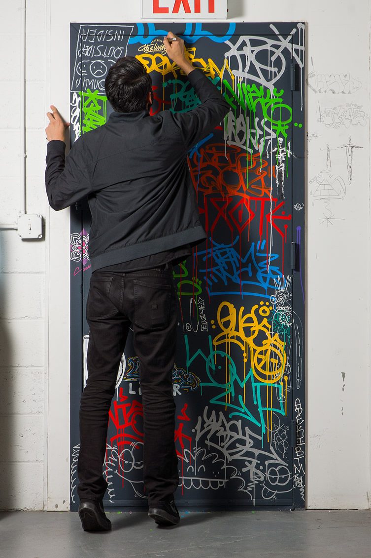
For me, when I got into graffiti, it was with some friends in Mexico. I always liked tags. It was seeing photographs from New York though, — the drips; the doors; the texture — that has inspired me and the work that I’m making now.
Which designers and/or sign painters have been influential to you over the years?
I have so many people who have inspired me and influenced my work — the list is super long but, at the moment, I love the work that Commercial Type produces: Christian Schwartz; Paul Barnes; Greg Gazdowicz and Miguel Reyes, who’s my good friend and kind of my mentor. Ken Barber is also a huge inspiration for me, he is one of the very few people who can do any style of lettering and also design typefaces. Donald Young is just a legend who deeply inspires me. Also I love the work of Roger Excoffon … he was a french typeface designer, an artist and an ad man.
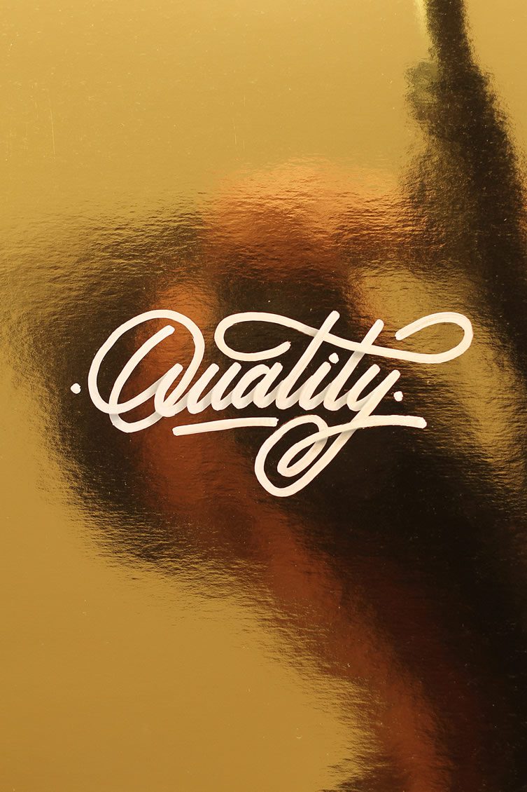
Instagram has been a great tool in terms of accessibility, discovery and sharing. Do you feel this has been a positive outlet for your work?
Mostly yes, but Instagram has been more a way to share what I do and meeting other designers/illustrators … even friends. I have been very lucky to have such a strong following, and to be part of a huge lettering/calligraphy/typography community worldwide — all because of Instagram. I also have a lot of people reaching out who find my work through Behance. The difference is, on Instagram I post what I love to do, whilst Behance showcases the more commercial work I do as a designer.
Immediate or future, what’s happening?
I recently joined Art Directors Club, which I always wanted to be a part of since I was in Mexico so, for me, coming to NYC and becoming a member and participating has been one of the greatest experiences. They are super supportive with all of their members, and the ADC crew have amazing ideas … they’re very passionate. We all went to Miami for the ADC Festival. It’s always a good time, as well as connecting with others in the community.
After Miami I had the opportunity to speak at The Typers, a series of talks in Pachuca, Mexico about trends, information about what is current and happening in lettering/type/calligraphy around the world from our point of view. It was great to be around some incredibly talented designers: Panco Sassano; Alan Rodriguez; Jonathan Cuervo; Andres Ochoa to name just a few. There’s so much crazy talent in Mexico, and it’s important for me to support and encourage others. Hopefully this is the first of many conferences I can participate in.
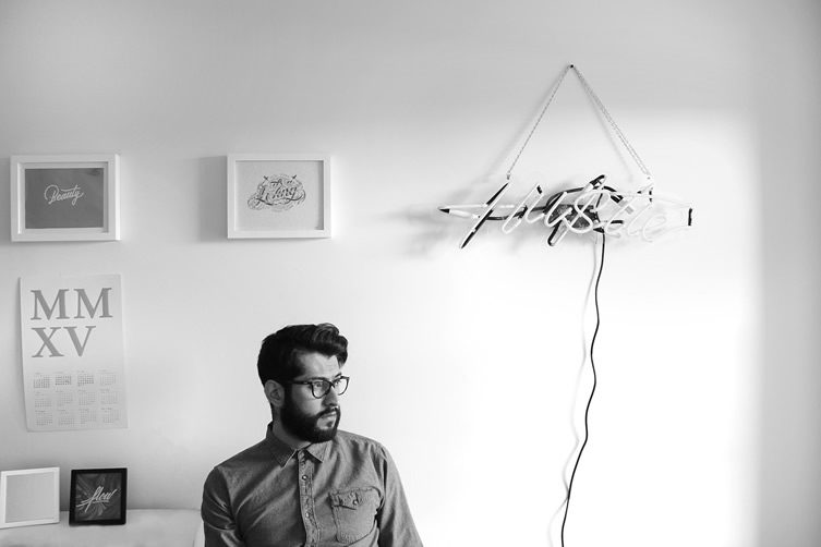
I’ve collaborated with Good Fucking Design Advice at Beam Brooklyn on three big posters, 4 x 6 ft and featuring three custom GFDA Advices that we selected and turned into lettering. There was a great turnout at the launch party … a lot of fun, and the amount of attention it got was amazing.
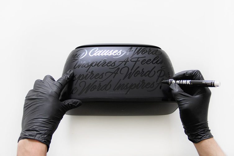
I have been working with Krink and Bowers & Wilkins for a very cool collaboration too, I got to paint a Speaker AM1 using Krink markers — however I wanted. I had the idea of covering the speaker with lettering. The words came from a interview with my favourite band, Beach House, and their lead singer Victoria Legrand: “A feeling causes a word. A sound inspires a feeling, which inspires a word, perhaps. The word inspires a vision.” I always loved this quote, seeing as it makes so much sense in what I do.
I just want to keep working with amazing people…


