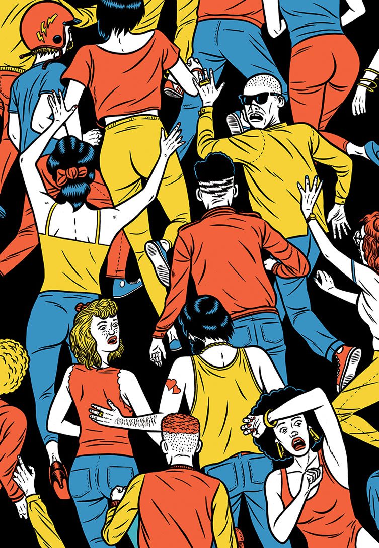
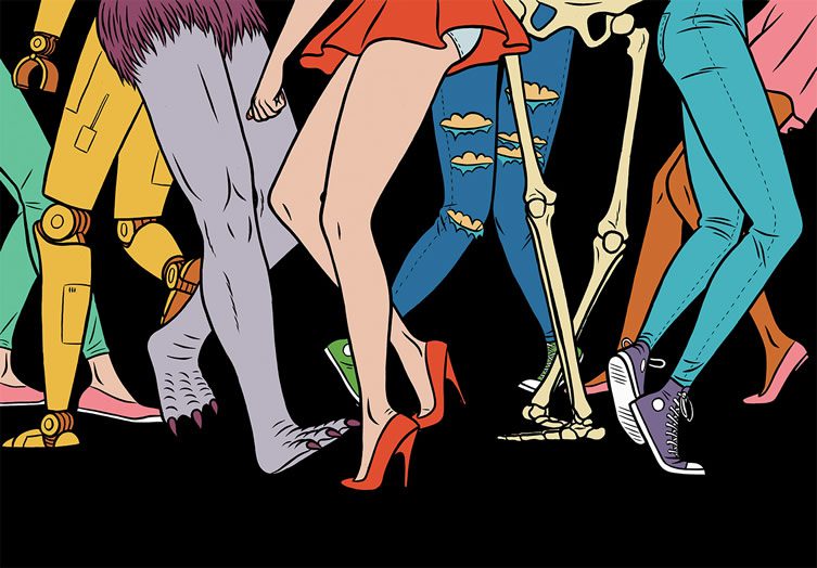
Against the black background of a nightclub a cluster of comic-book hands wave in the air; the revellers’ bodies aren’t shown, but it’s clear even with our limited view that one is a skeleton, another an android, one kind of lizard-creature, and that one is a human smoking a cigarette. Another example: the swimsuited lady from the art of a thousand 1950s ads and magazine covers smiles at us while lounging on a surfboard. It’s a perfect, seductive image; the only problem is that she’s also on fire.
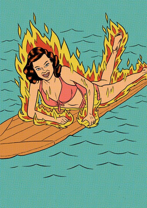
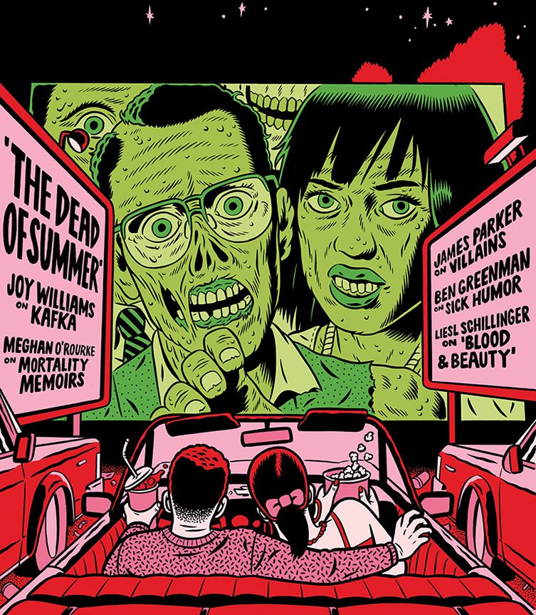
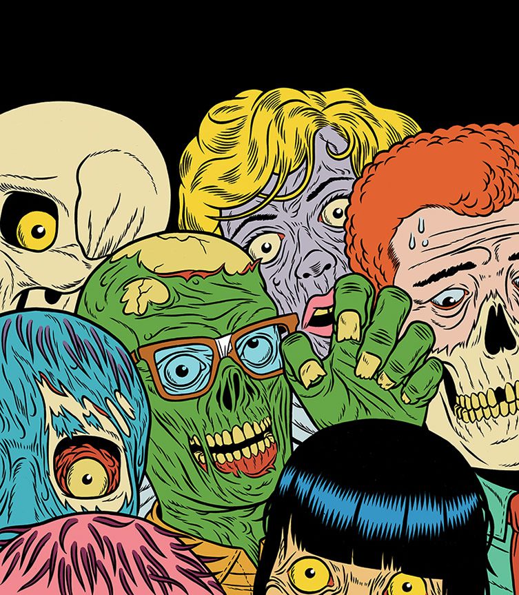
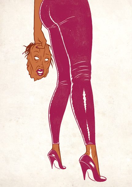
These are only two examples of Norwegian Kristian Hammerstad’s darkly amusing inversions of the tropes of 1950s American comic-book art. I’ve seen his work described as riffing on upbeat series such as Archie and the innumerable romance comics of the period, but it seems to me that his interest in those is more than matched by his fascination with the 50s’ equally prevalent horror comics.
‘I’ve actually never read Archie comics,’ he admits when I ask him about this, ‘but horror, sci-fi and fantasy have always been big influences on me. I guess I draw in a sort of classical comics or illustration tradition with brush and ink and clear colours, which is often associated with something of a bygone era, so I guess I am influenced by the ‘silver age’ of comics.
Like Jack Kirby or even earlier stuff, like Will Eisner. But also modern artists like Charles burns, Daniel Clowes or Mike Mignola or Moebius. It is nearly impossible not to reference all the great art that has come before.’
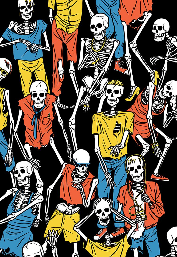
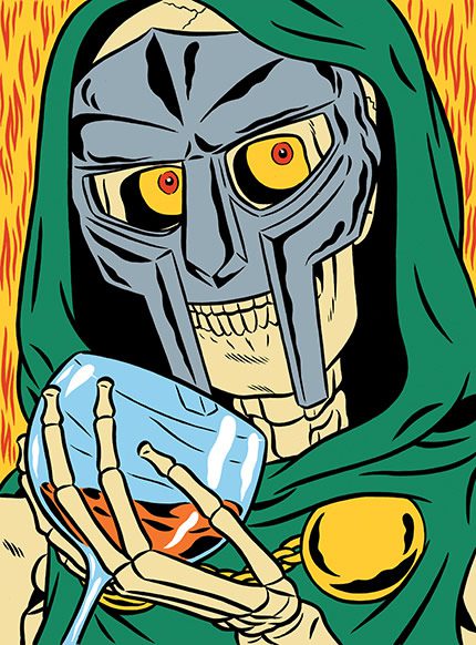
Would he describe his approach as subversive, I wonder, or homage? It can be difficult to tell.
‘I don’t know if subversion is something I consciously try to do — it’s all about context. I’m not really into parody or irony, it’s more about really liking something and having fun with it.’
There’s also something more than ‘fun’ going on in the images — often, in their blending of nostalgia, unease, affection and empathy, the images have a deeper resonance than his playful description of his process suggests.
‘Well, the world is a horrible place, but there is also so much fun and excitement. Humans just come up with the weirdest ideas and concepts and make them work. Or it doesn’t work, and it all goes terribly wrong. There’s a sort of tension about the human experience I think is very well reflected by ‘horror’ or ‘the weird’, an expression of how on the cusp of the future things could be either utopic and lovely or dystopic and horrifying.’
He’s a Norwegian artist based in Oslo, but there does seem to be something overwhelmingly American about his aesthetic. Not that that’s particularly unusual worldwide, but what’s the particular story here?
‘Norway has always been a very provincial country and post-WW2 the US has had such a strong pull in terms of culture. Just thinking of art, cinema and music of the last 60 or 70 years it would be strange not to be influenced by America. I love so many aspects of it. On the other hand, European culture and thinking is obviously also very strong in Norway. So it’s a mix of ideas. I guess maybe my work reflects an admiration for American culture, but from a European perspective …’
How unusual is that in Oslo? Is he part of a community of like-minded artists, or does his approach and set of interests set him somewhat apart?
‘I guess my style of drawing is considered more ‘American comics-looking’ that what a lot of other people are doing here, but I still have great discussions about work with my peers here. To me it is mostly about the ideas anyway. There are Norwegian cartoonists and illustrators that are very influenced by Hergé and the French or Belgian ‘ligne claire’, so it’s the same thing, just different tools. Plus, of course, as well as being hugely influential the US is very influenced by Europe and the rest of the world, so it’s an endless feedback loop. Which is great!’
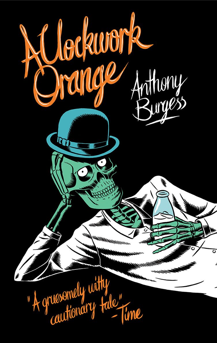
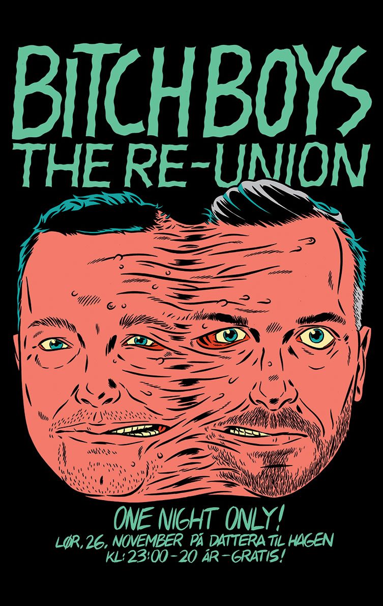
He works in quite a range of different formats, if not styles: graphic novels, illustrations for the New Yorker and many others, book covers (his A Clockwork Orange is particularly striking), gallery shows. Is there one thing that he prefers?
‘Like I said before, I like to think the ideas in the picture are always going to be more important than style — style is good for reference and context, but you often need more. A picture has to say something interesting or it’s just not going to work. In terms of doing different things, I feel like it’s really just up to me. If I want to do a comic book, I’ll do that. Or a small gallery show. It helps keeping things fun and fresh. It’s really important to me to stay curious and keep checking things out. If I didn’t have time for that I would be depressed!’


