To make your exhibit at a trade show impactful, you need to give participants a lasting impression even after the show’s done. How to do this? Beyond presenting some great concepts and products, you want to make your exhibition stand truly unique.
Some of the most successful exhibitors in any industry know this. They’re the ones going above and beyond to be seen as leaders, with a unique flare and memorable visual experience for participants.
When we consider the point of a trade show booth, it is really quite simple:
To have a physical space where you audience can interact with your brand, with the overarching goal to lead to more business through sales (and partnerships with other brands).
But what makes a physical exhibition stand unique?
1. It grabs attention
2. It expresses the brand’s personality
3. It answers the question, “Who are we, and what do we do?”
Lots of businesses can grab attention (#1), but they struggle to stay true to their brand (#2). Catching attention is easy. Toss up a big, flashy booth, get your team to wear wild outfits, and you’ll turn heads.
But doing it while staying true to your brand and expressing key information that the audience needs to know? That’s the real challenge.
Here are some great stand designs that hit the mark when it comes to unique visual displays. For all those budding trade show exhibitors, take note, as they’re great inspiration for your future booth designs.
Zipgrow’s Seamless Display and Demo
Take a leaf out of Zipgrow’s book (once Bright Agrotech), the brainy startup into vertical farming gear.
They nailed it with an expo wall that’s a great product showcase and a live demo rolled into one.

Pulling off a move like that, you’d be cutting down on materials means giving the exhibition company less of your hard-earned money. It’s a win-win.
Theme-Driven Exhibition Stand
Fernleigh Design created an exhibition booth promoting fresh and organic Welsh produce with a charming country-style setup.
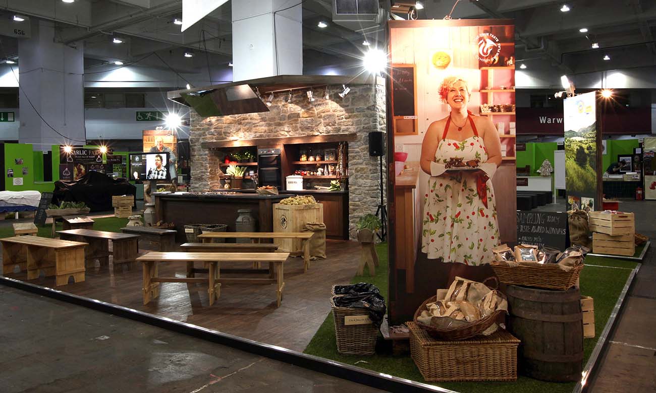
Their emphasis on locally sourced, organic ingredients shines through in every aspect, from the presentation panels to the exhibition furniture. And that creates a welcoming atmosphere for the attendees while letting them know what the business is about. Key takeaway: Stick to your theme and make what you’re selling crystal clear.
Attractive & Interactive Booth
Nature’s Path sets a new standard with its exhibition stall, breaking the mould with a standout and interactive treehouse display where you can actually go climbing.
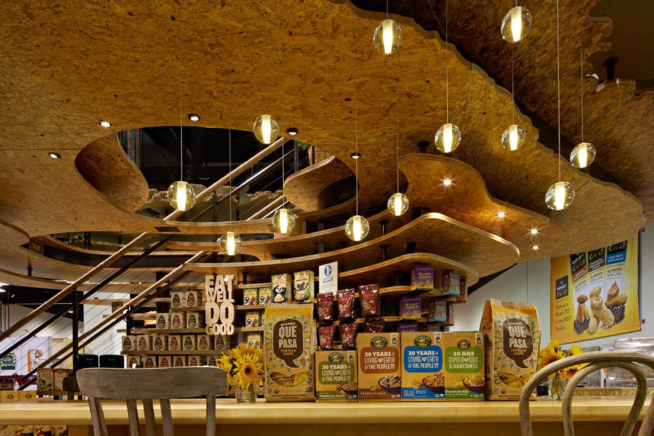
They’ve used eco-friendly materials to hammer home their commitment to sustainability, making the whole setup a statement of their green focus.
A Simple Yet Elegant Design
A minimalist design remains both graceful and unique. Check out this stand by Novel Ingredients. They’ve set up these neat private conference rooms for one-on-one chats with the trade show reps.
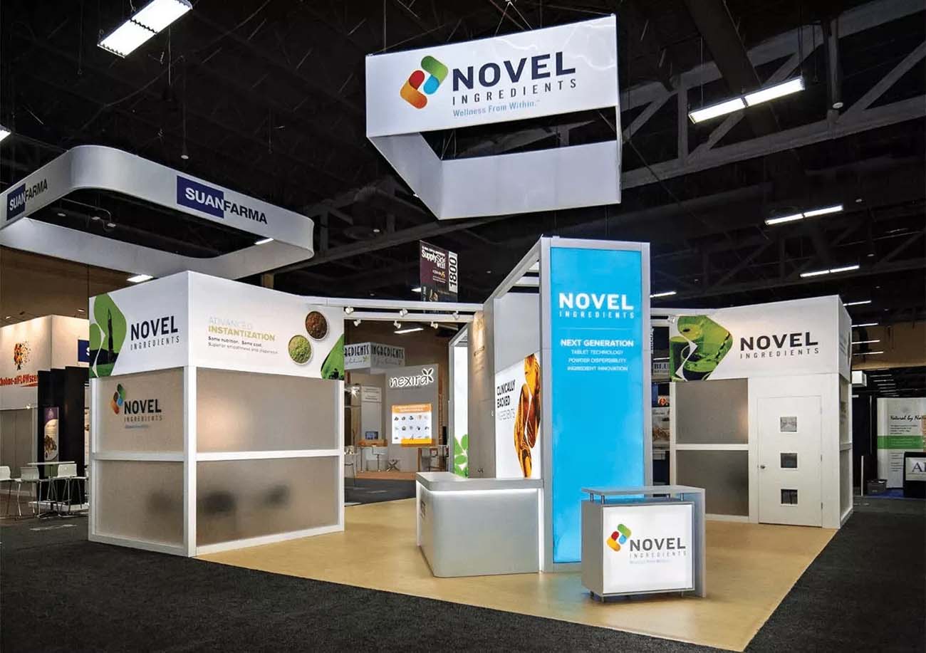
While a few of the team engage people at the booth, the open areas are decked out with branded furniture and LED walls to get the visitors interested in the brand and products. It’s a great design, focusing on real conversations about the brand.
Maximising Impact in Limited Spaces
E.C. Carpet’s exhibition booth does well at leveraging limited space. They couldn’t spread out horizontally, so they went vertical. E.C. Carpet created a floor-to-ceiling carpet effect with a custom exhibition wall to make their spot suddenly look a lot bigger than it really is.
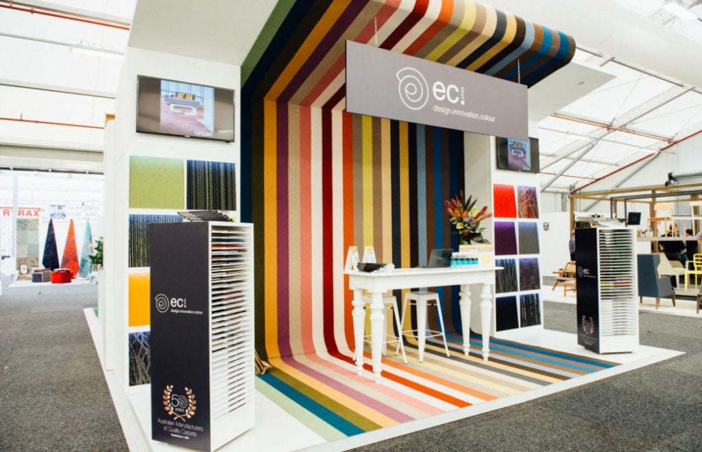
They also mixed in some bright colours with white to give it that extra kick. It’s simply brilliant.
A Touch of Light
Lighting can really elevate the whole environment of your exhibition stall design. See Fasetto LLC’s exhibition booth at the 2017 International Consumer Electronics Show – it was already stunning with its huge, well-designed space and a 20-foot sculpture.
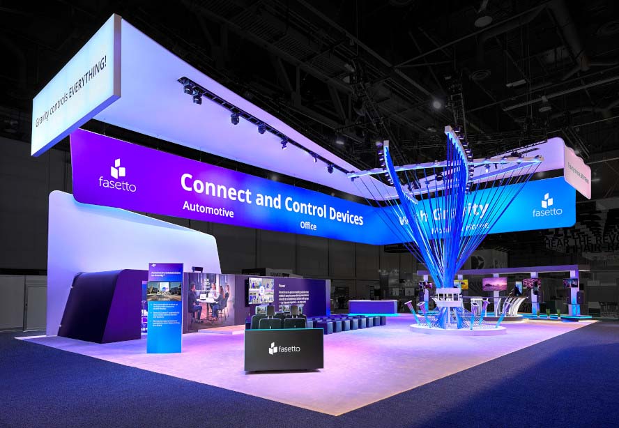
But what really kicked it up a notch was the purple lighting. That hue made the whole exhibition pop, making the booth feel richer and more alive.
Simple Idea, Exceptional Implementation
A basic idea can be a big hit with great execution. Take SplashTacular, a water slide manufacturer from the US. Their concept was as simple as making you feel like you’re inside a water slide.
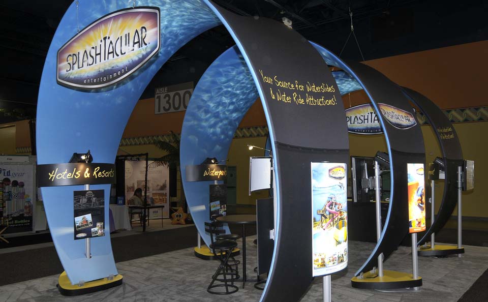
They created their booth with consecutive, cylinder-like arches and added water reflections on the roof. Result? It feels like you’re cruising down a massive water slide, maybe even surfing a wave.
Leverage the Tech
Utilizing tech in exhibition stands is, of course, getting more and more advanced. A great example is the Wonderwall – a massive LED digital screen with a hundred million pixels made by 2LK for Intel.
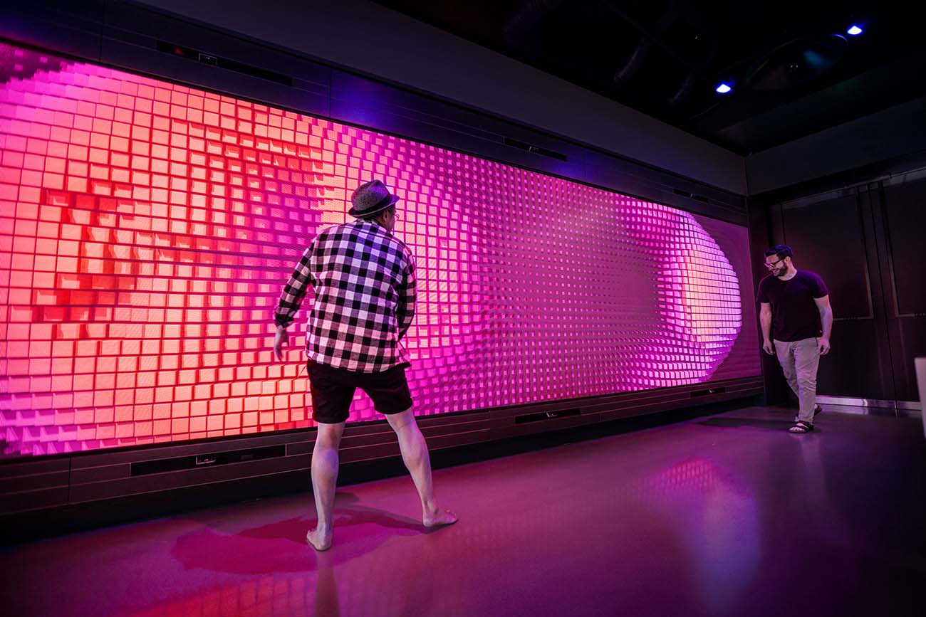
It has motion sensors that pick up on the crowd’s movements and spit out cool effects based on what they’re up to. The team at the booth used it to showcase their presentation to the fair attendees.
Now, you don’t need screens as big and flashy as the Wonderwall to grab attention. Even a video presentation can draw in the crowd and get them interested in what your company’s all about.
Look Beyond the Surface
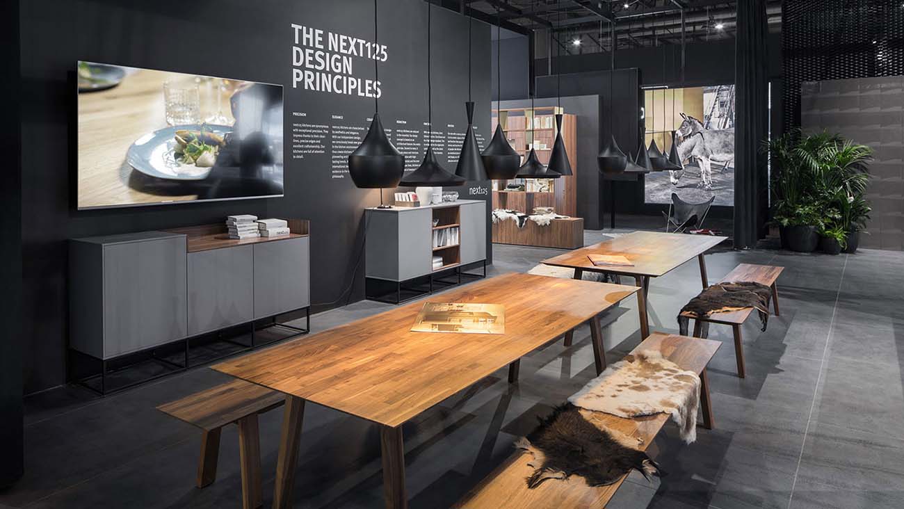
Never judge a book by its cover. Check out the Schüller Möbelwerk exhibition stand by Dart – it might look simple and modern on the outside, just a bunch of bright cubes with the brand logo.
But step inside, and it’s a whole different story. You’re hit with a dark, fancy, and classy kitchen and dining room setup.
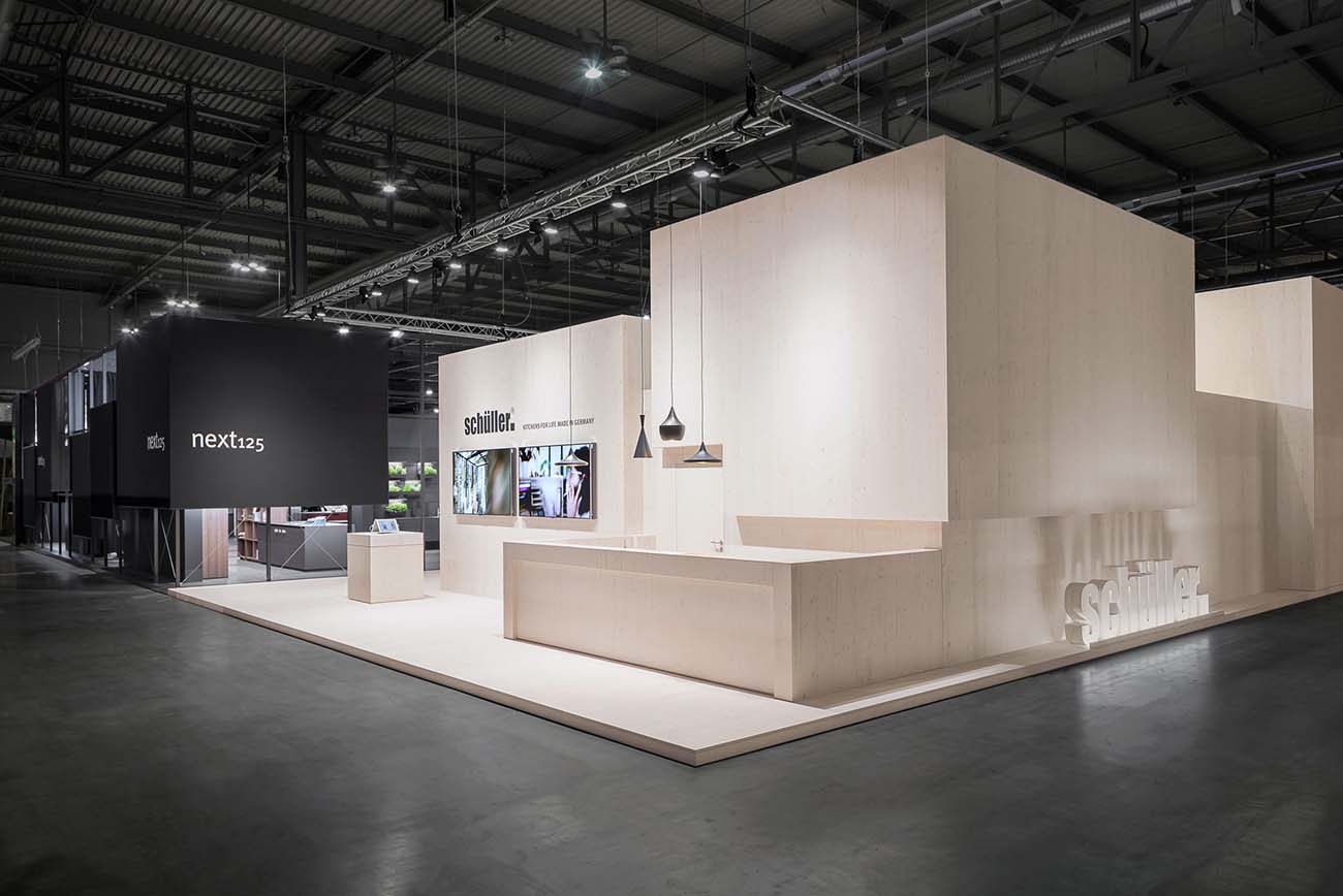
Black walls with a matte finish, black powdered aluminium structures, and slick wood furniture give it that luxurious vibe. It’s the kind of design that piques people’s interest, making them keen to sneak a peek inside the exhibition.
Wrapping Up
Even seasoned exhibitors can struggle with booth design ideas. When you’re attending shows, swing by other exhibitors and snag some inspiration from their setups.
Always have a plan B, and maybe even a plan C, just in case things don’t pan out like you thought. You might not need them, but having backup plans ensures everything runs smoothly.


