Set designers and prop makers, design duo Anna Fulmine and Victoria Shahrokh – who go under the fabulously comic-book moniker of Lightning & Kinglyface – are masters of their craft, and ascending quickly to greatness.
With a diverse portfolio of work for the likes of Wallpaper*, Harrods, Nike and Swarovski building up behind them, the pair have also found time for their own high-concept artworks and curiosities – along with designing installations for Topshop, V&A and Zaha Hadid, amongst others. Impressive, no? We caught up with them to find out more about their mesmerising work…
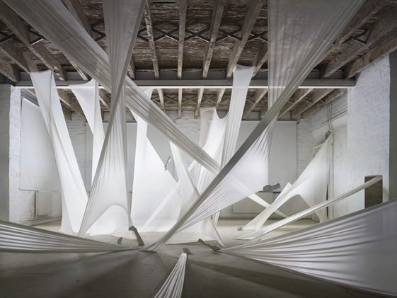
Photography © Thomas Brown
What’s the history of Anna and Victoria – what were you doing before the partnership, and do you still work on personal projects?
Our story began at University in the suburban, misfit, chavfilled town of Epsom. I nervously spent a week preparing a speech to approach Victoria about a collaboration which included key words like ‘giant hair puppets,’ ‘staying up all night working on wooden automata.’ She couldn’t resist. Fed up with our Graphic Design BA we were both itching to get outside of our sketchbooks and make short films, installations, rooms full of puppets with interactive projections.
We wanted more than our course could really offer us, yet we knew we wanted the outcome to be presented in a clean and graphic manner. Little did I know that Victoria was actually as naturally ‘geeky’ as me, some may say more so. When we started we had no idea what we were doing, we would just meet at Victoria’s house and essentially pour a lot of dangerous liquids into containers and see what we got. The worst example was a resin cast of a head that to this day lies gloopy and wet in a box somewhere stinking out the studio.
At first we did work on our own projects but realised that what we do requires two pairs of hands: one person to hold the ladder the other one to climb it and our work was too exhausting for a one man band. We need each other to spur the energy required to make bigger work and we encourage one anothers ludicrous ideas.
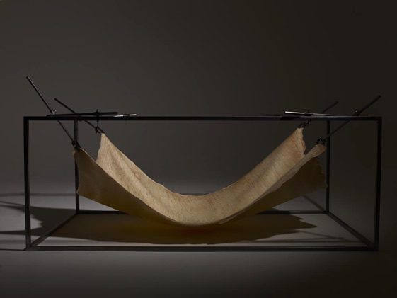
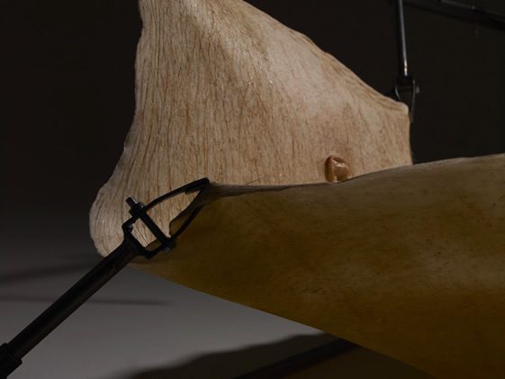
Photography © Beth Evans
You’ve worked for a whole host of clients, small to large, creative to corporate… does a bigger budget, or more creative client, provide more freedom, or simply greater challenges?
Often we find that the bigger the client, the greater the pressure, however it’s not necessarily these clients who pose the most taxing challenges. It’s normally the small jobs that get us into the most compromising situations, maybe because there is less hierachy of mediators to stop the ridiculous from happening. Once we did a low budget job which ended with me finding Anna nearly toppling off a 6meter ladder into an Old Master painting at the V&A. I often think back and wonder how this could have been allowed to happen, and more importantly, would our insurance have covered it?!
It appears that the more corporate things get the more protected you are, signing forms, wearing hard hats and writing method statements on how you plan to lift a heavy object. Then when we are left to our own devices all sensible approaches go out of the window and we are mixing toxic chemicals and brandishing power tools around the place without a care in the world.
As for having creative input, it really depends on the nature of the client, the industry is small so building up trust by doing a good job means you can slowly inject more and more of your own tastes and preferences and get away with it. You have to rely on a bit of social intelligence when gauging who to push the boundaries with.
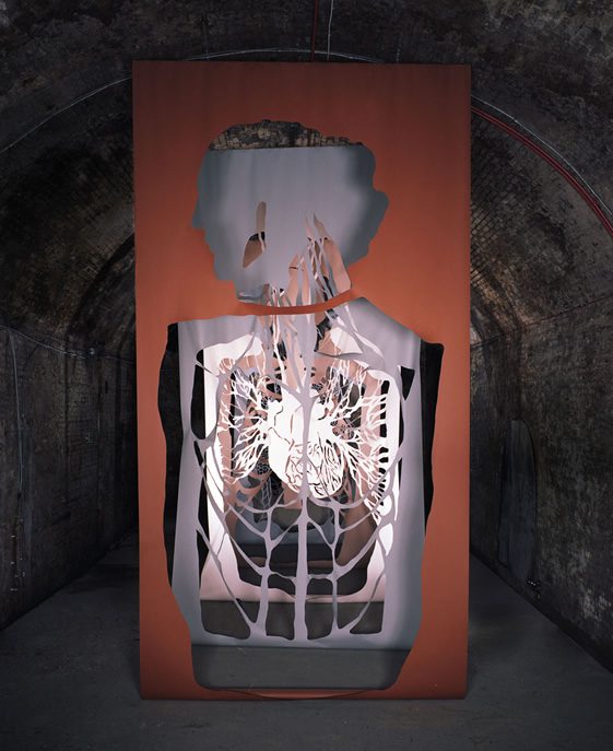
Photography © Alexandre Guikinger
Some of your personal work can appear quite haunting, is it an intentional shift away from the more bright, commercial pieces you’re commissioned for?
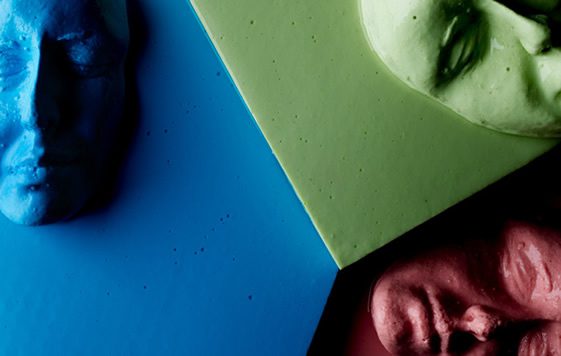
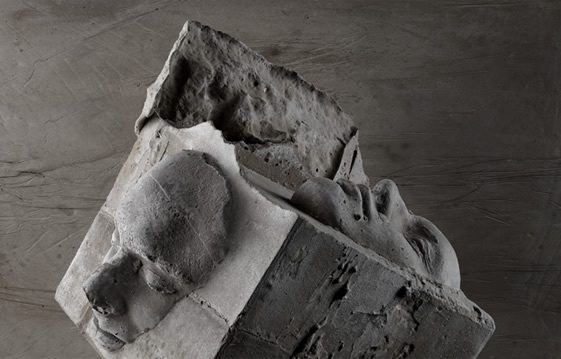
I think our creative tone of voice developed due to our love of storytelling. Our course at university was essentially about semiotics, studying methods to communicate a story with a twist developed into a hunger for us. When we left uni we started to work in the theatre in places like Shunt. This plus a love for Jan Svankmajer, Tony Oursler, the Quay Brothers and Max Ernst meant we developed an unhealthy appetite towards what some may call a ‘darker’ narrative. I still walk into the studio some mornings to find Victoria leaning over Hans Bellmer’s drawings muttering…’genius’ under her breath. Our ethos became to inspire what these artists have inspired in us, wonderment and sheer intrigue.
When people see our work we want them to think, how did they do that? Why did they do that? And when you experience it first hand we want people to be overwhelmed by a feeling, they don’t have to necessarily like the work visually as long as we inspire some sort of feeling. If that’s a haunting feeling then by jove I think we’ve done it! It’s not intentional that we shift our tone of voice I think we just haven’t been given the opportunity to work in this manner in a more commercial environment.
Photography © Jobe Lawrenson
What – or who – are your inspirations?
Apart from the aforementioned…
Hieronymous Bosch – we love because he was so ahead of his time, The Garden of earthly delights: fish on skates, ears carrying knives. All in the 15th Century.
Umberto Eco – for writing two of the most thought provoking books; On Beauty and On Ugliness.
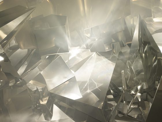
Roger Hiorns – for his blue crystal, copper sulphate room which makes us bemoan daily wishing we’d done it first.
Bill Turpin -for his prosthetic genius, casting incredible things in all manner of materials.
The Wellcome collection – for their endless inspirational artefacts.
Gray’s anatomy – if we could have been anything else we would most certainly have been surgeons.
We have the pleasure of being immersed in what seems to be a creative hub of people, many of our friends work for artists and are artists themselves. We naturally are inspired by all of them namely those that are pioneers in our field: Chrissie Macdonald, Lyndsay Milne, Nicola Yeoman and Rachel Thomas.
Photography © Thomas Brown
Which pieces(s), to date, are you most happy with?
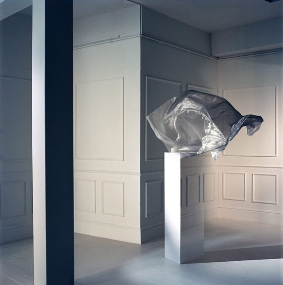
Purely for the people and the environment in which we made it, our favorite project has to be Tunnel 228, with a revisit at the end of the year for Tenth Cranial Nerve. The Old Vic tunnels will forever hold a special place in our hearts for fulfilling everything we deem important in a project. The space is eery, huge, dramatic, dank and steeped in history. When Punchdrunk commissioned us to work on this project we were beside ourselves with excitement and it proved to be an experiment that people talk about to this day.
Photography © Steve Harries
Do you want to continue with the commercial/personal balance, or is your desire to move more into your self-initiated projects?
We change our minds about this every single time we finish a job. To be honest we don’t know. Striking a happy medium between commercial work and personal work is what I think every creative strives for. We know well enough that without the commercial projects there would be no personal work.
We like curveballs and that for us is what commercial work throws into our court. When a job comes in we don’t throw our tools out of the pram so to speak, we sort of like the distraction from the inward thinking of personal work. Essentially we like to collaborate so self initiated projects are always undertaken with other artists in mind and eventually an application to the industry.
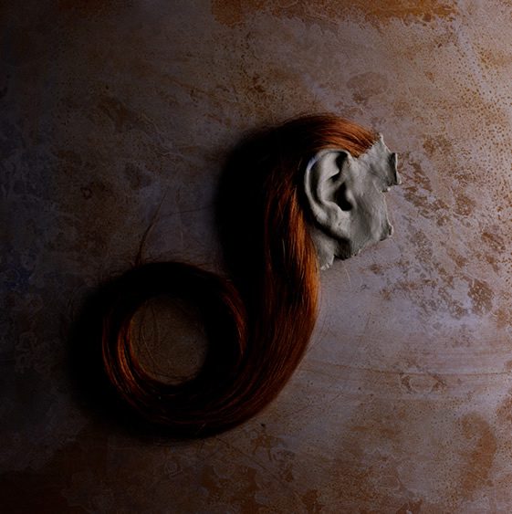
Photography © Jobe Lawrenson
What does the immediate future hold for Lightning & Kinglyface?
A lot of collaborations with some great photographers, including Thomas Brown and Ryan Hopkinson, an ongoing monthly installment with Wallpaper* magazine and lots more personal work. We’re casting like crazy for our next installation – Memento Mori soon to be shown in an undisclosed location in London. But in a more general sense the future is about bigger projects, testing new materials, transforming spaces into physical illusions and also trying to integrate our newly purchased smoke machine into everything we do.
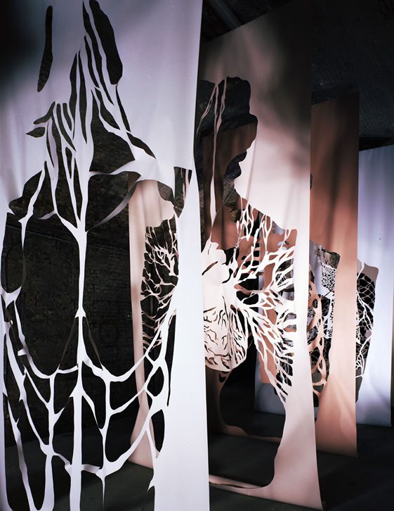
Photography © Alexandre Guikinger


