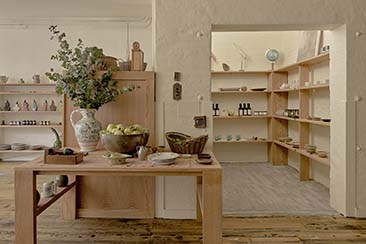
Watching your waistline? Then this may make uncomfortable viewing, but for those of you who like a little bit of what you fancy every now and again, check out Polka Gelato.
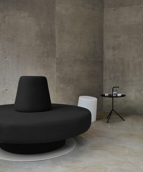
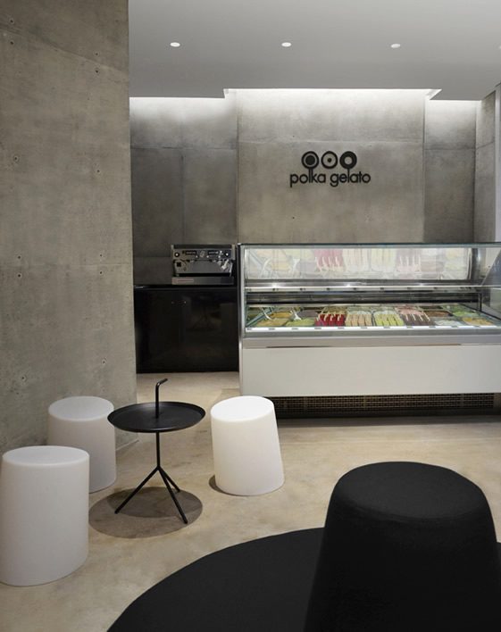
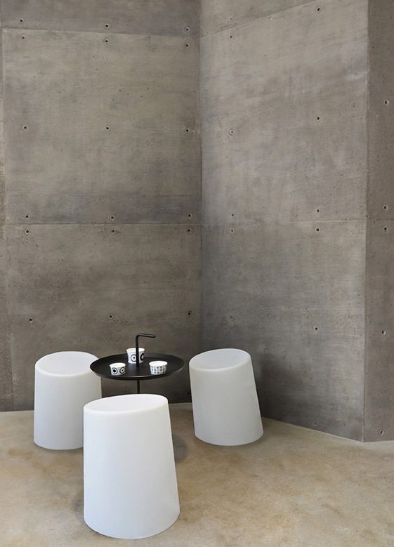
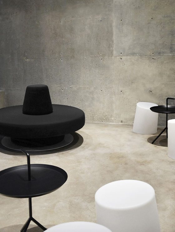
Rather like the Italian version of ice-cream on sale here, designers Vonsung have gone for a decidedly low-fat look for the London store. Renowned for their stark interiors, the London firm have stayed true to form with this minimalist creation in Fitzroy Square, while hoping to convey the textures of the product itself through tactile surfaces. In essence, says Creative Director Joseph Sung, they want visitors to feel like they are in a gelato. It beats throwing oneself into a vat of the stuff, I suppose.
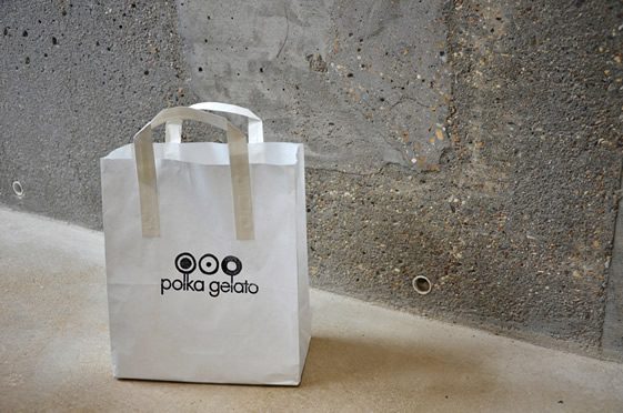
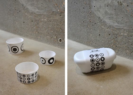
The space uses muted colours throughout, leaving the star of the show, the gelato, as its colourful centrepiece. Vonsung has also cleverly reduced the oppressive concreteyness of the concrete by mixing in limestone to the wall finish, and punctured the slabs to give a more porous feel. But their work didn’t stop there, as you can (almost) see from the typically spartan branding work…
