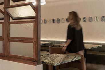
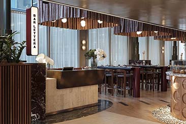
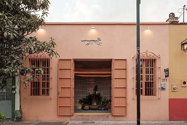
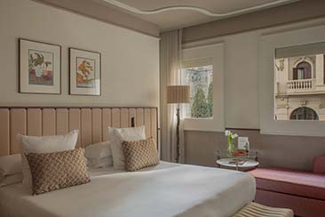
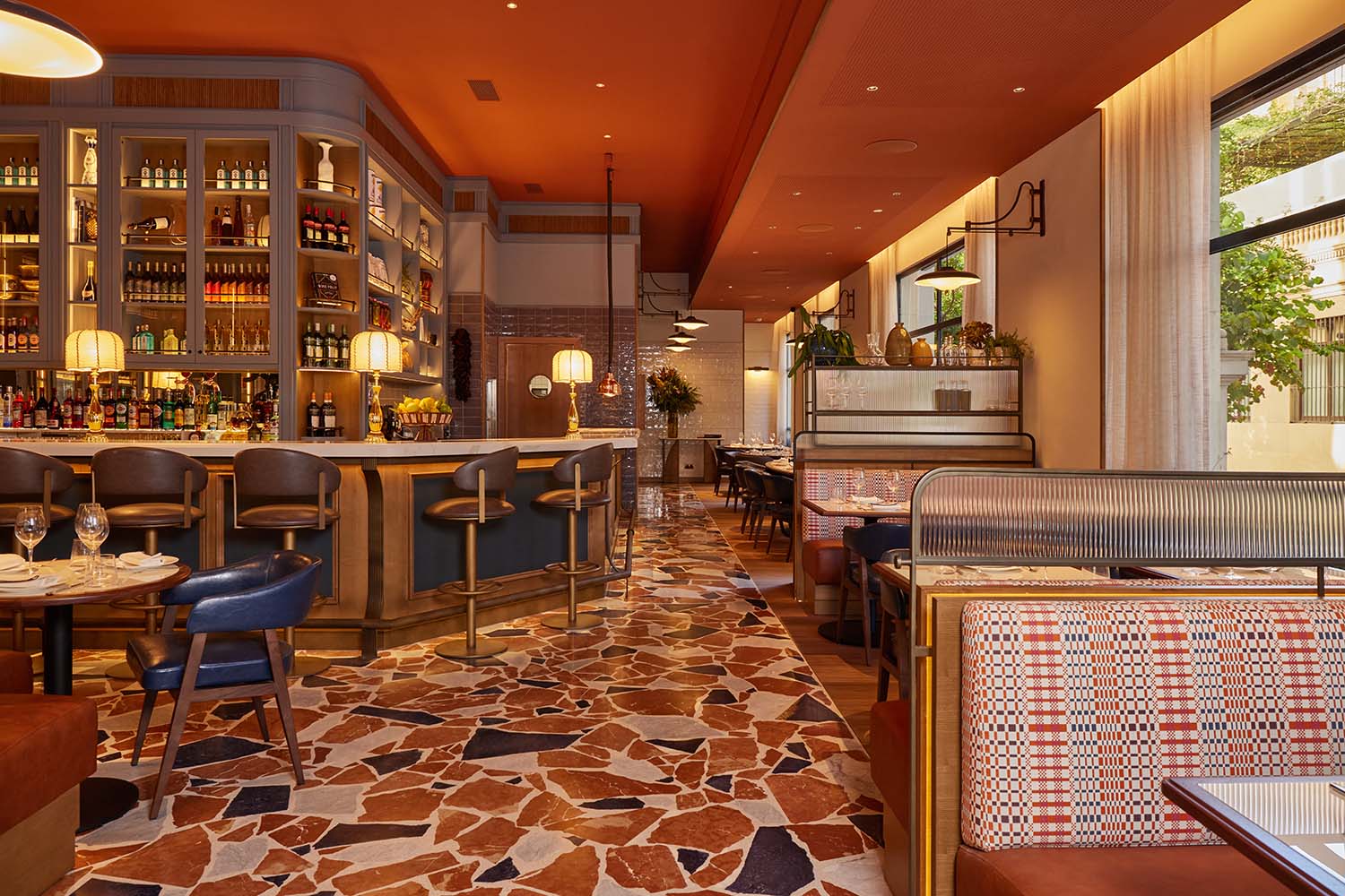
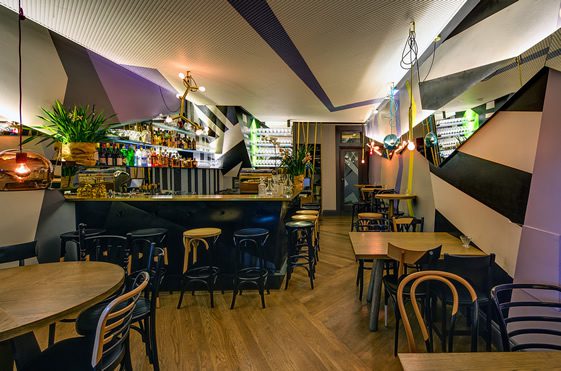
The newly-refitted Claude’s in Woollahra (a suburb of Sydney), New South Wales, has been divided into two distinct dining areas, the result being a dazzling if somewhat dizzying dichotomy. Interior architect Pascale Gomes-McNabb was given the task of providing both a relaxed bistro with limited space, and a more formal fine-dining area, settling on a two-tiered layout with bistro below.
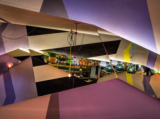
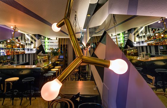
His inspiration for the small lower level came from the World War Two ships that used a patchwork of angled mirrors to confuse their enemies, and the effect has been recreated here, in combination with colourful graphics, to rather disorientating effect. The rest of the room, however, is easier on the senses; a solid oak floor and lovely brass bar top are highlights among the highlights.
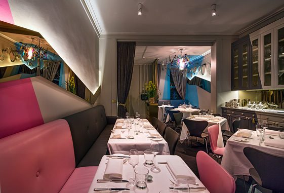
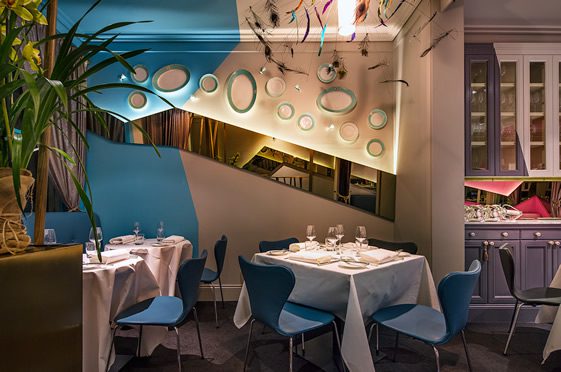
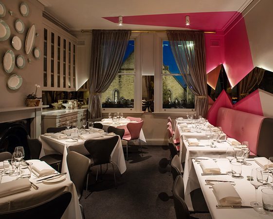
Upstairs, the lid has been put back on somewhat. Although the vivid graphics remain, the tableware and seating helps to give the area a slightly more restrained flavour. It’s still not going to be a place for traditionalists, but for individualists… definitely one to rejoice in.
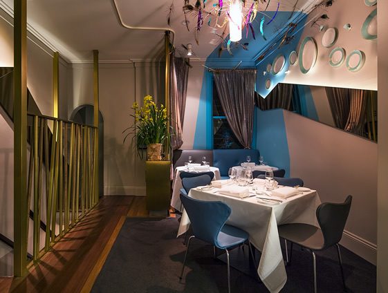
Photography, Murray Fredericks

