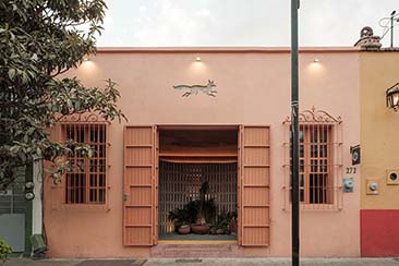
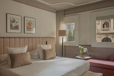
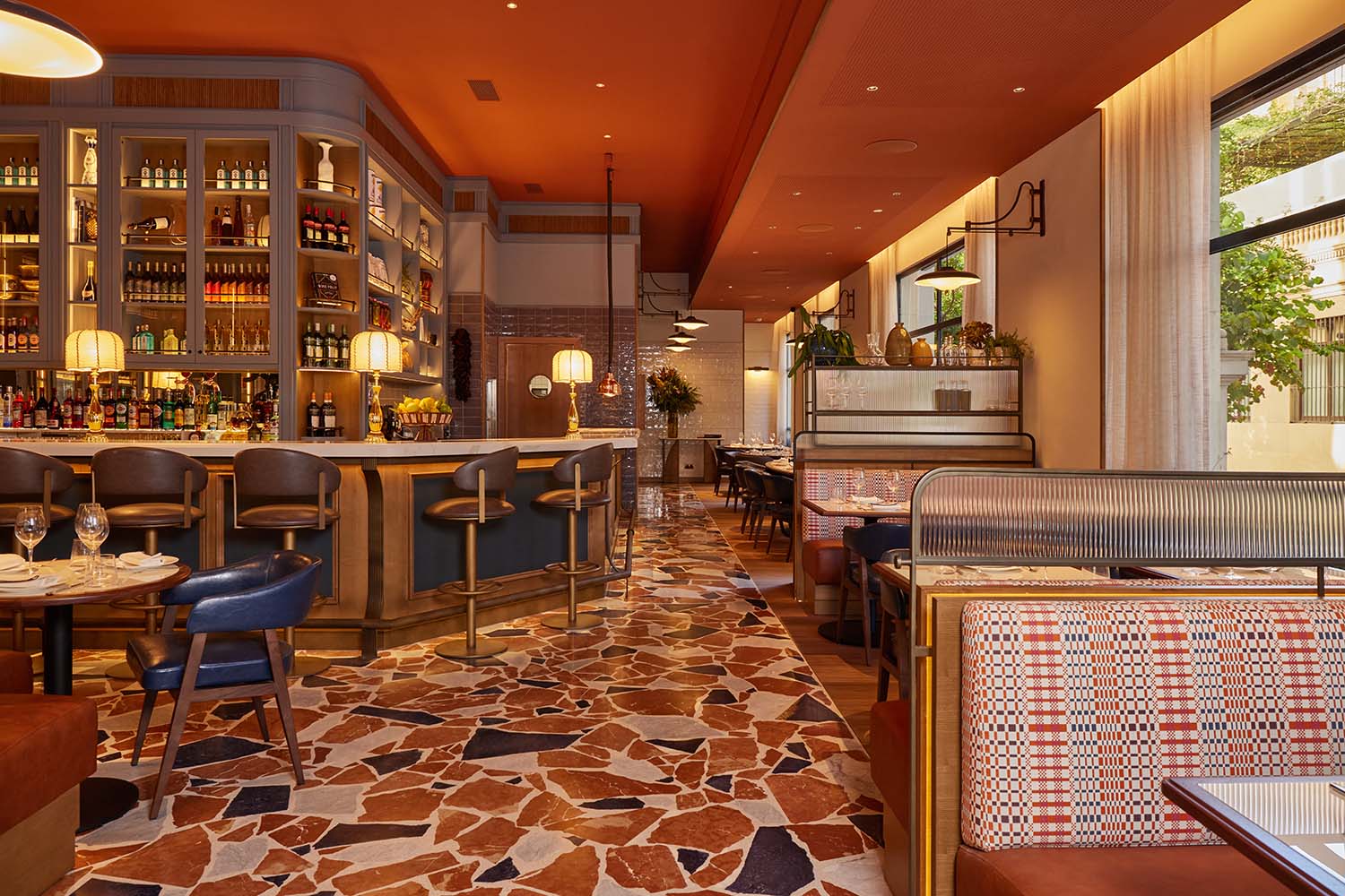
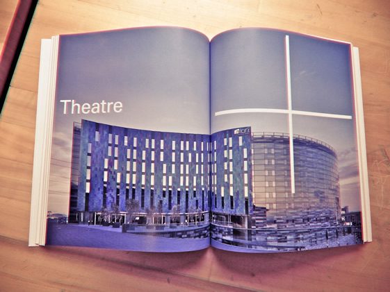
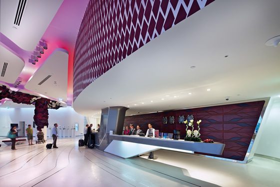
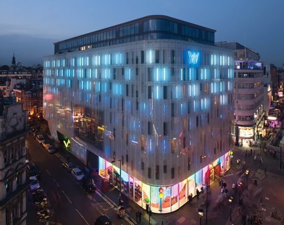
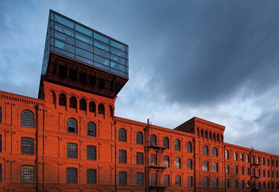
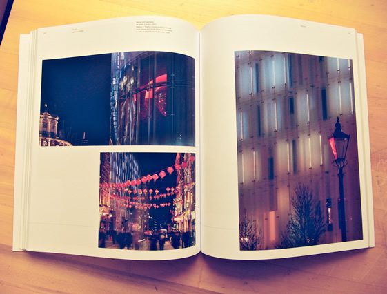
The recently published PLUS Jestico + Whiles stands out more that your average glossy architecture/design book. An avid fan, but far from an architectural expert, I’m immediately taken by the stunning photography and, diving straight in, I instantly recognise many of their high profile projects – W Hotel Leicester Square, the Michelin-starred Hakkasan refit, and the recent regeneration of Borough Market – but beyond the eye-candy, there’s substance here that has me hooked.
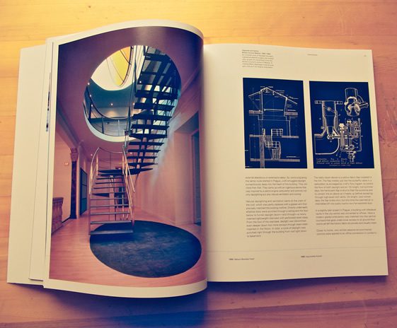
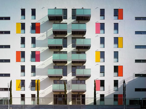
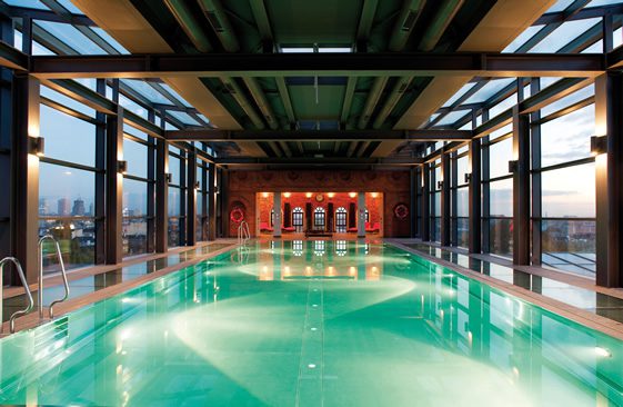
The 192-page paperback traces Jestico + Whiles thirty year career in architectural design; profiling their mainstream, educational, leisure and housing projects. Internationally and on home turf, from offices in London and Prague, their focus is not on architecture alone; having won 100s of awards, their interior design team also share in the glory that this publication bestows. Not too wordy, yet embellished with detail and drawings throughout, PLUS is a leisurely read – I don’t need to think too hard, but I’m soon less of an architectural novice. Published by Artifice Books, the architect’s story is told through a series of essays by industry experts Martin Spring and David Taylor.
Beginning in the late 1970s with just two designers – Tom Jestico and John Whiles – the flow of PLUS is essentially a timeline of important political and economical events which have seen the practice flourish over the last three decades: “we design simple, rational, pragmatic, contemporary buildings” – a self-proclamation that is somewhat modest when you delve into their portfolio. With sustainability and responsibility running through each project, and having been one of the first companies to transfer ownership of the practice to its staff, their ethics as well as pioneering ideas are prominent throughout.
It’s actually quite staggering how many projects they have under their belts. Although the practice have no particular house style, Jestico + Whiles’ characteristics are apparent in every project – from the colour changing glass façade of W Hotel in Leicester Square ,to the restoration and redevelopment of The Foundling museum, all projects resonate clean and contemporary aesthetics. A glossy dollop of eye-candy, yes – but as founding director Heinz Richard so brilliantly sums up; “design is for life, not for magazine covers”… substance counts for a lot.

Images courtesy of Jestico + Whiles and Artifice Books
expect book images, © We Heart

