Pop ups and portable wagons are all very well, but to really make your mark there comes a time when you must drive your flag into the ground and claim a permanent piece of the food market territory. Somewhere you can turn loose a hungry design team with a bag of tricks and let them sink their teeth into it. Yianni Papoutsis and Scott Collins have done just that with their third bricks-and-mortar venue, following the stellar success of MEATliquor and MEATmarket. Once more the pair have turned to interiors firm Shed, who must have been saying a prayer of thanks to some higher power when they saw the premises in which they were to do their thing.
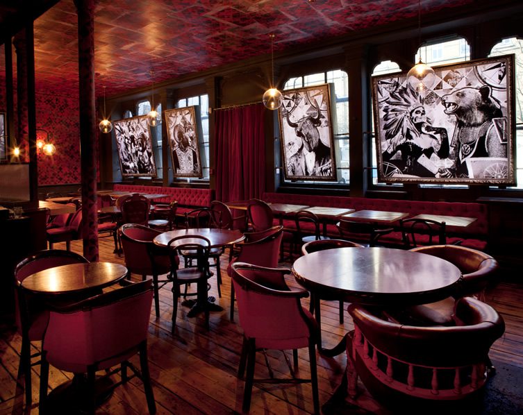
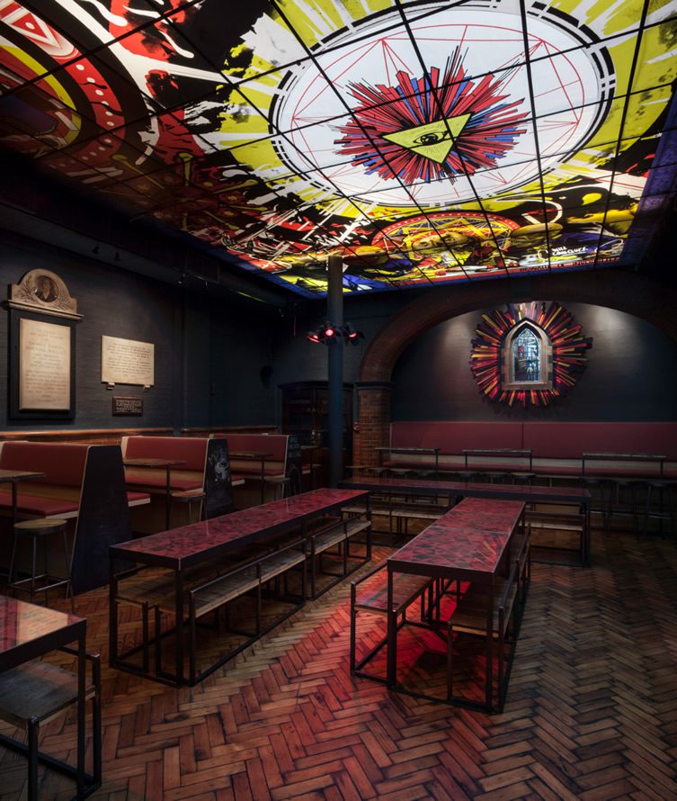
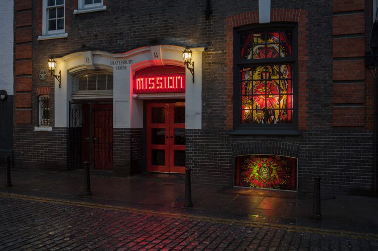
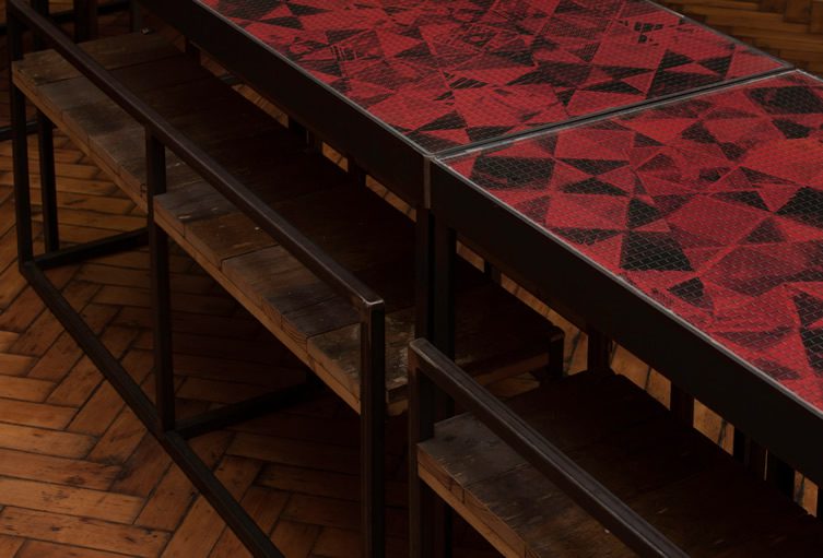
An old Victorian Mission, tucked behind Hoxton Square, was the location which informed the direction Shed were to go, and go they did. Using a brilliant blend of authentic period features and newly made edgy facsimiles, the team have created something truly amazing – in fact I am going to wind my neck out and say this is the best-looking, cleverly-designed and beautifully realised burger joint I have ever seen. If you want to prove me wrong, send us a pretender to the throne via the usual means. Shed have got plenty of previous for their belting design work, but this must be their finest moment yet.
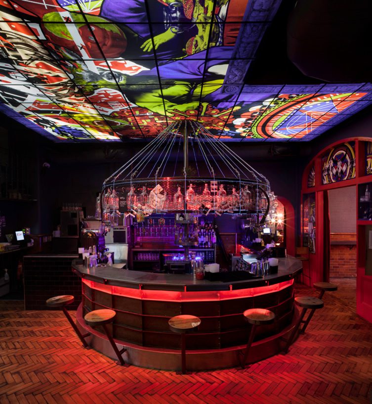
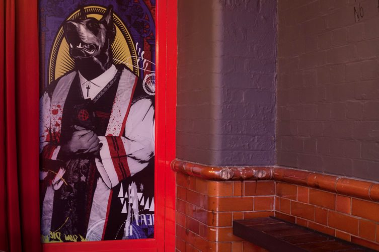
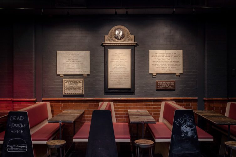
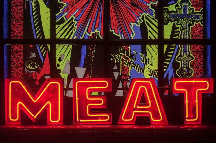
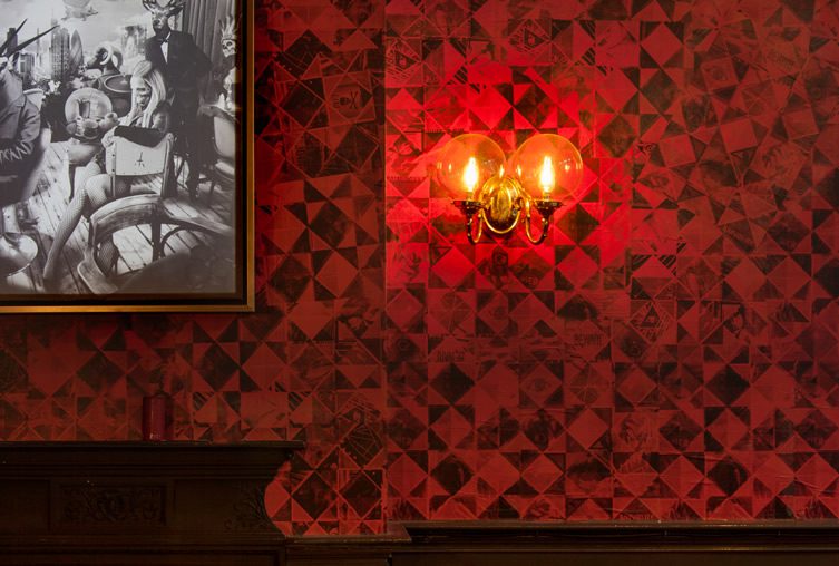
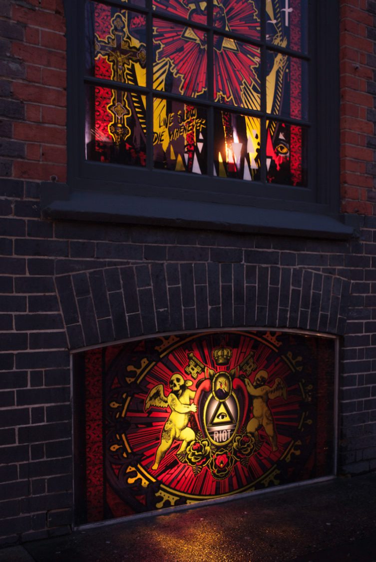
It begins as all good religious experiences do, with a sign, glowing and mysterious and in the Meatailer family blacked-out and neon contrast style, complimented by a stained-glass-like window. The main hall, dotted with war memorials and plaques, demanded careful reverence, so Shed looked upward for inspiration and came upon the idea of letting loose on the ceiling. They called in the illustrating talent of ilovedust, who must share a huge chunk of the credit for the success of MEATmission – their fantastic and fantastical pop-religion artwork is as omnipresent at this venue as God himself.
We could go on but we’re worried about using up the rest of the internet, so we’ll wrap up this sermon thus: Mine eyes have seen the glory of the coming of the burger Lord.
Photography, James Medcraft

