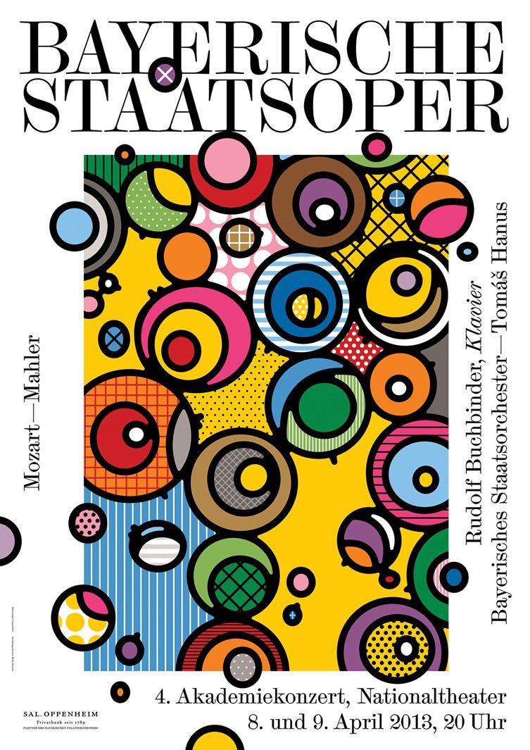
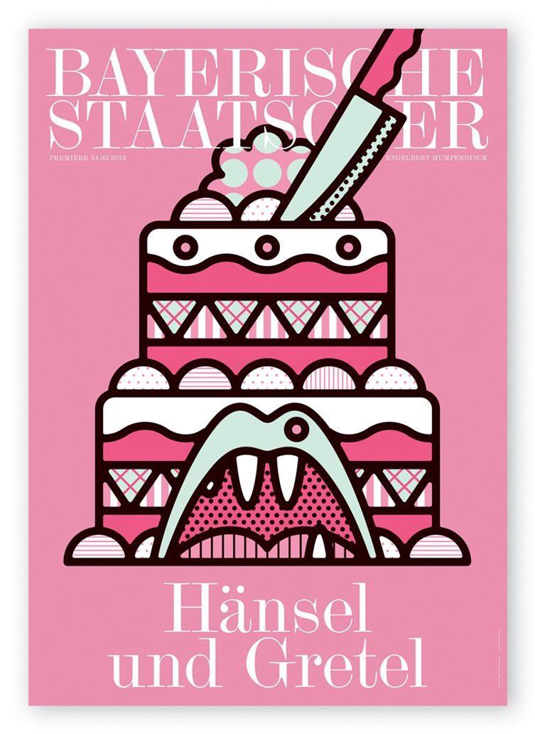
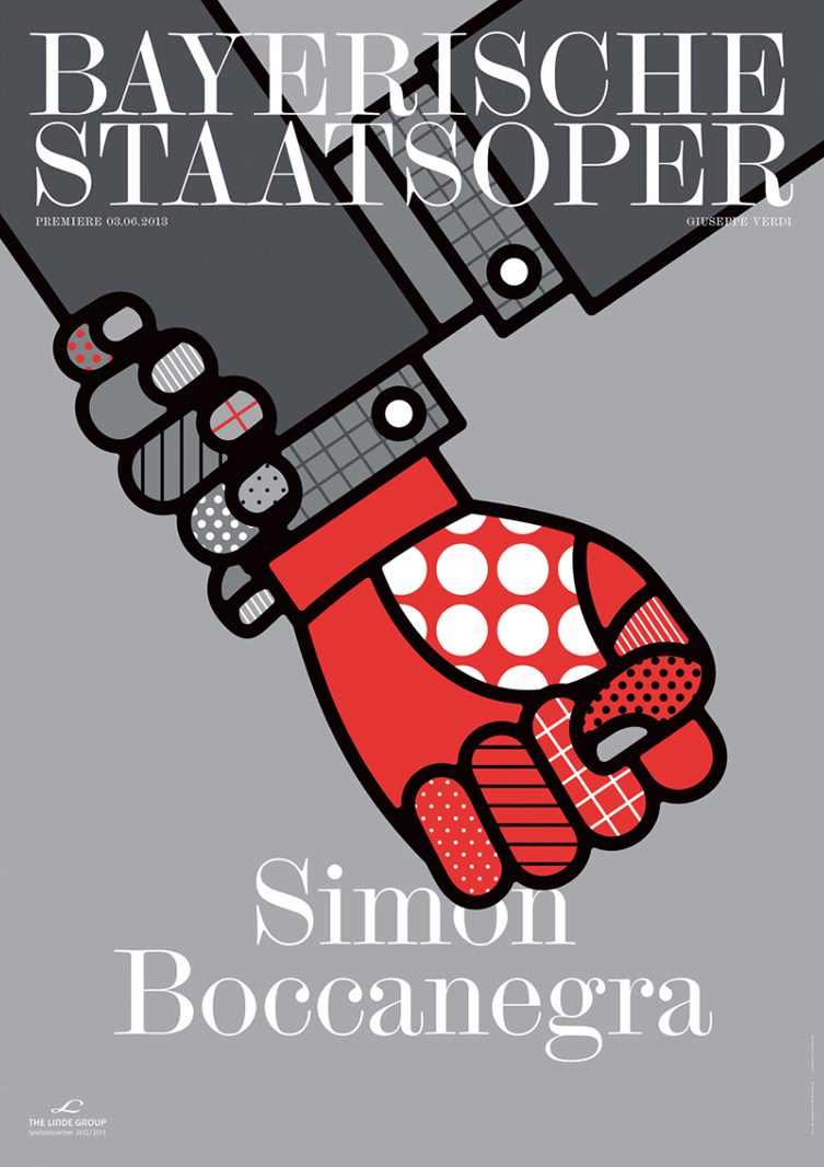
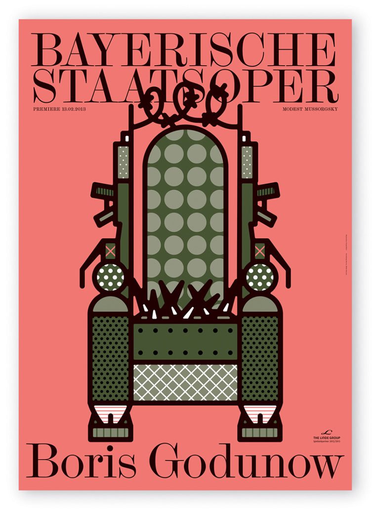
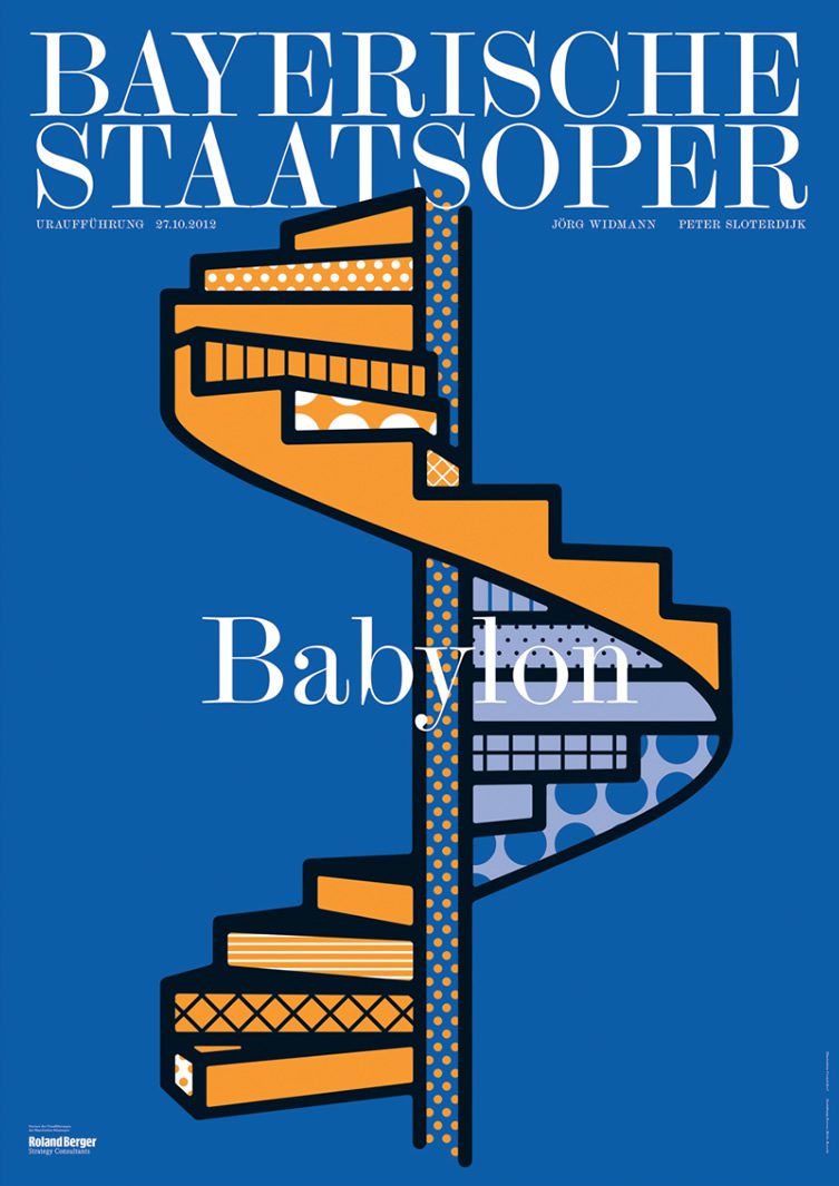
Opera – an art form so traditional that any moves to modernise or popularise it runs the risk of looking like your dad buying hipster jeans in an attempt to look cool. Fair play to the Bavarian State Opera then for even trying, and extra credit for choosing Munich design agency Bureau Mirko Borshe to handle the promotion of their forthcoming season – who got on the blower with pop-illustrator duo Craig & Karl and commissioned this series of posters.
The key to the success of this collaboration lies in the pair’s style, which is stylish, modern and fresh – while at once managing to be definitely retro; and thus delivers something modern without overly trampling on the genre’s expectations. Big blobs and sections of colour chunkier than a mezzo-soprano in January lie within the thick black boundaries of their creatively re-imagined subjects, simple but descriptive in their delivery. We’re going to skip the “hits the high notes” big finish and just exit stage left while Craig & Karl’s work sings its own praises.
