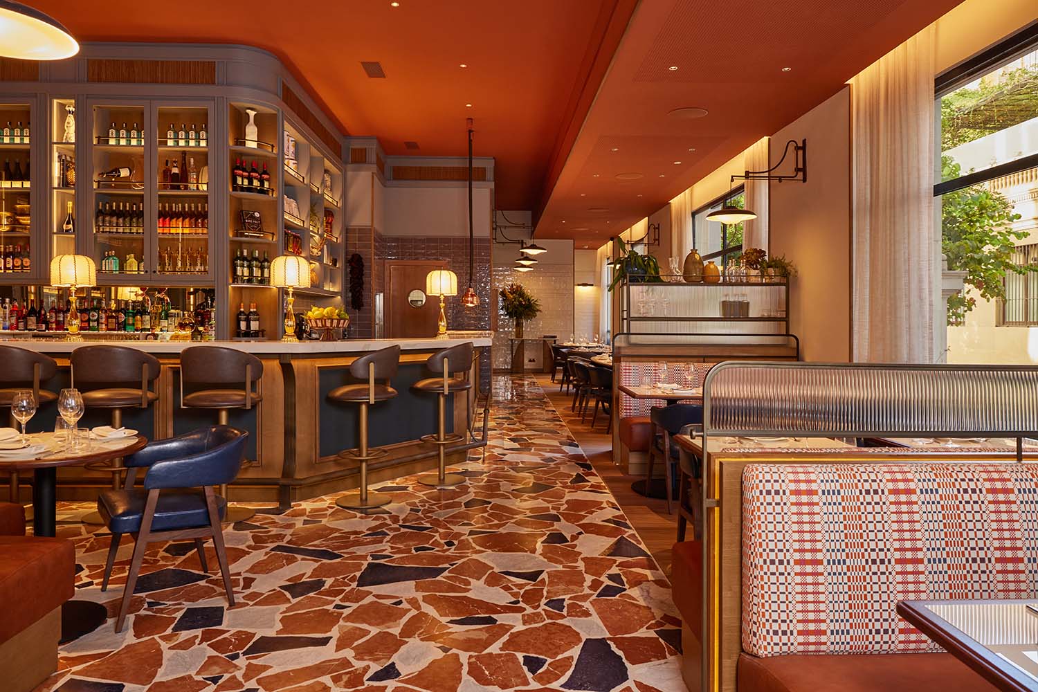
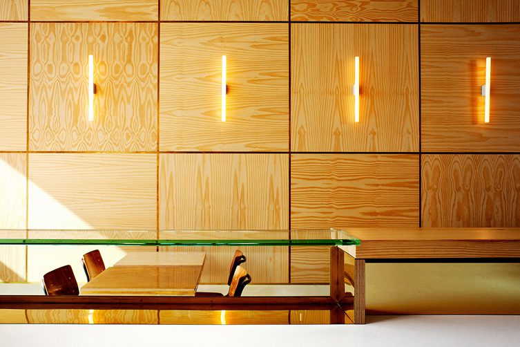
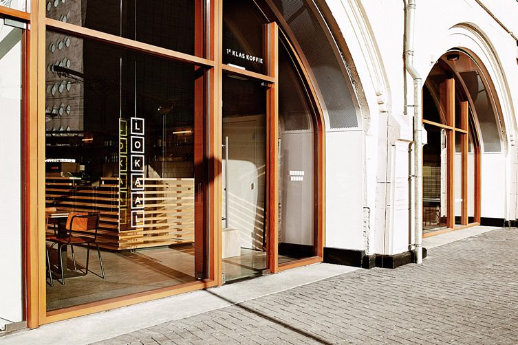
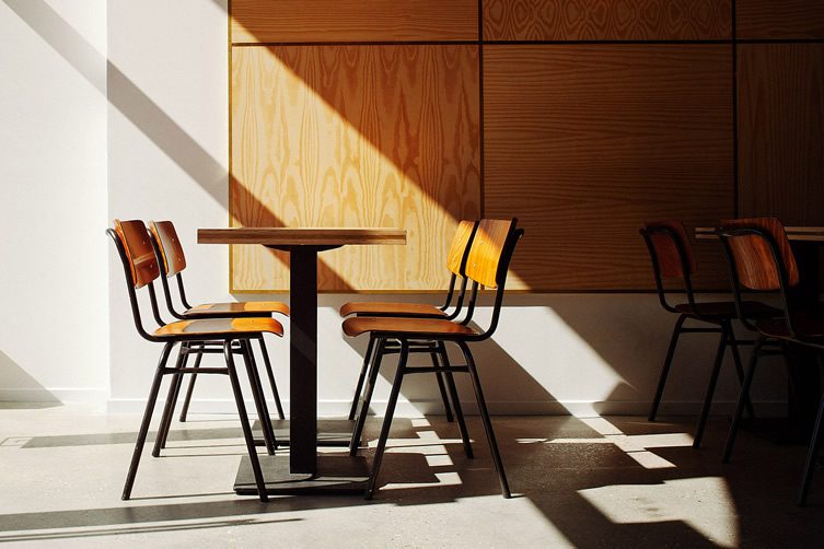
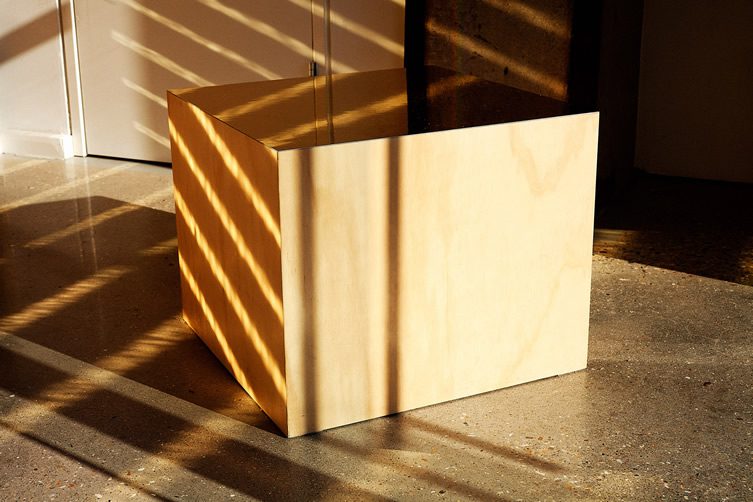
It’s hip to be square at Rotterdam espresso bar Lokaal – everything about the place looks like it has been stacked from the ground up. Clean lines and edges dominate the interior by design firm weaponofchoice, whose philosophy of keeping things simple extends to the use of materials, pine, brass and glass constitute most of the cosmetic element of Lokaal. The premises sits under an old railway line near Rotterdam’s gone but not forgotten pre-war train station, and designers weaponofchoice sought to recreate a canteen atmosphere that old railway stations once enjoyed before the invasion of chain-store coffee bars produced a depressing homogeneity.
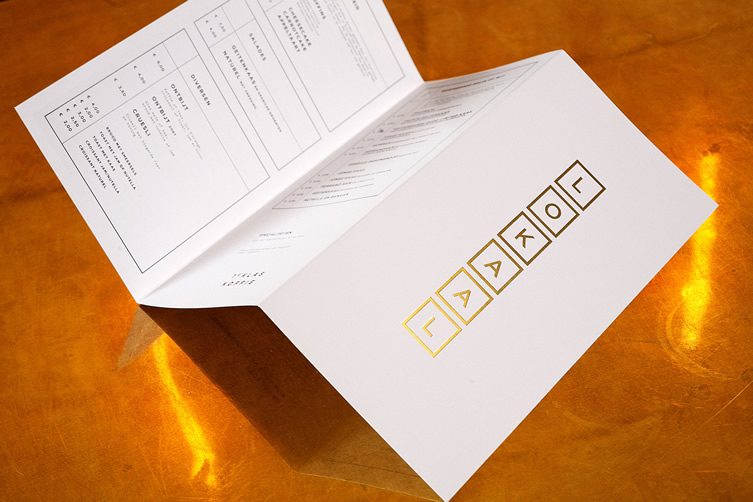
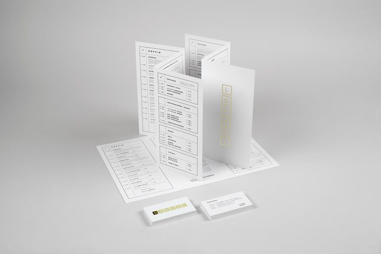
Rotterdam is the hometown of weaponofchoice, so they were extra invested in this particular project, handling everything from the interior design down to the business cards. The branding on the paperwork follows their core philosophy of their overall design, clean, square, with a reassuringly solid quality. A bit of a bullseye, we think.
Photography, Mathilde Karrer


