When long-time friend of We Heart, and Confessions of a Design Geek founder, Katie Treggiden met magCulture founder Jeremy Leslie — a go-to authority in the magazine industry, thanks to over a quarter of a century in the industry — it was fated that good would come of a chance encounter.
“I did a Masterclass on independent publishing at the Guardian and Jeremy was one of the speakers” begins Treggiden, “I already had the concept for Fiera at that stage, and Jeremy approached me afterwards, suggesting we worked on it together. I was absolutely blown away, and of course bit his hand off. That course (run by Steve Watson of Stack Magazines), and subsequent meetings with Jeremy, really helped to add flesh to the bones.”
“I’d observed a number of online publishers moving into print,” recalls Leslie “and when I met Katie briefly at the Masterclass I was impressed by her ambition and intent. I was keen to help, but didn’t anticipate co-publishing until later. It developed very naturally, the demands of the Kickstarter campaign really helped us define the magazine” — which Katie confirms: “it’s a hundred times the magazine it was at concept stage”
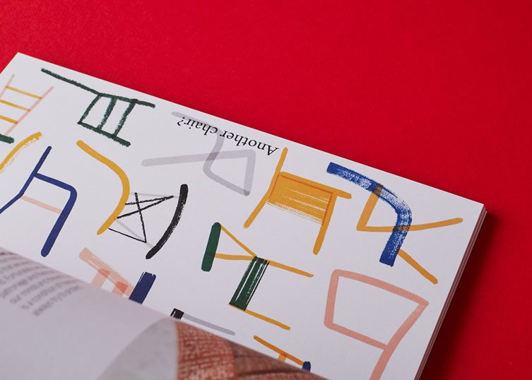
“There are now more design weeks than there are weeks in the year, so we’re spoilt for choice
The intention is that each issue has a core show that we will always cover (London Design Festival in December issues, Milan Design Week in June issues), then each issue will feature another three festivals that will change annually.”
As a freelance design journalist for a host of publications — The Guardian; Design Milk; Dezeen; our good selves… — Treggiden has been through the design fair mill, and is adamant that Fiera will reach into the circuit’s darker recesses: “I try to get off the beaten track as much as possible, visiting fairs our readers might not be able to get to themselves, and visiting countries with growing reputations for emerging design talent.
Part of the reason for founding Fiera was that so much mainstream coverage of design fairs is written before the fairs happen, due to long lead times, and so is based upon press releases. This means that the writers often haven’t seen the work they’re writing about firsthand, and it also means that the work of young designers without PR representation gets missed. The idea of Fiera is to visit the fairs in person and discover new talent that other publications aren’t writing about … yet.”
Understandably, Leslie’s exposure to design fairs was limited in relation to that of a leading design writer … “I knew they existed, but hadn’t attended many” admits Fiera’s Creative Director. “Although I’ve been to enough graphics/trade/books fairs to know the downside of huge sheds full of stalls selling to you. I can’t graze that situation. I’d read a lot of what I felt was superficial coverage about the design fairs, and part of what Katie does with here blog, and now Fiera, is to go deeper — finding the real stories and trends. Her approach means that the reader can get a better idea of what was on show, not just the PR-driven, repeating headlines.”
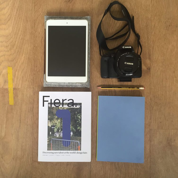
Katie’s design fair essentials
On the road: how to survive the whirlwind undertaking of attending shows; meeting designers; documenting works and post-event referencing…
“I tend to stay in Airbnb apartments — they’re much cheaper than hotels, and a great way to feel part of the city very quickly. I get up early, find some coffee and work fairly methodically through everything I want to see. I try not to write while I’m away, so I can spend every waking second scouring the show for new designers. I often get so absorbed in what I’m doing that I have to remind myself to stop and eat. Comfortable shoes are a must because I’m on my feet all day. I usually pack a lot into my trips, so will be out and about until things start to close.”
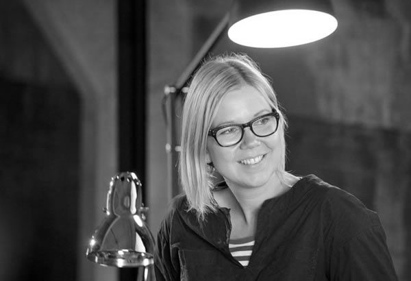
Katie Treggiden
Katie stresses the importance of finding time to talk to all the designers whose work catches her eye: “that’s the benefit of being there in person, and often the only way you really find out what’s interesting about a product … some nugget about the way it’s made, what inspired it, or how it solves a problem, can be the difference between whether it’s included in the magazine or not.”
Short on time, overwhelmed by potential stories, it’s a process that calls for military precision — something that Treggiden aims for: “I’m usually travelling hand luggage only, so I try to run a paperless ‘office’ — I photograph the work, the designer, and then their contact details and any information about the product; which means those things are all kept together for easy reference. Then when I get home, I can just go through my photos to find everything I need. The reality is rarely quite that simple, but that’s the intention.”
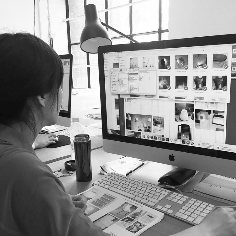
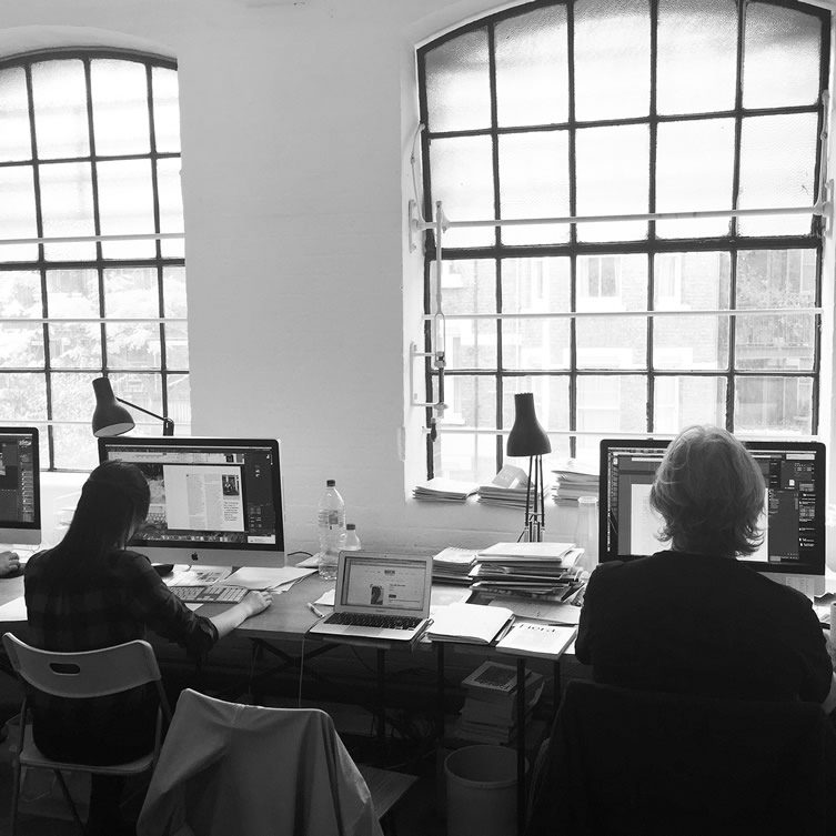
“Good editorial design stems from the concept and content of the magazine. Fiera is intended to act as a journal of record, a collectible biannual, so the design needed to be clear, functional, and design-conscious
The format is deliberately book-like,” explains Leslie, “but that small scale also means I can use white space generously — without it looking gratuitous or wasteful. The ratio of content to space is satisfying to me; it’s not a hugely flamboyant piece of design but is very flexible, and has a strong but subtle identity that lets the design work take the attention. The serif font is called Arno, named after the river that flows through Florence, which feels nicely Renaissance.
The original design process was surprisingly smooth; the Kickstarter demanded a quick, early design ahead of the first actual issue, and that was an ideal start in iterating the layout.”
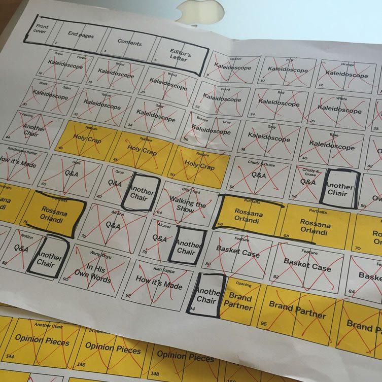
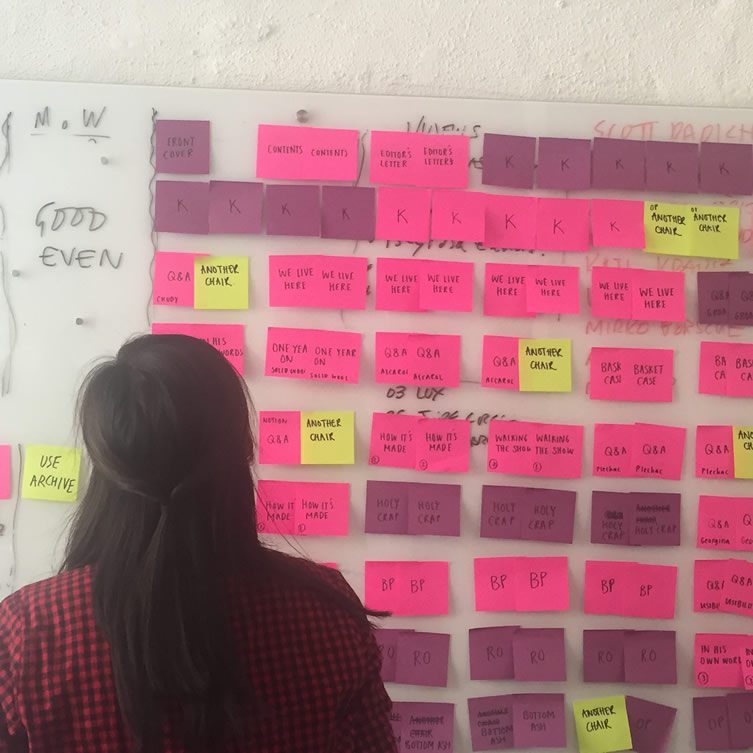
As a tightly-packed, comprehensive publication, the process of mapping editorial requires structure and discipline…
“I tend to formulate story-ideas as I am walking the shows, making notes on my iPhone. Once I’m home, I get in touch with designers and contributors and start pulling the content together. magCulture and I have a shared DropBox where I start compiling content. Once it’s ready for Jeremy to start working up into spreads, I highlight the folder in green (for GO) and he gets to work.
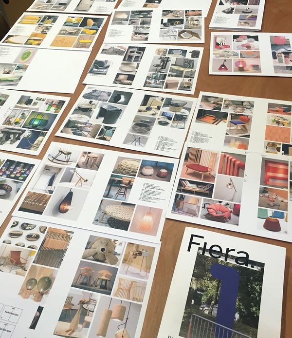
We also commission a photo essay and a series of illustrations for every issue, so those features get worked in. We have a flat plan which we populate as we go and review throughout the process (both as a formal document, and as a collection of colour-coded post-it notes on Jeremy’s studio wall). At some point we print out every page and lay out the whole magazine on the floor, to make sure it flows well and has the right balance of content. We’re constantly tweaking things as we go — and usually have more features than we need, so we can chose the strongest content, both visually and editorially.”
“It takes discipline,” adds Jeremy, “something Katie and I share as we each juggle so many projects. With discipline it works well; I’ve worked on other projects in the same way and it’s certainly not always so smooth.”
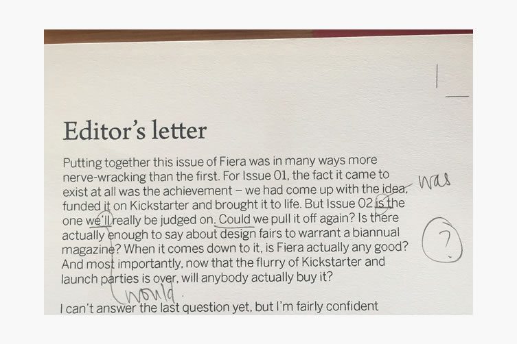
“There’s lots of back and forth throughout the process, and I often spend a day at magCulture in the run-up to publication. I’m usually there for the whole week before we go to print because there are so many little details to resolve
Luckily Jeremy and Jese are an absolute pleasure to work with and a local coffee shop keeps us energised for the inevitable long hours as the print deadline looms.”
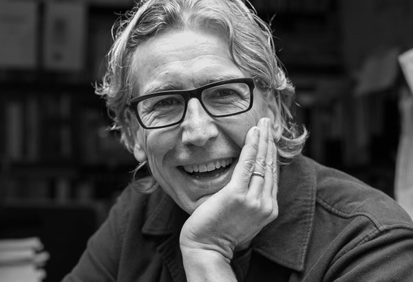
Jeremy Leslie
Aside from the inescapable last-minute tweaking that any print job demands, a considered approach and structured design means that the majority of the process is calm, controlled: “Fiera is made up of many small parts, so preparing an issue means designing lots of brief elements then working them into a running order” observes Leslie.
“Jese and I have a strong sense of the visual flow, Katie knows the editorial flow, and together it’s a pretty quick process. It could perhaps be done in a single afternoon, but tends to be tinkered with as things get completed. As a biannual we have time in the schedule; although the majority of pages are designed in a relatively intense production period the run up to that and final production process leaves time for iteration that a monthly, or even a quarterly, would not have.”
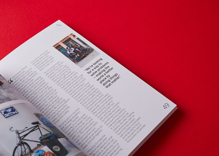
“There’s nothing like holding the first copy of an issue in your hands. Months of hard work made tangible — it’s incredible”
There’s little time to relax though; promotion, distribution, marketing… in some ways, the production of an independent magazine is the beginning of the story. “We’re doing pretty much everything ourselves at this stage,” Treggiden starts, “Katie takes the brunt of it,” continues Leslie, “but it’s a key point for anyone planning their own magazine — the job doesn’t end with the print delivery.”
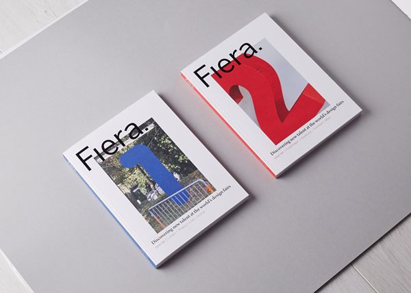
“The next issue is always a little way off, but there’s always another project in mind, so I tend to find that when the printed magazine arrives I flick through it and see only the things I feel didn’t work or could be better. We’ve already spent so long with the pages as work-in-progress that the final thing is always a disappointment at first. Only later can you appreciate what worked. That said, I was really pleased with the cover of Issue 02. It jumped out at you in a way 01 didn’t.
Marginally less critical, nonetheless, Katie shares Jeremy’s desire for constant improvement: “Issue 02 was the magazine I set out to make. With Issue 01, the achievement was doing it at all, and I was really proud that we did, but there were inevitably teething problems, which I think we addressed in Issue 02, so I’m incredibly proud of the second magazine. That said, of course there is always room for improvement and evolution and I think being constantly aware of that is what makes a good magazine”
With a sell-out debut issue, and the second just released, Fiera is a baby in the world of independent publishing; of course the duo are hungry for future success…
“We’ve got the beginnings of a fantastic network of stockists all over the world and are building that up,” Katie tells us, “and we are currently working out a subscription model. Next stop is the London Design Festival where we have a few things going on to promote the magazine — look out for us at Home London and Tent London — and of course it’s the first show we’re covering for Issue 03. No rest for the wicked…”
Jeremy’s final word is equally determined: “our first year has seen the mag improve from Kickstarter dummy, to Issue 01, and now Issue 02. Each one a step forward. Everything’s going to plan so far, we’re establishing the name and its audience, and have plenty more planned.”
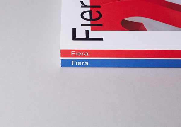
Covering Northmodern, Copenhagen; the Stockholm Furniture Fair; Ambiente Frankfurt; and Milan Design Week across 164 pages, Fiera Magazine Issue 02 is available now for £20.


