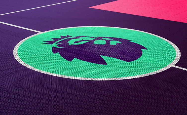
In case you missed the news, the Premier League has a new logo. Which means people get upset; the art of the rebrand can never just slip under the radar.
Whether it is being sentimentally attached to a prior look, folk with sexual frustration spotting things they shouldn’t (that Airbnb/genitalia story just wouldn’t go down, would it?), or it just not being very good (sorry Uber) — rebrands kick up a shit storm, and the rise of social media has only added to designer’s woes.
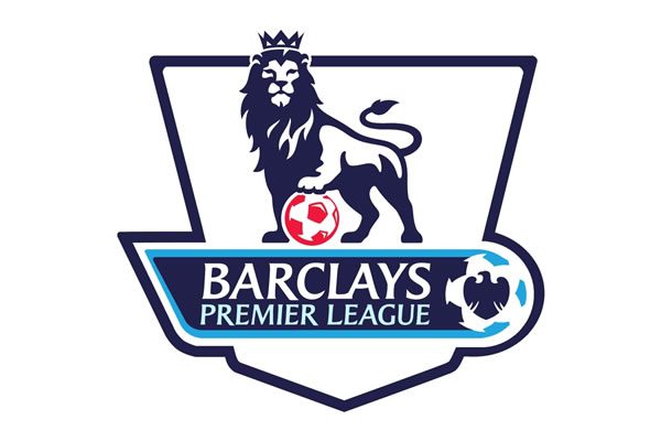
What we have on the left is the current Premier League logo, and what we have above is the work of London-based DesignStudio (also behind the aforementioned Airbnb furore). “Lots of people around the world understood that lion to represent the Premier League … so it wasn’t about destroying everything that was there to build something new, it was about building on that equity and heritage,” DesignStudio CEO and co-founder Paul Stafford told Creative Review.
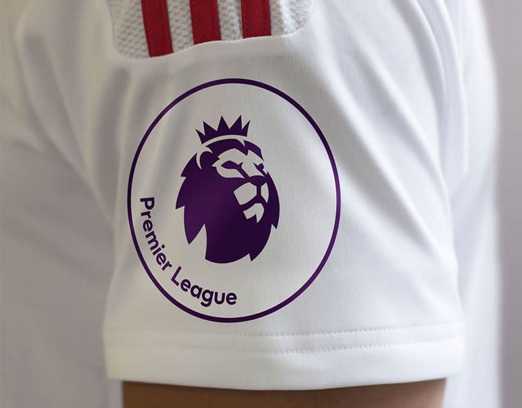
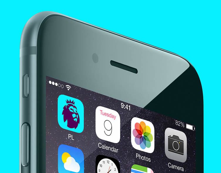
Truth is, the old logo was a bit of a hot mess, and DesignStudio’s crisp new look is just that: crisp, fresh, and works nicely across the multitude of platforms it needs to. So why all the fuss? Because everyone thinks they’re a designer … and the ‘my kid could do that’ brigade have been out in force today’:
@richard_conway @BBCNews my 6 yr old could do better than that.
— Michael Burke (@mikeybourne) February 9, 2016
@richard_conway @BBCNews it looks like a bad sixth form art project
— Josh Phillips (@ChopperPhillips) February 9, 2016
As cringeworthy as this old shtick may be, it’s hard not to have an opinion in this day and age — especially if something is not to your liking:
Oh, in case you wanted our two penneth worth on the Uber rebrand: it’s shite.
— We Heart (@we_heart) February 5, 2016
In our defence, we weren’t alone — Uber’s head of design Andrew Crow stepping down last week amid universal condemnation of the brand’s new look.
Perhaps more infuriating than the ‘my six year old could do better’ lot are the ‘I could do better’ lot, who have been indulged — in the lowest rent sense possible — by bastion of journalism The Guardian:
Can you design a better logo for the Premier League? https://t.co/uLrddhrPlh pic.twitter.com/Ac4DkMQOzh
— Guardian sport (@guardian_sport) February 9, 2016
Designers have been universal in condemnation of the newspaper, Koto founder James Greenfield (who led the Airbnb rebrand) wading in with the gloves off:
@ianprior How can you claim to be a serious sports paper with crap like this? https://t.co/d0ouh3V2RA
— gradiate (@gradiate) February 9, 2016
@ianprior I've been reading for 20 years and will continue to pay to read your paper, but you're kicking the 580k people that work in design
— gradiate (@gradiate) February 9, 2016
Head of Sport for the newspaper, and its Sunday sister the Observer, retorted with a distinct lack of class — essentially reverting to the role of social media troll:
@gradiate Remarkably touchy lot, designers
— Ian Prior (@ianprior) February 9, 2016
Inevitably attracting further criticism from design professionals (making valid points, well):
@ianprior @gradiate You wouldn’t have a job without us Ian, on the other hand…
— Instruct (@instruct) February 9, 2016
@ianprior @gradiate You’d get millions of wasted megabytes of Clipart St.George’s flags and dragons. Design is as much a profession as yrs.
— Stephen Jackson (@TheLittleChef) February 9, 2016
And herein lies the problem, a widespread lack of understanding for different professions. Why does Ian Prior have such disregard for designers? Does he understand design? Unlikely. How many keyboard warrior flexi-bloggers think they can do Prior’s job? (If it’s publishing the above ‘competition’, then perhaps they have a point.)
Why do so many ‘regular folk’ have such little understanding of design … does that facilitate the perpetuation of bad design? Are people that deeply afraid of change, or are they — by extension of giving an opinion, any opinion — merely validating their worth?
