Minimal, and largely monochrome; Stockholm’s Guise deliver bold, contemporary work with more than a knowing nod to the Swedish capital’s illustrious design heritage. You may recall that ‘our man in Stockholm’, Mr. Samuel Sweetman, recently caught up with Form Us With Love for the first instalment in our ‘Inside Swedish Design’ series… well, he’s back again; this time chatting with the rather talented guys behind the architectural interiors of Stockholm’s Fotografiska gallery and the highly acclaimed concept store for fashion brand Fifth Avenue Shoe Repair. Here’s what happened when We Heart met Guise…
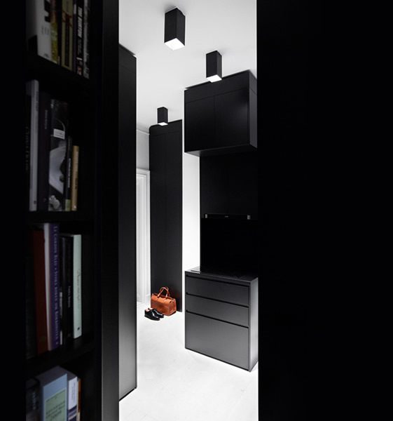
Firstly can you tell us a little about yourselves – who you are, how you met and what you do:
Initially we were very involved together academically; we ran courses in architecture at the Royal Institute of Technology department of Architecture as well as at Konstfack University College of Arts, Crafts and Design. Around four years back we decided to end our academic engagements and put all our energy into building an architectural office. We had both studied Fine Art before we started to study architecture, and we still nurture our work in reference to the art world. But today our references have become broader; during the initial concept development stage we usually have a quite interdisciplinary discussion.
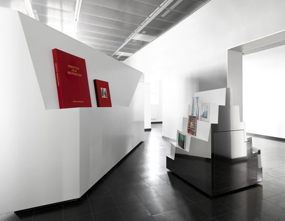
You are the designers of the now-famous Stockholm photography haunt Fotografiska – what was the inspiration behind this project?
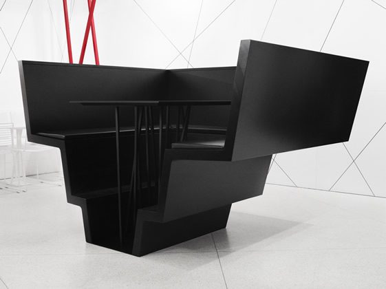
Initially we looked at all sorts of subjects for inspiration. We started of with a nostalgic approach relating to photography, we looked at the origin of the art. We found wonderful images of coagulating silver grains, photos in extreme close up. We scaled up the grain to become a spatial language, to be used as design input for all furniture. We made prototypes of cut silver grain formations into steel and wood. We then tested another approach using an aesthetic closely linked to the art of photography – we thought about lenses and the spatial effect of them and did a lot of tests with perspective deformations. We also tried to implement out-of-focus effects, which is an aesthetic deriving from photography. The final design was a mix of them all; the main material is silver-like, which came from our research within silver grain. The slight mirror effect has a clear blurry, or out-of-focus effect. The perspective deformations came from the effects of cameras lenses.
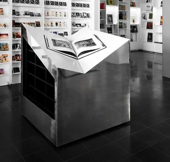
This toolbox of design parameters has been implemented for the all the furniture and the functions they serve. Swedes are very practical and rational, so we needed to be very clear on letting the functions drive the formal language. So the shape of a wide-open portfolio/large book gave shape to the portfolio in a very direct way, but with a twist, literally. The objects/functions that give shape to the furniture are rotated a few degrees, to give it a more unique appearance. The book modules merge together the function of a table and bookshelf, also slightly rotated. The same design approach has been used for all the furniture within the project. The reception differs a bit as a result of the flow of visitors with large cuts in which to house folders and other informative material. Very rational, but with a distinctive design.
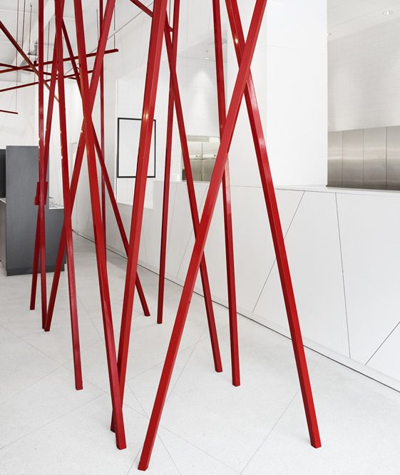
Yes, looking through your work there’s a very deliberate style – how would you describe it? Is each project different or do you have a certain way of working together?
The outcome of our projects is the result of clear spatial ideas, rather than focusing on a specific aesthetics. But we use all forms of strong expression to nurture the discussion at the office. When starting a project together we usually try to have an intense workshop together with the aim of generating a lot of ideas. Then there is a testing period to see what seems most suitable for that individual project.
So what have you been working on lately – do you have any upcoming exhibitions, launches, openings, etc?
Yes, we have a few things coming up:
- A new architecture exhibition for the Swedish public authority Levande Historia or ‘the Living History Forum’ called “P.K.” An exhibition dealing with intolerance and the effect in society an intolerant attitude can bring. It is based on recent studies of intolerance amongst young people in Sweden, this report was recently published by the Living history forum. The report and the exhibition brings up subjects that are very related to the terrible deeds that happened in Norway in July, and with it a very important platform for current discussion. The media has already begun referring to the report.
- New work for Fifth Avenue Shoe Repair. New store concept!
- New apartment project. It is the 3rd in a series of apartments that derives from the same spatial ideas.
- Small villa project on an island in the Stockholm archipelago.
- Finally; a new profile for our office, we have started a separate company dealing with production and project management. The reason for this is to do more advanced projects, while still keeping budgets low.
Lastly, we are constantly inundated with exceptional talent out of Stockholm – any insights or reasons for this you can think of?
There is a generation shift happening in Sweden right now, not only in architecture, but across all cultural fields. And the recent success of Swedish fashion, music and art is only nurturing this phenomenon.


