If you are not an architect or interior designer, it is hard to follow how design is evolving in real time. It is much easier to look back a few years later and track the progression. For those who are in the hospitality industry, hindsight is not enough. You need to be on top of the trends.
One of the realities you will learn from following design trends is that they are often a lot less organic than they seem. For example, Pantone chooses a colour palette every year which is adopted by fashion and interior designers worldwide. This kind of strategy streamlines marketing and sales, and ensures everyone is on the same page.
This is why going out of the box will only get you so far. Yes, your restaurant should absolutely express your uniqueness. However, it needs to be within certain bounds in order for the available furniture and interiors to actually match your themes. Restaurant architecture and interior design has already evolved in the 21st century. If you haven’t been following the trends, here is what you need to know.
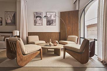
Minimalism is in: Whether you like it or not, there is no doubt that minimalism is in. This extends to all aspects of a restaurant’s interiors. When you furnish your restaurant, you need to take into account that patrons will be drawn to stripped-down pieces. Less is more.
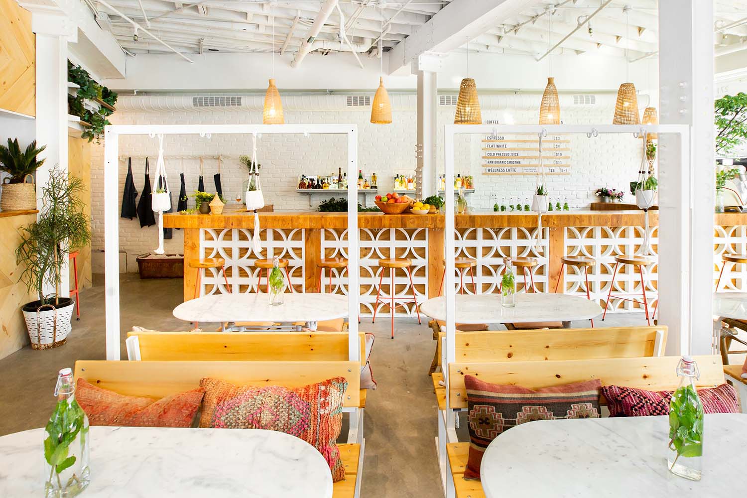
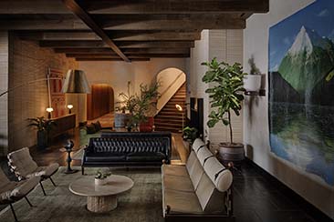
Minimalism does not necessarily imply empty space and simplicity. Visible lighting fixtures, bare brick, and the like are all examples of minimalism. They express a contentedness with the bare bones of a space’s design, and contentedness is what minimalism is all about. It expresses a willingness to embrace beauty in the basics.
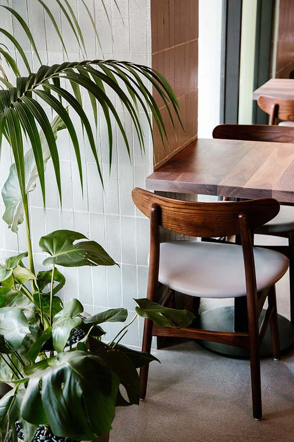
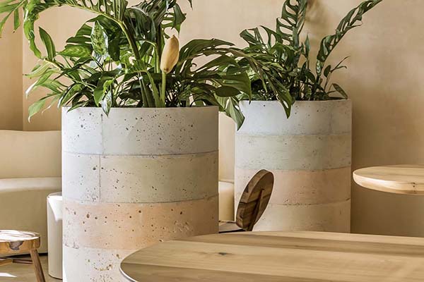
For this reason, plant life adds to this aesthetic. Bringing nature inside speaks to all the values in minimalistic thinking.
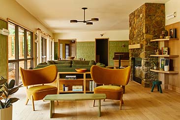
Natural building blocks: As we get further and further into a manmade world, everyone seems to want a break from modernity. Instead of the futuristic interiors sci-fi creators once imagined, people are going back to basics. In the 21st century, we have seen a lot of restaurants go for wooden walls and floors, fireplaces, and other ‘natural’ building blocks.
Every modern designer has the instinct to create spaces that look like they are thinking ahead of their times. But the reality is that the future is no longer as enticing as it once was. We hold the latest tech in our hands at all times. When eating out, nature is a nice break.
Soft colours: Another old sci-fi trope was that the future would be full of bright colours and neon lights. The reality is that those things now make a restaurant look incredibly outdated. People today want something more subtle, which is why neutral colours and soft pastels are in vogue.
We’ve all realised that a restaurant should be a place that takes us away from the intensity of the online world. We want to be less stimulated by the colours and more so by the food. 21st century restaurants look nothing like we once expected them to. Knowing the trends is important before you start thinking outside the box.


