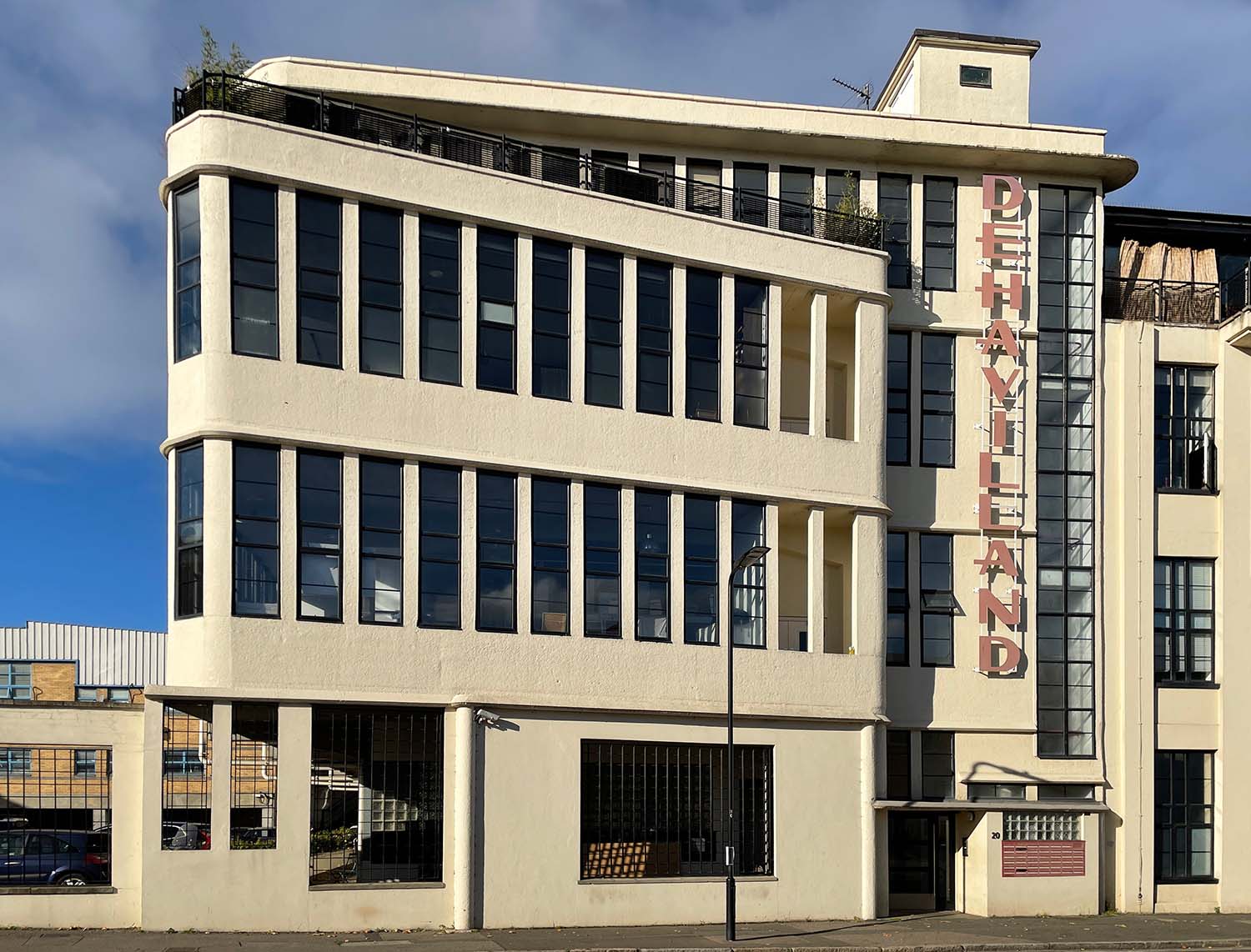
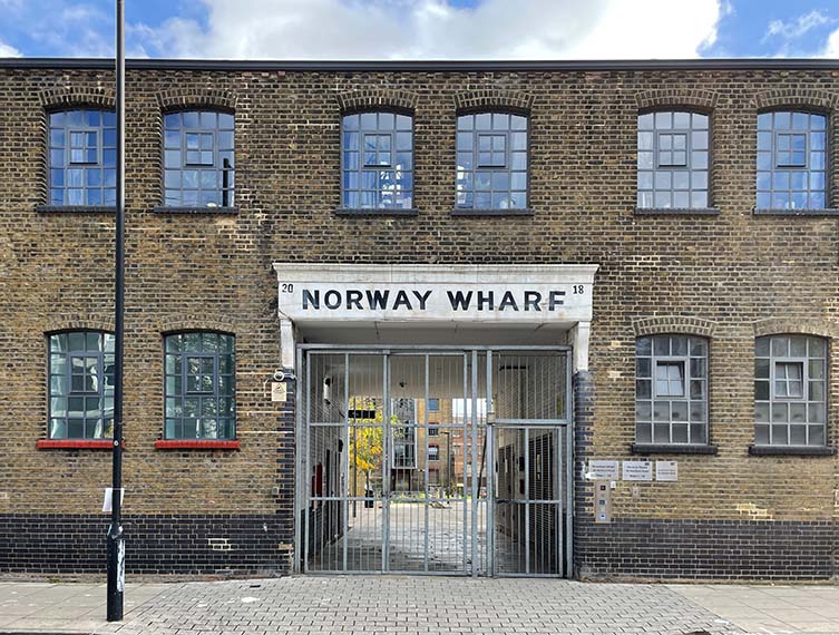
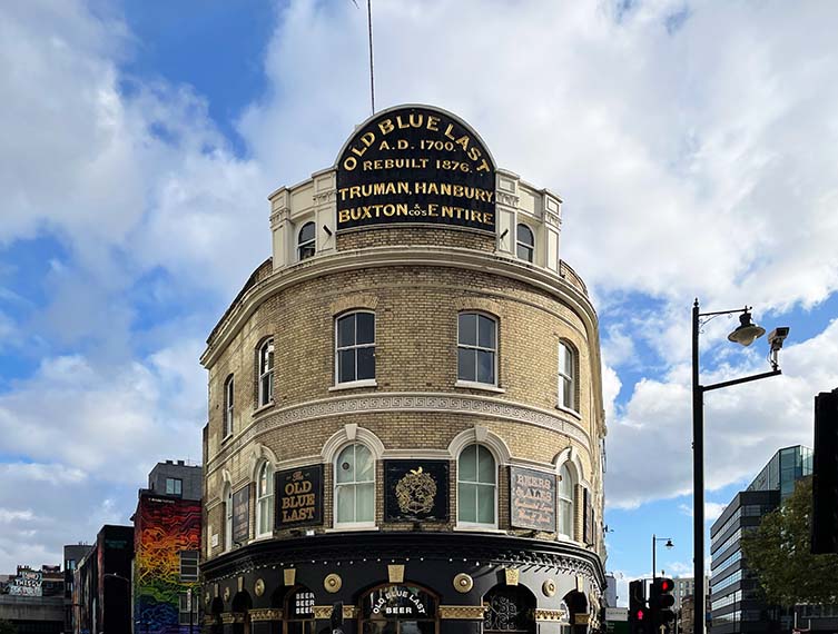
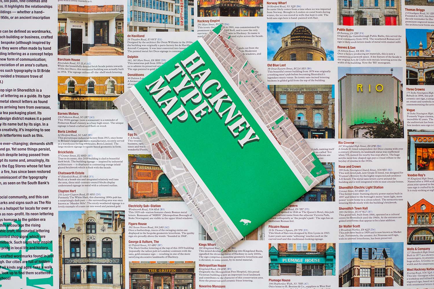
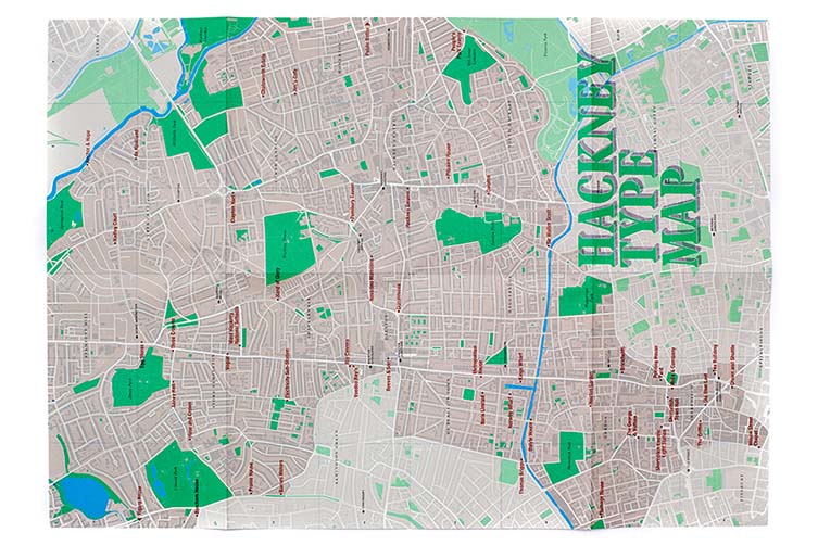
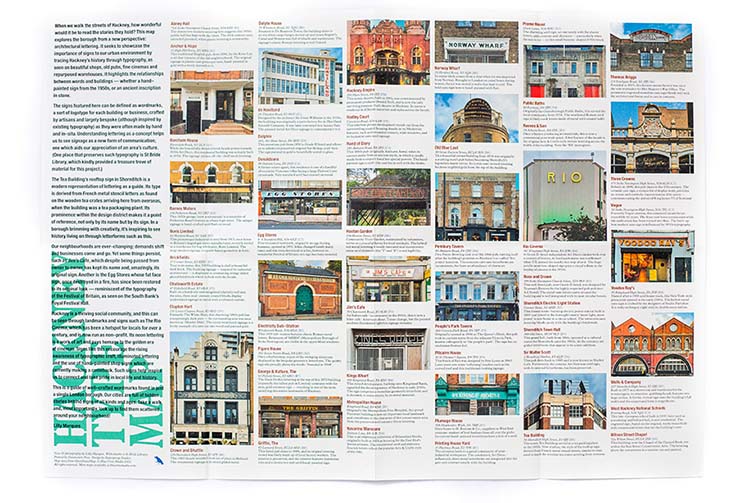
Author and Hackney-based designer, Lilly Marques, provides text and imagery for Blue Crow Media‘s latest guide, the Hackney Type Map. Celebrating architectural lettering in Hackney, the two-sided map is the publisher’s first title dedicated to architectural lettering, exploring centuries of typography, from hand-painted signs and centuries-old stonework to neon letters and contemporary metalwork.
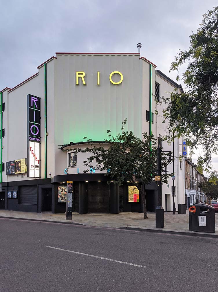
The typography map features examples of lettering across 50 buildings, such as shops, pubs, cinemas and warehouses, some locations now renowned urban landmarks thanks to their characterful and eye-catching type form; the Tea Building in Shoreditch one of those examples with its sign derived from French Metal Stencil letters as found on the wooden tea crates, as well as Dalston’s Rio Cinema, which pays homage to the golden era of cinemas.
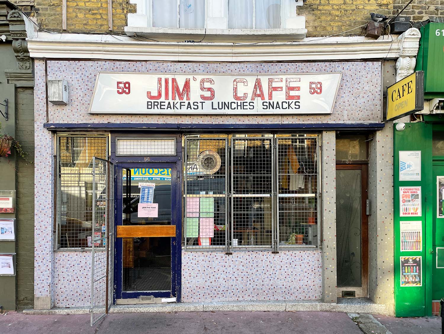
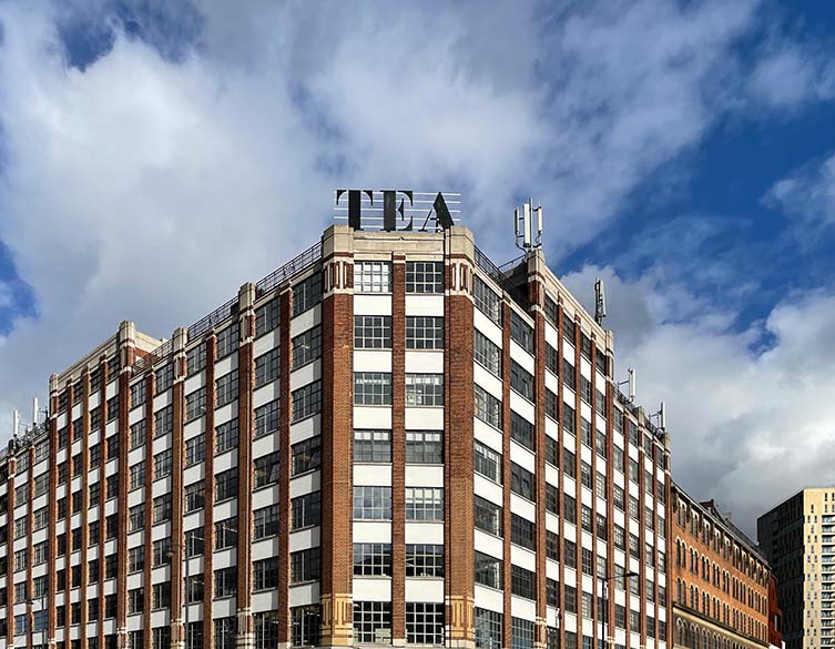
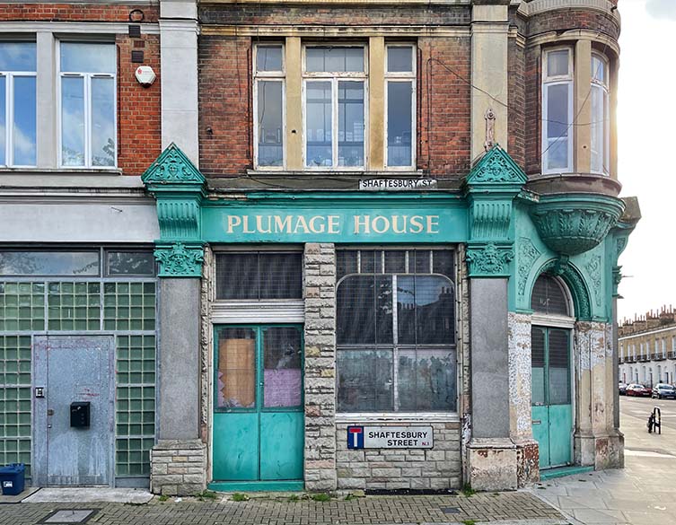
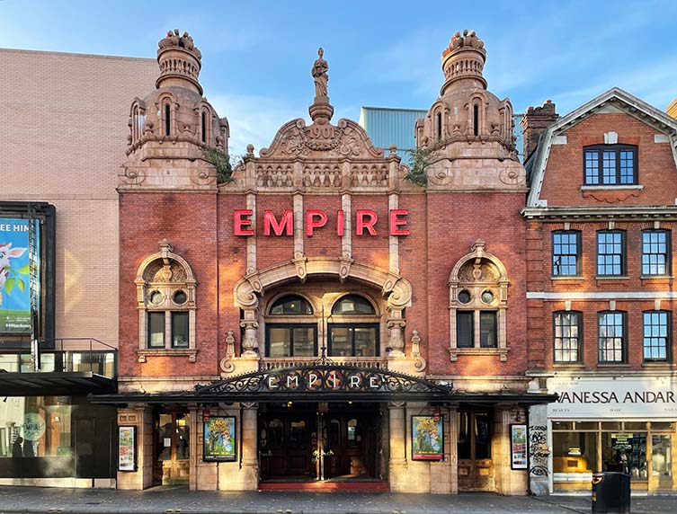
Seeing a rising awareness of typographic craft, illuminated lettering, and the use of hand-painted shop signs, Lilly Marques used the extensive typography archive at St Bride Library as a resource for her research, the unique lettering of Hackney connecting those that see it first hand to the borough’s cultural history and thriving present; the author commenting “understanding lettering as a concept helps us to see signage as a new form of communication; one which aids our appreciation of an area’s culture.”
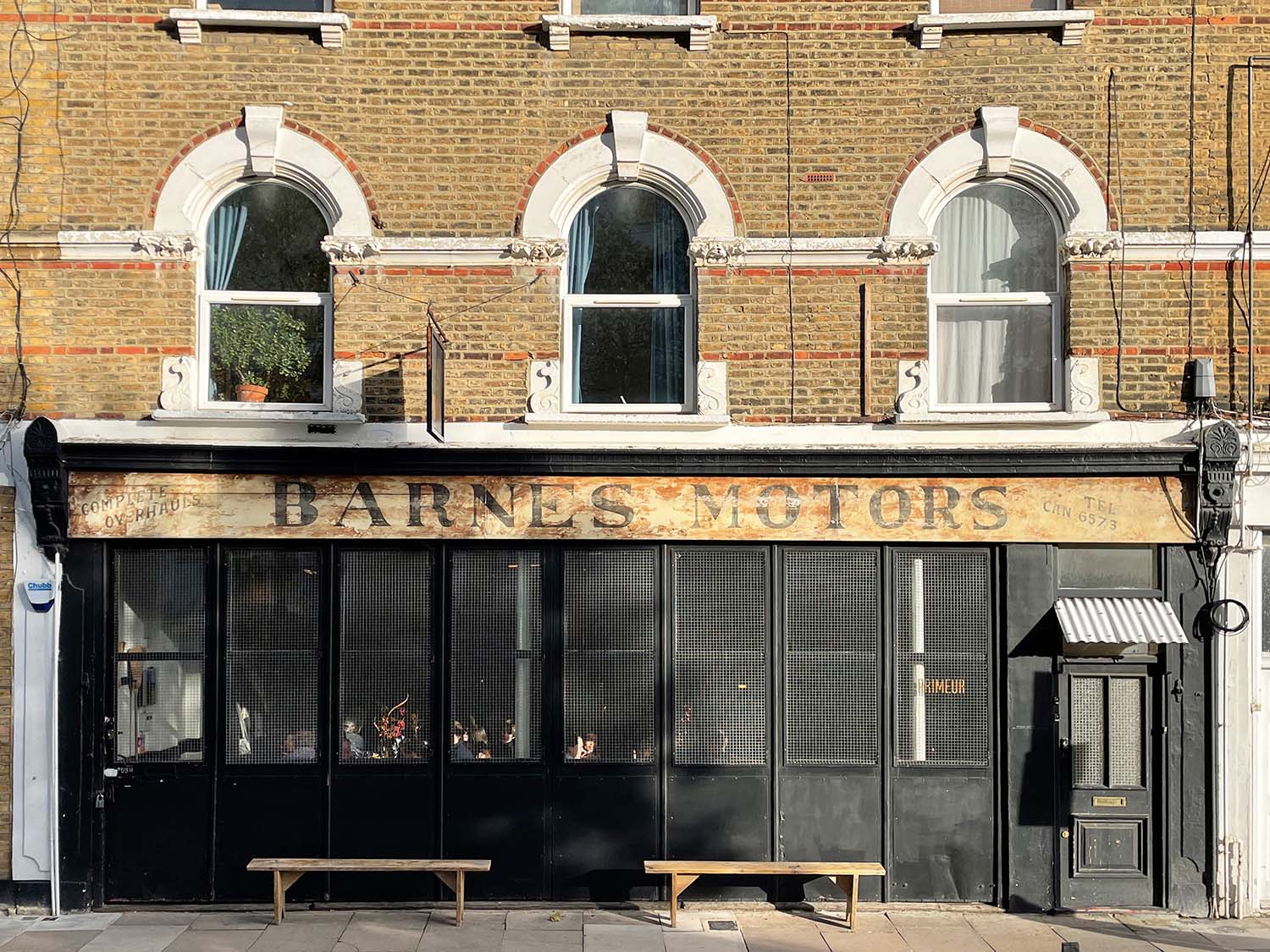
Printed on quality recycled paper in the UK by a family-run B Corp-certified printer, the A2-sized Hackney Type Map is available to purchase from purchase from bluecrowmedia.com now. Buy it today and take a ‘lettering tour of the neighbourhood’, enjoying gems including the 1951-opened Egg Stores, the iconic Tea Building, Barnes Motors, and Dalston’s NYC-style pizza slice outpost, Voodoo Rays.
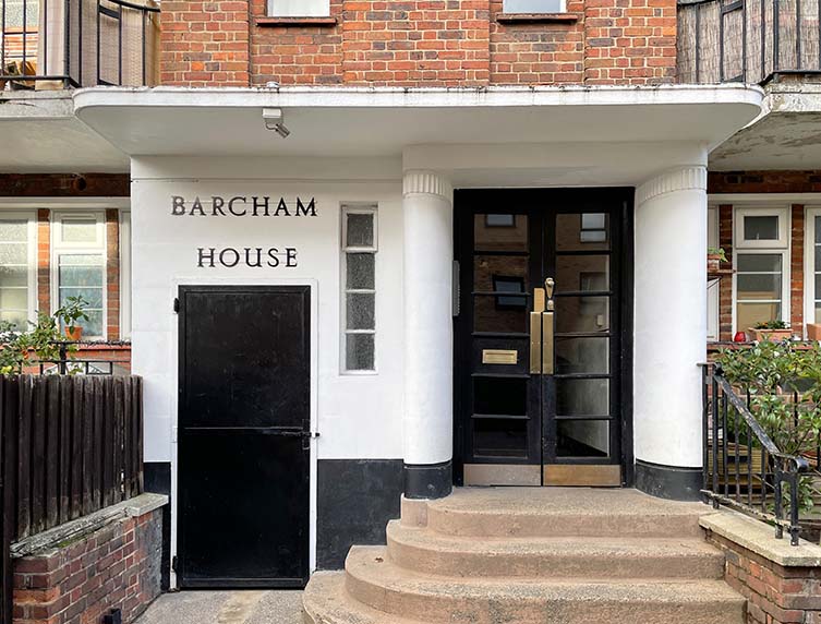
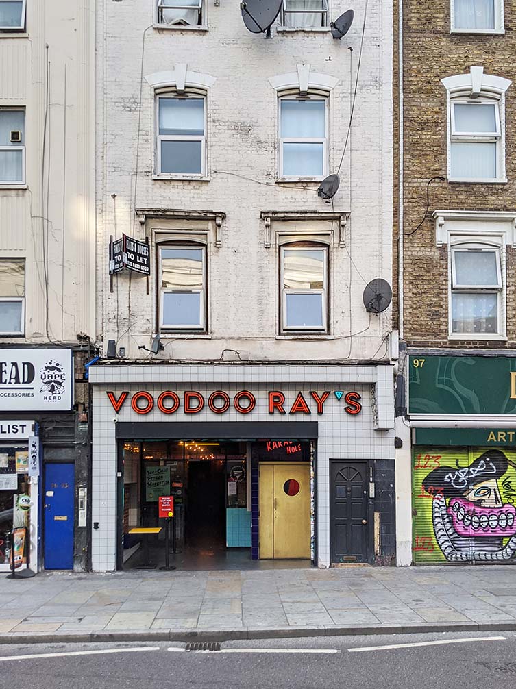
Hackney Type Map Photography, Lilly Marques.

